Optimizing EMBIBE Web for Organic Conversions: Header, Search and Sign-Up Funnel
Redesigning the header menu, introducing a global search, and improving the sign-up funnel optimized Embibe’s web platform to streamline access to educational content and as a result boost student app sign-ups.
.webp)
Employer
Embibe
Position
Senior UX/UI Designer
Contribution
Individual contributor
Timeline
Dec '22 - Aug '23
.webp)
.webp)


This design resulted in a 64% increase in the Signup rates.
If 5,000 out of 10,000 (current) viewers sign up, ₹2,000/course = ₹1Cr in 4 months
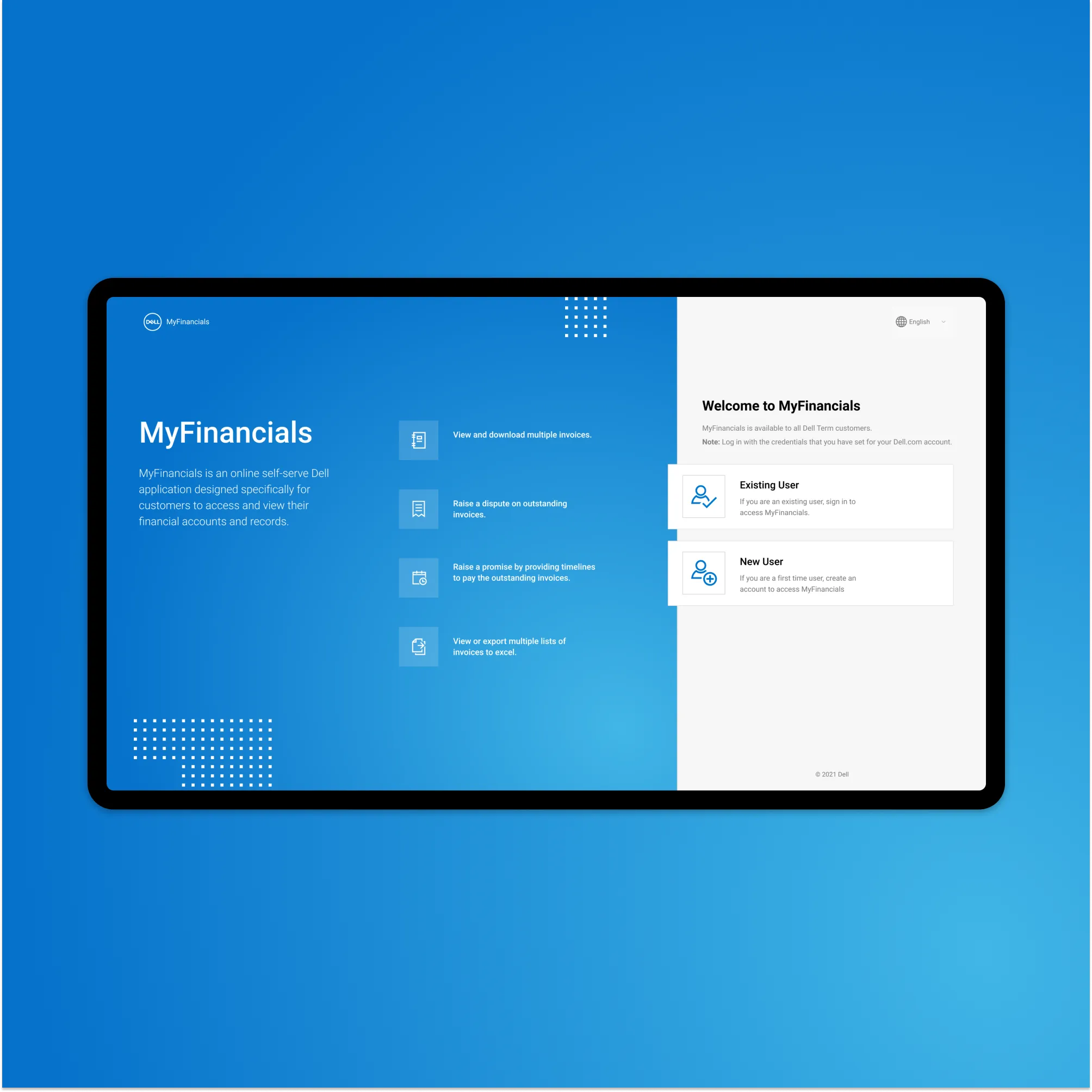
A Seamless Path from Organic Traffic to App Sign-Up


Solving Existing Problems and improving conversions
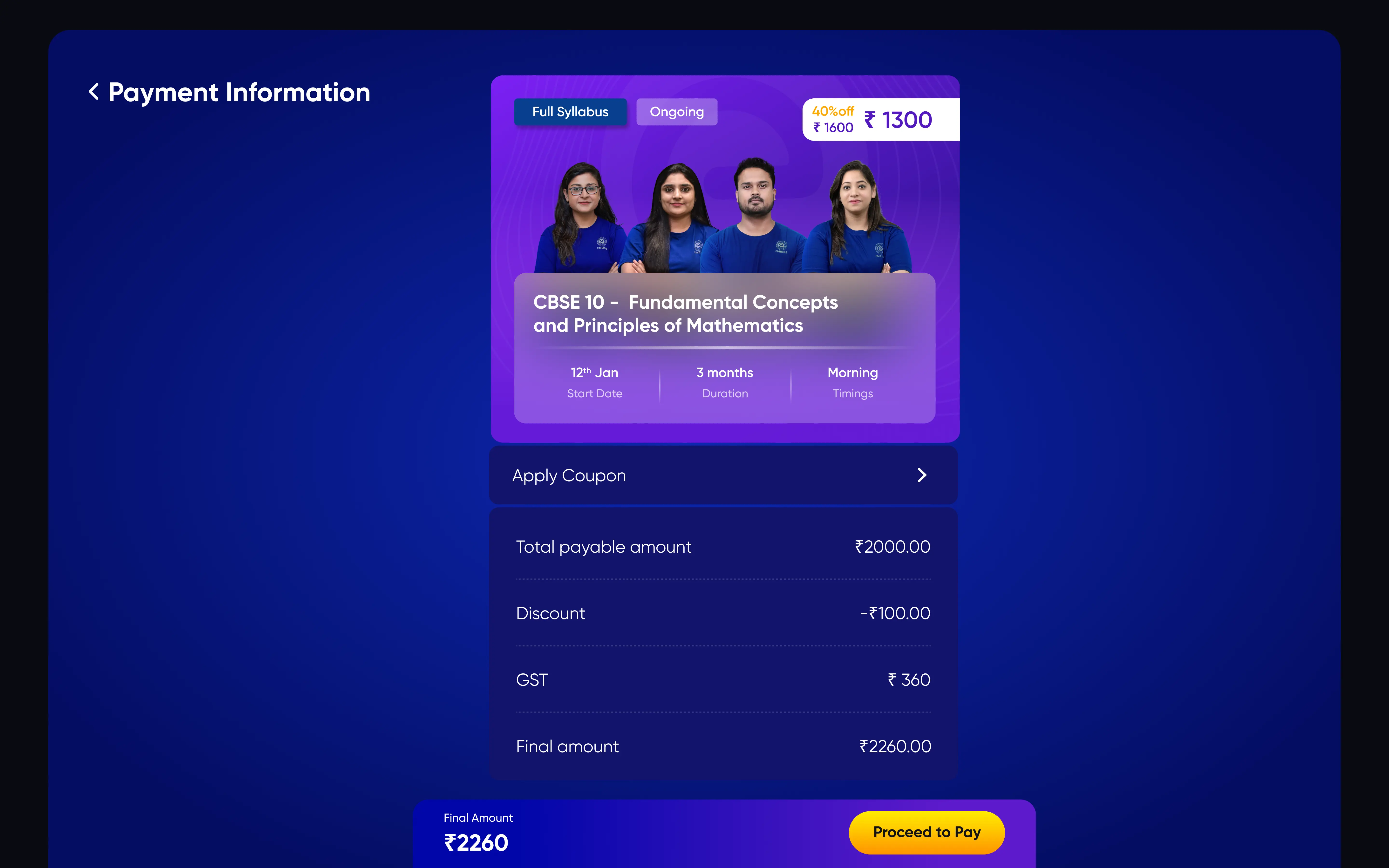
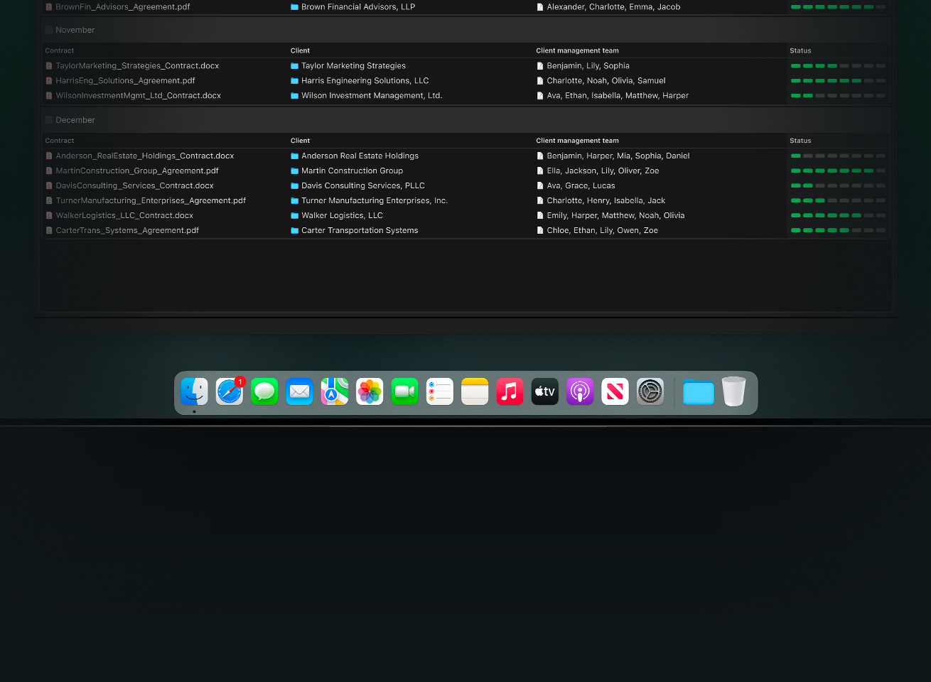
We transformed the current system of Live Classes to support batch-based courses that can be bought as a package, ensuring a seamless purchasing process for students.
.docx
.xlsx
.odt
.pptx
.rtf
.webp
Simplify descision making
Precisely state the value that the student would get by purchasing the Course. To give them enough pointers of the impact the course would provide to accomplish their Exam Goals.

.webp)
Solving Existing Problems and improving conversions
We transformed the current system of Live Classes to support batch-based courses that can be bought as a package, ensuring a seamless purchasing process for students.
.docx
.xlsx
.odt
.pptx
.rtf
.webp
Optimising for Monetisation
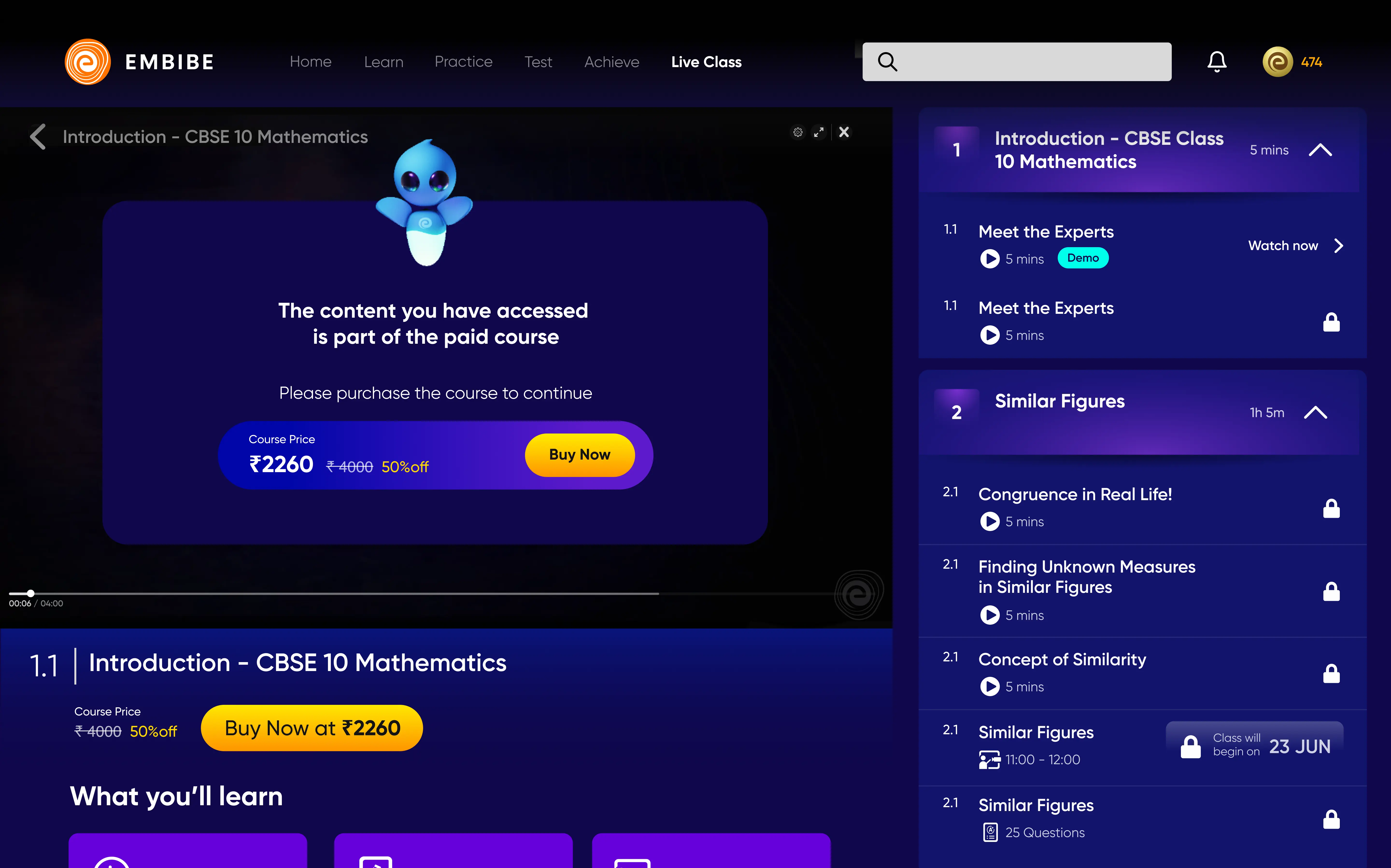
Designed features like payment gateways and access management, ensuring that students can purchase and access their course materials without any friction.

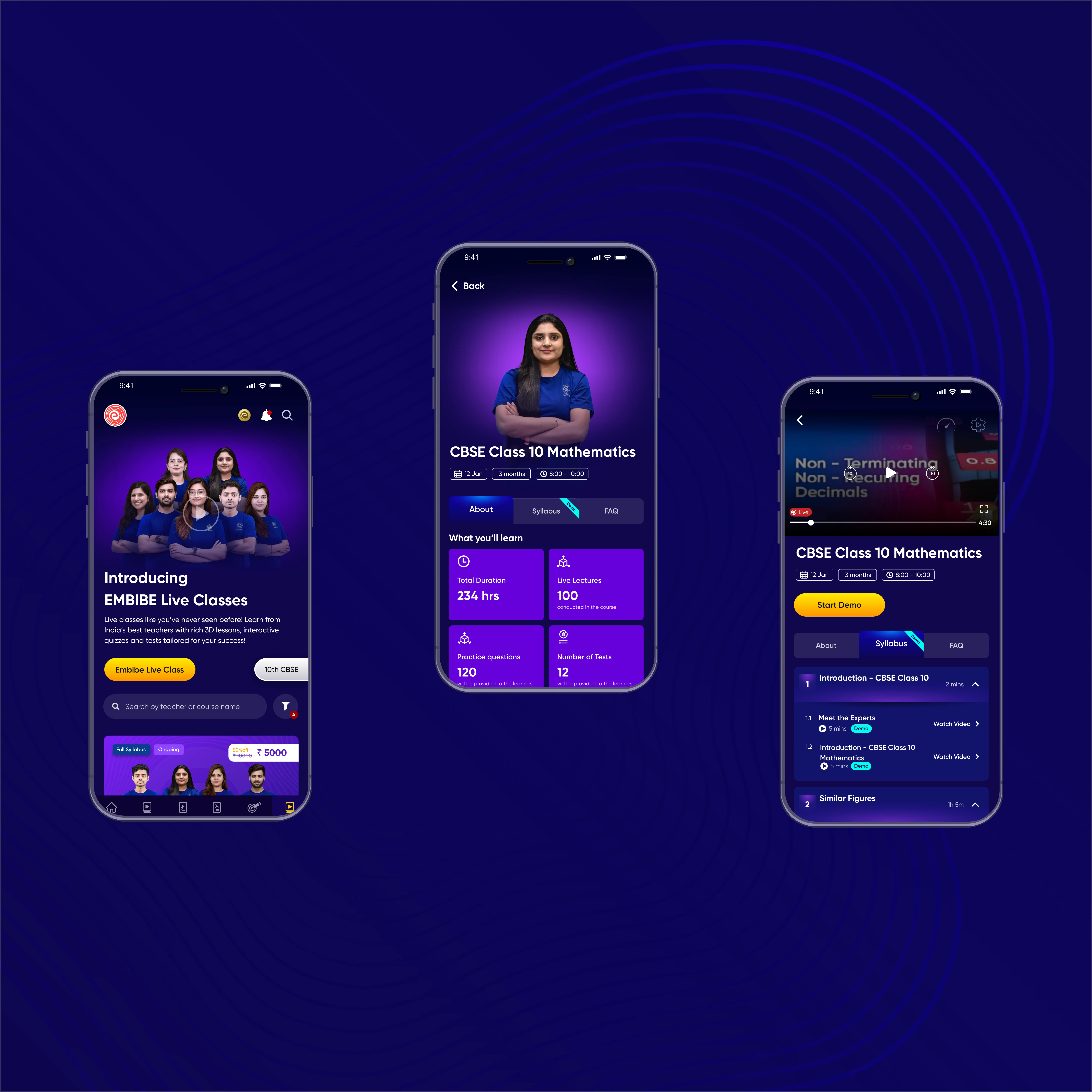
New direction for Embibe Student app
Highlighting challenges validated by teaching faculty, I proposed refined flows to address gaps, building credibility and driving updates to the requirements which matured over the project timeline.
Convincing stakeholders,
designing for a better exeperience.

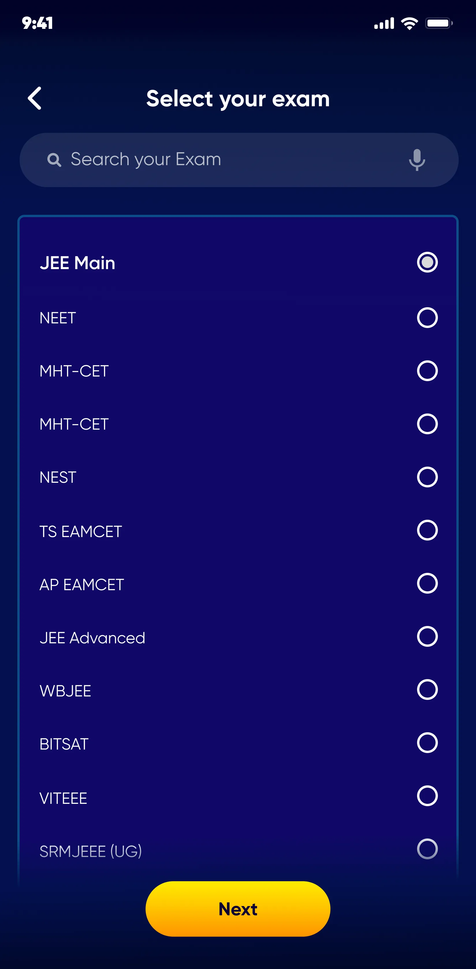
Requirement V1
Replicating Real-life coaching class experience
.svg)
- Beginner : Beginner level classes
- Performer : Intermediate level
classes
- Achiever : Advanced level classes
Requirement V2
Live Class Batching
Requirement V2.1
Monetization of Batching and Student app
Live Classes feature was unable to fully deliver its intended value.
Users are facing challenges that hinder their full learning experience. These challenges include:
Difficulty enrolling in multiple classes: Users have to register for each class separately, leading to a fragmented experience and making it difficult to manage their learning schedule.
Low completion rate of pre and post-class activities: A significant portion of users are not completing their homework, impacting the effectiveness of the learning journey.

Building upon clarity
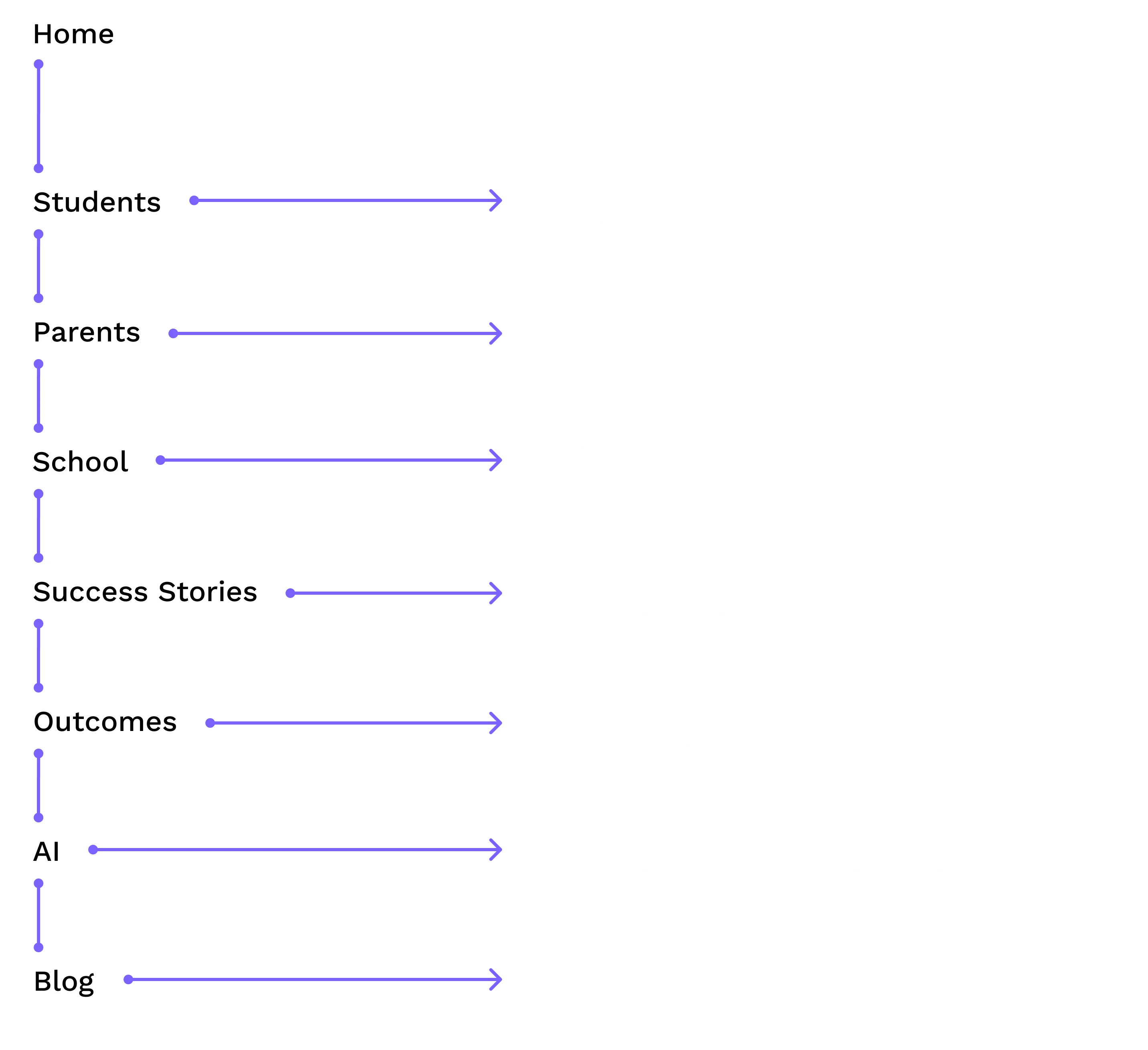
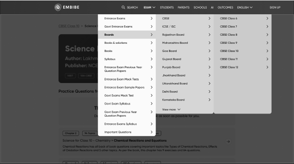
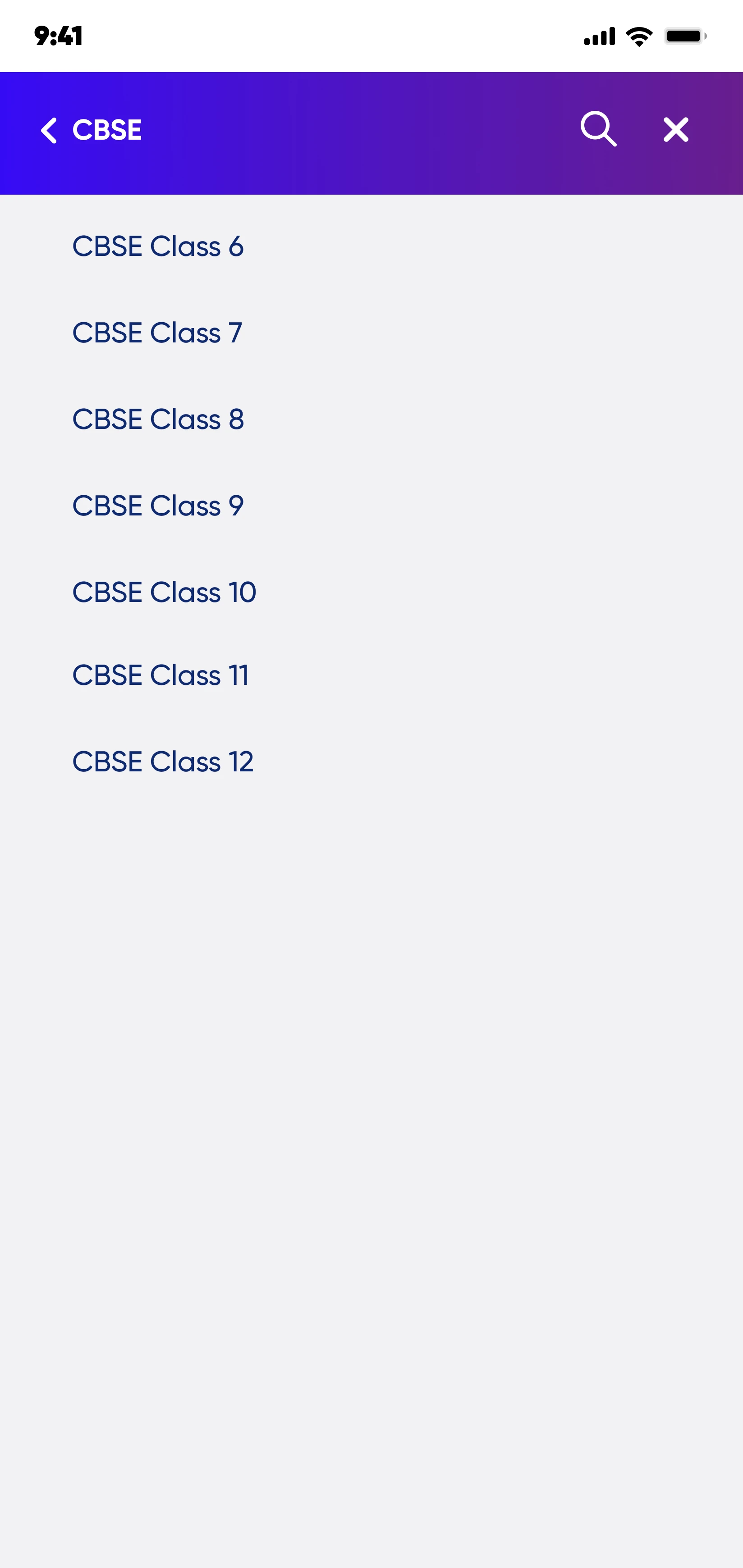
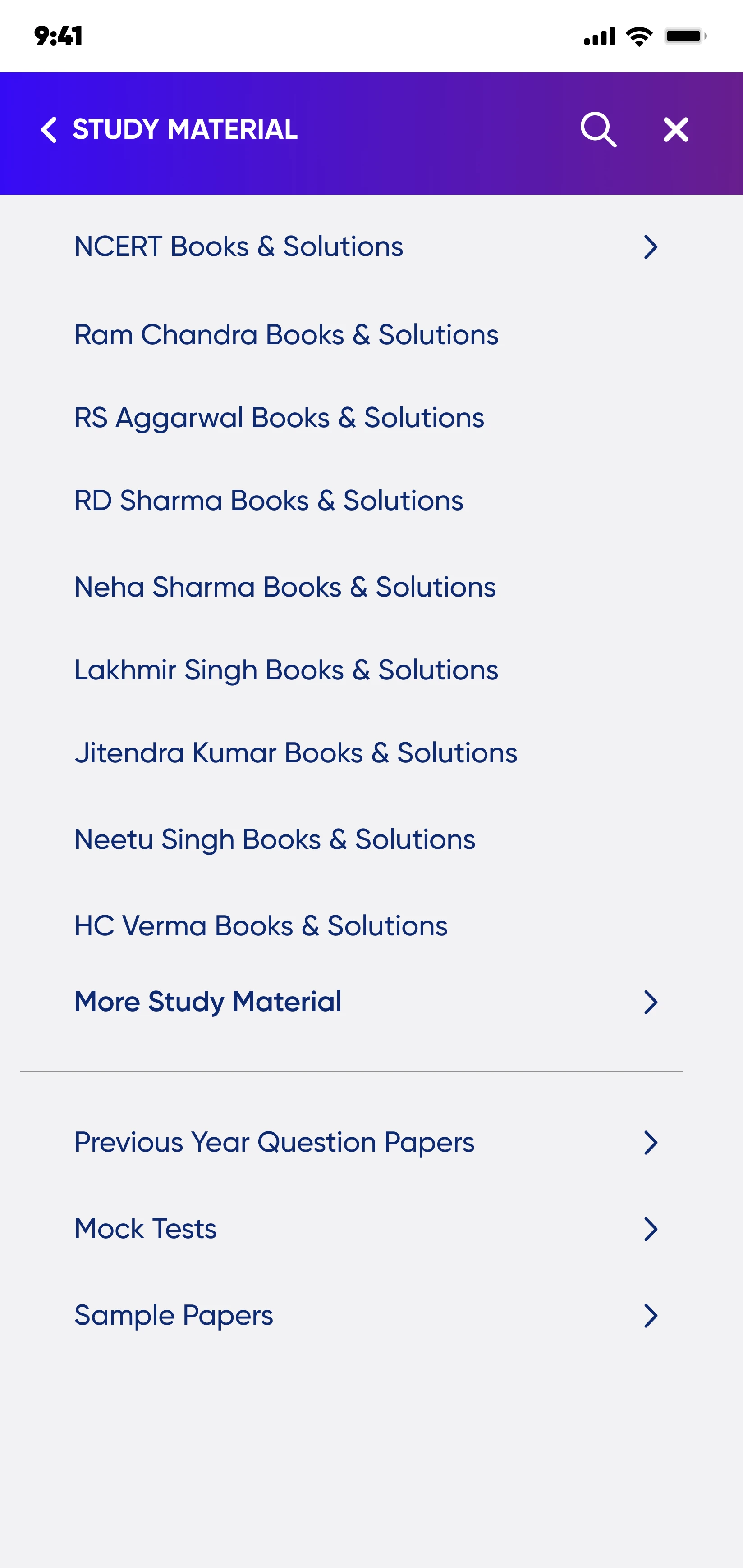
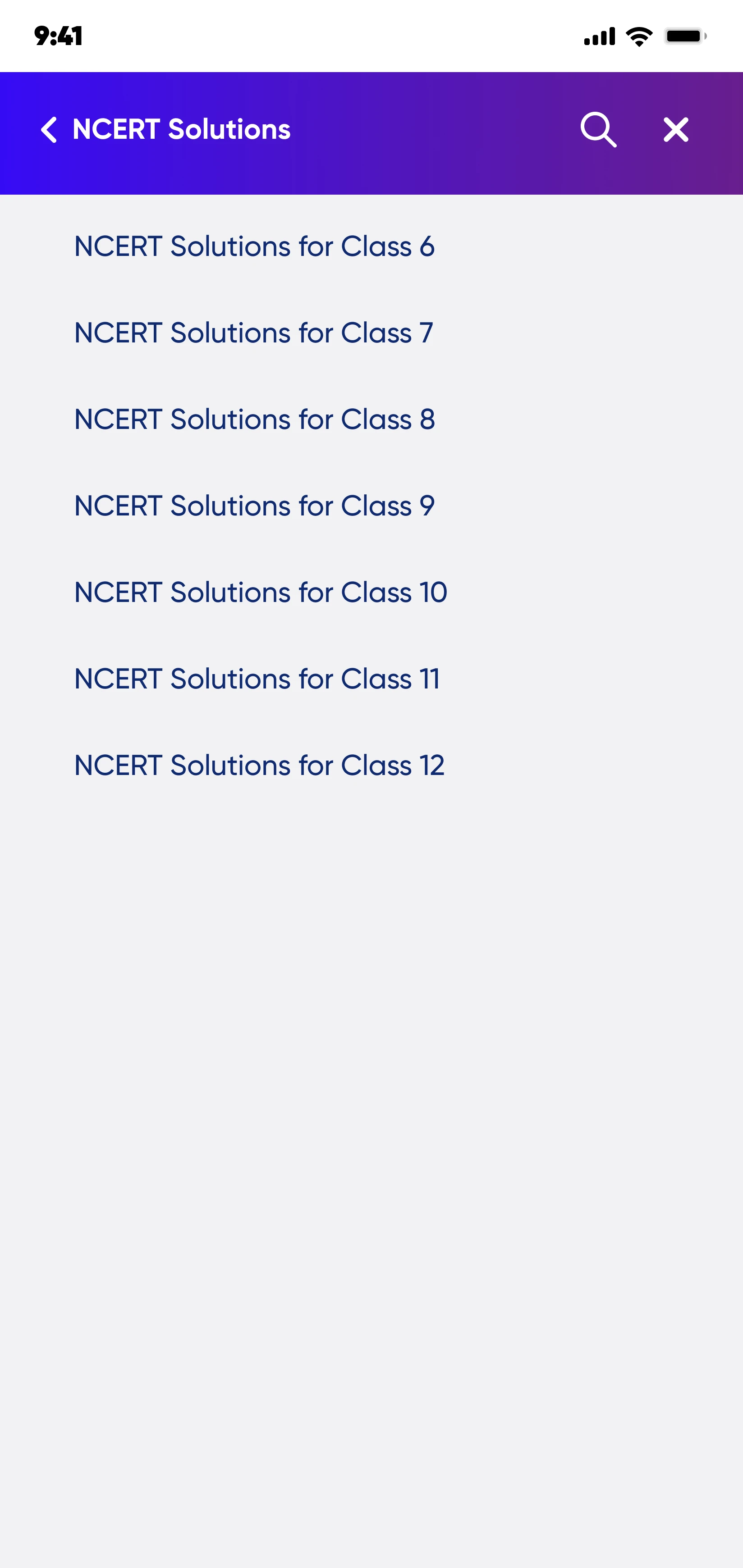
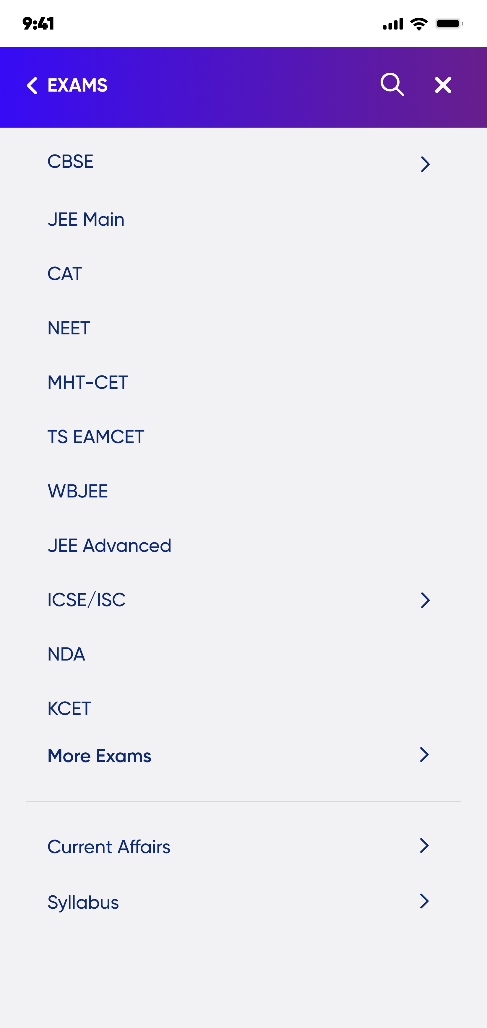
Before — Fragmented Information Architecture
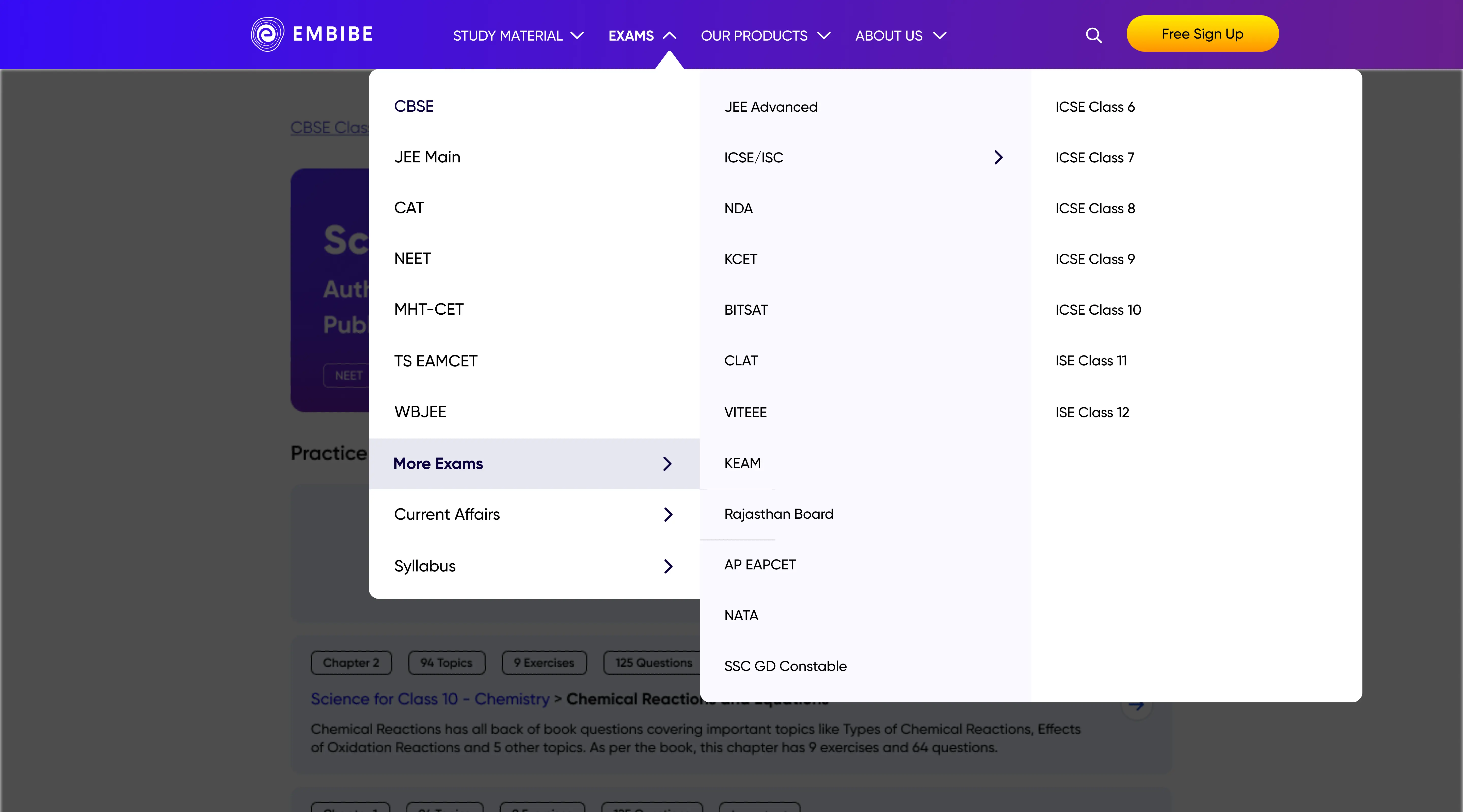
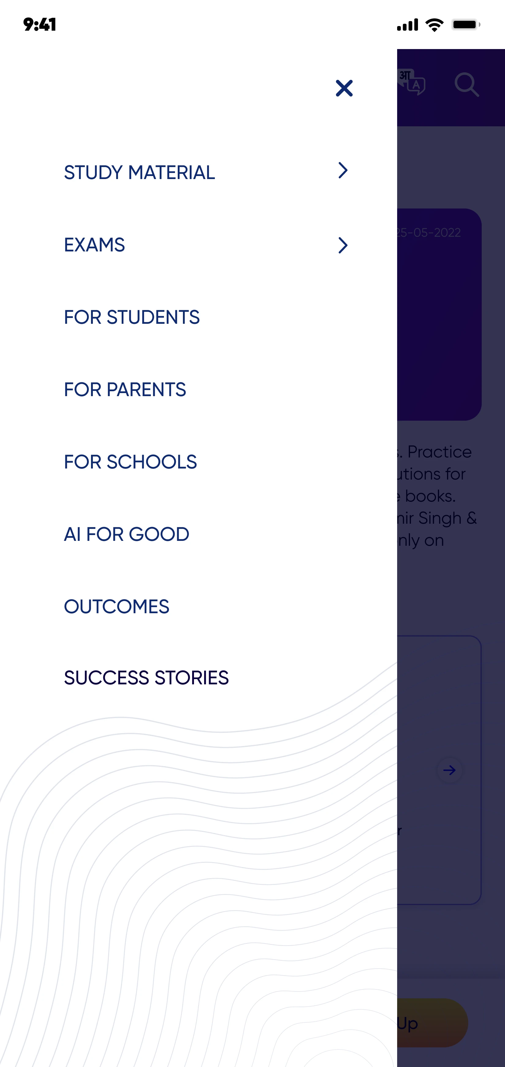
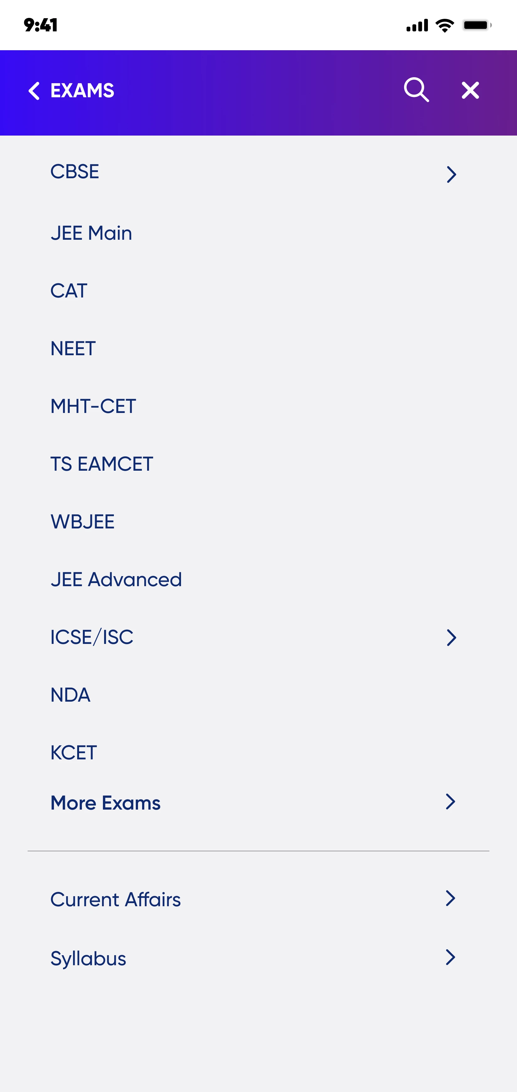
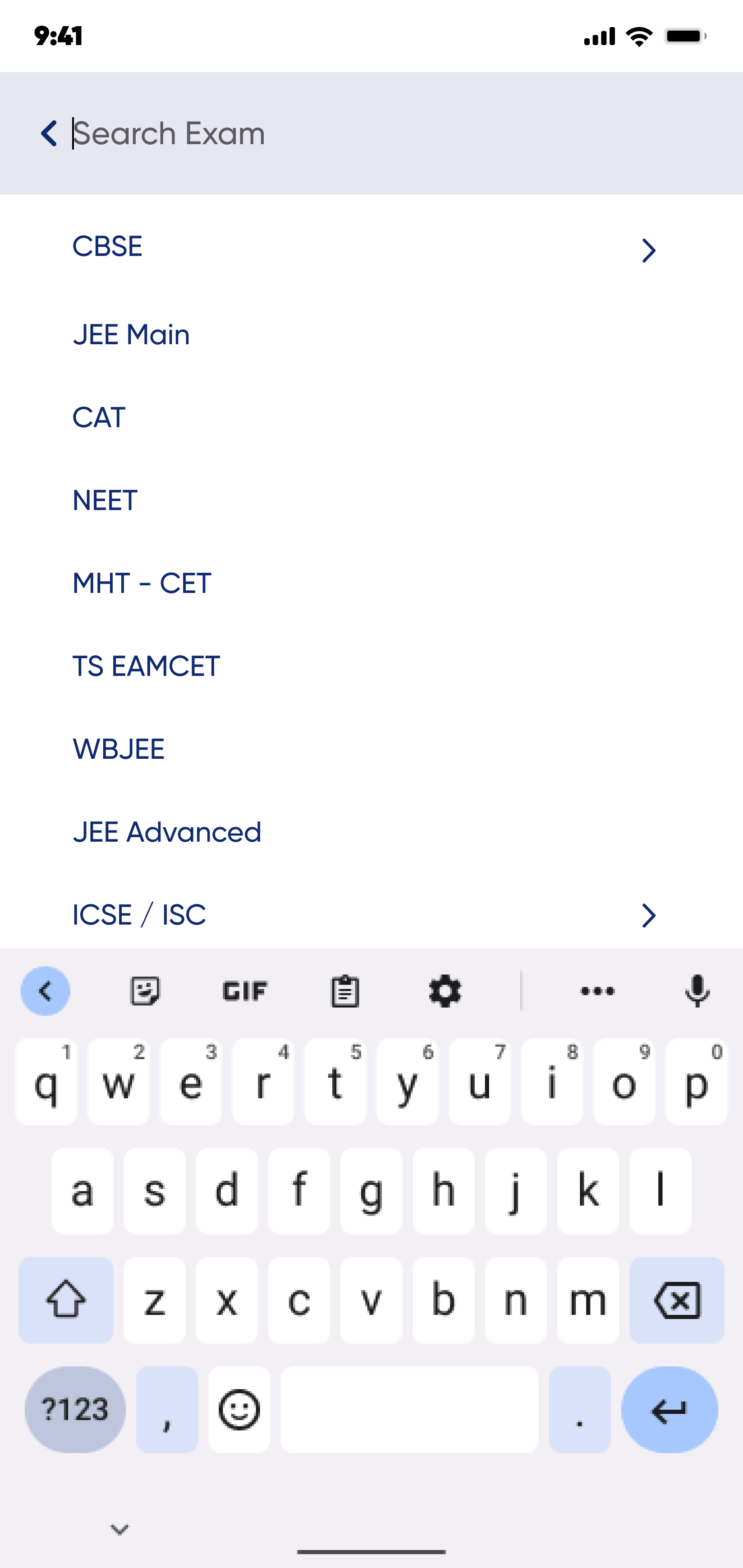
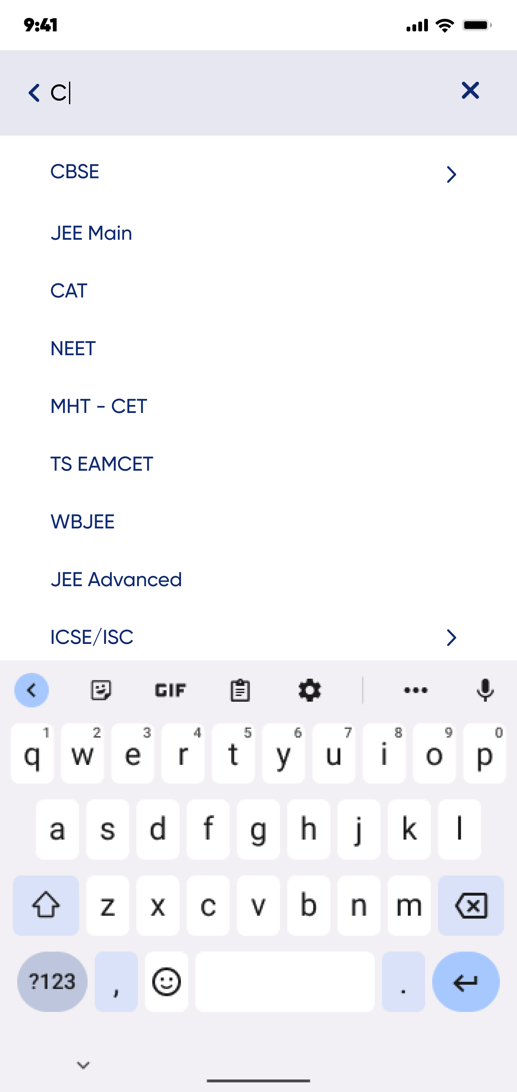
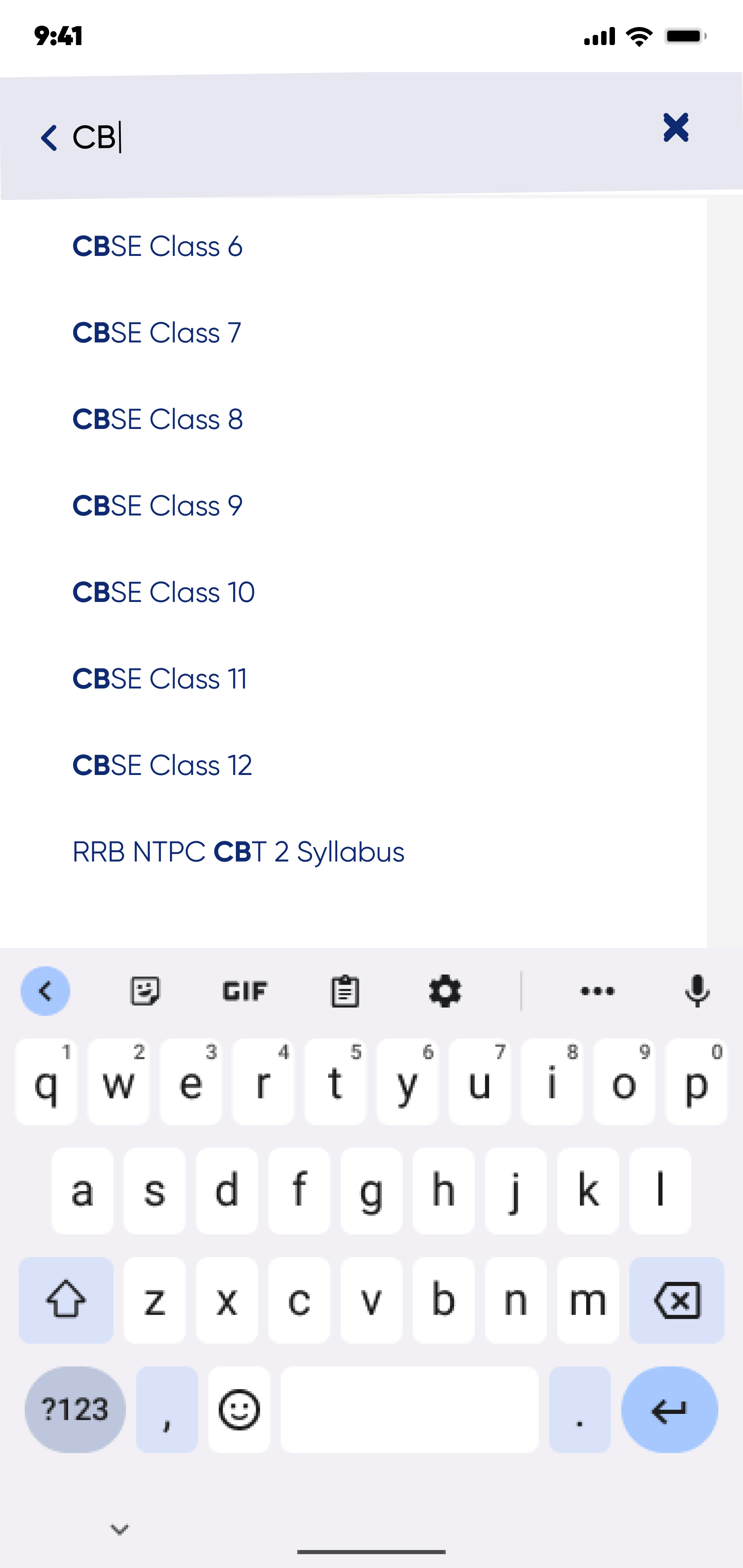
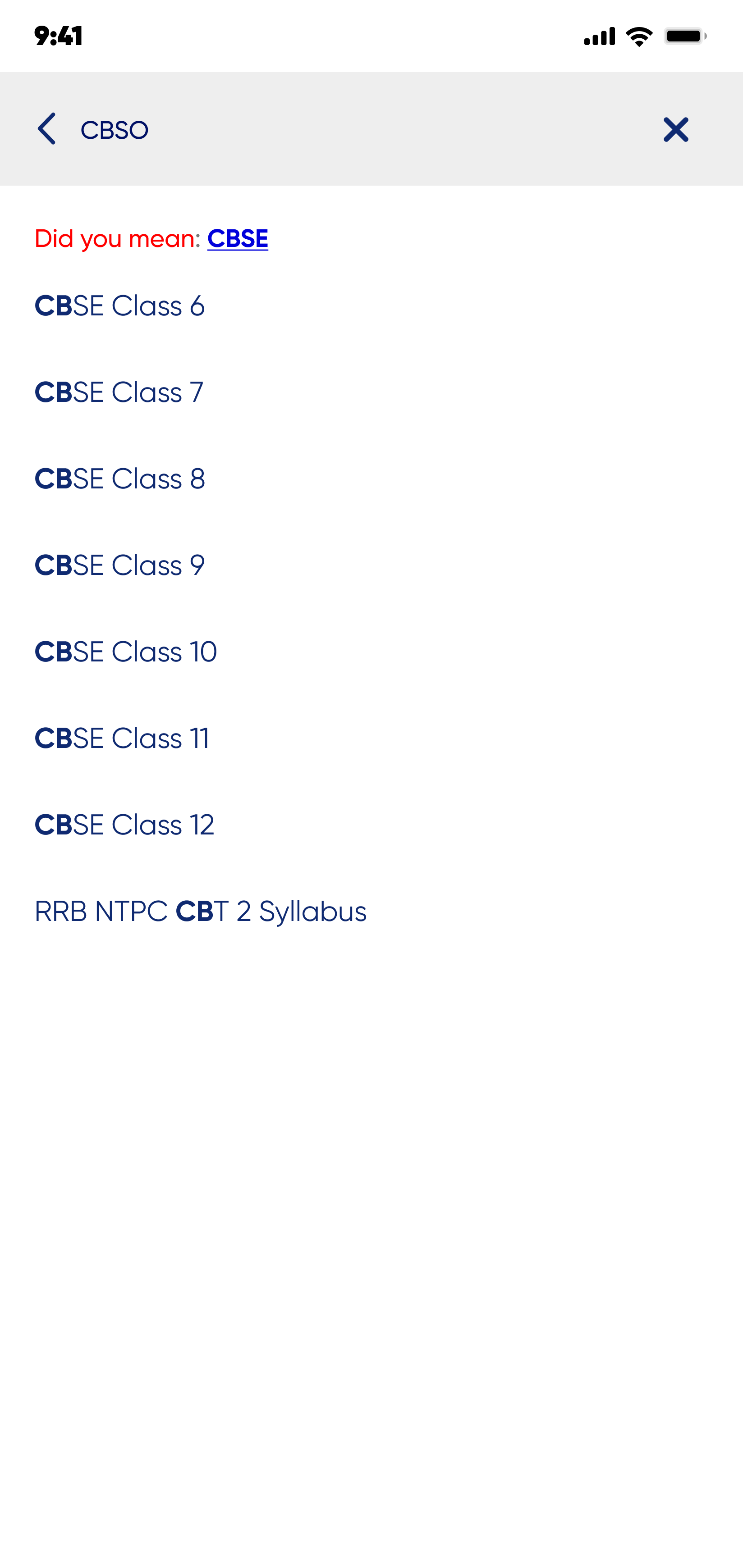
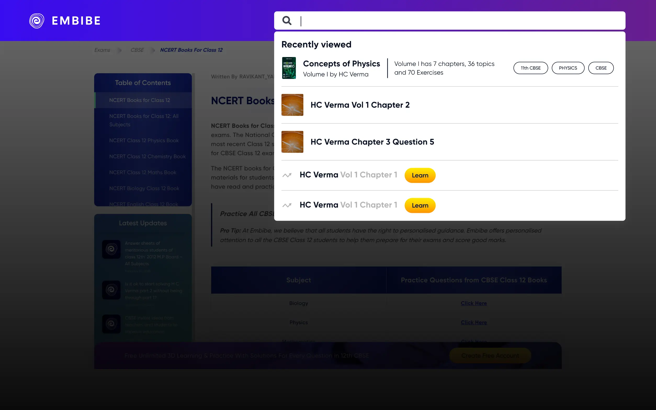
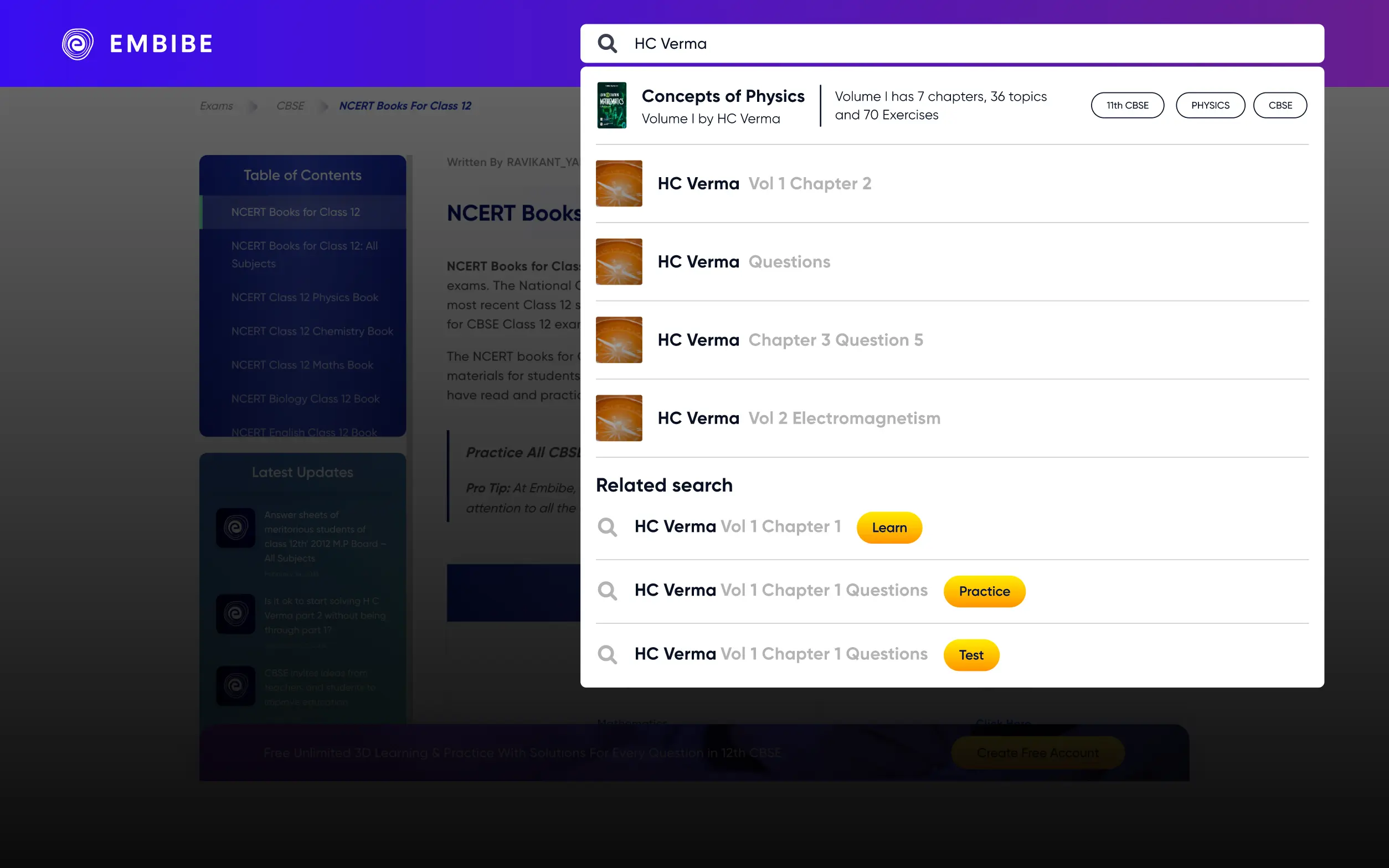
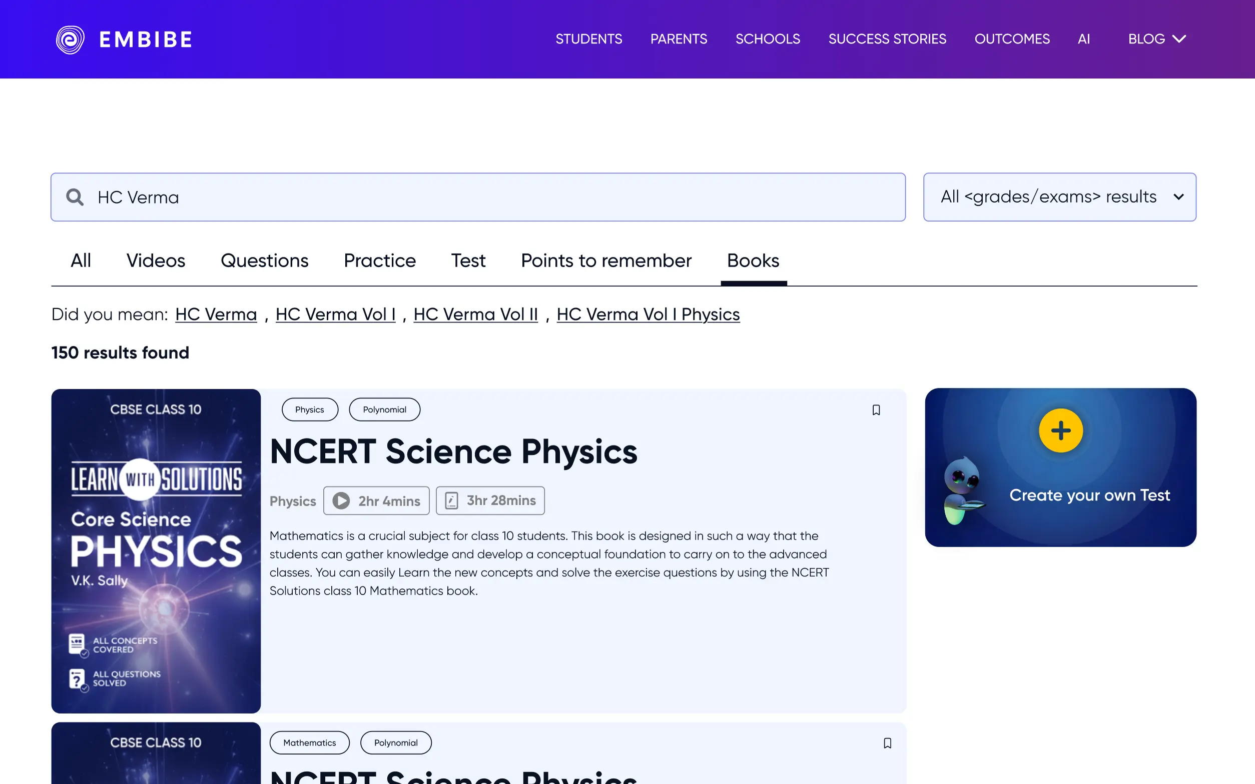
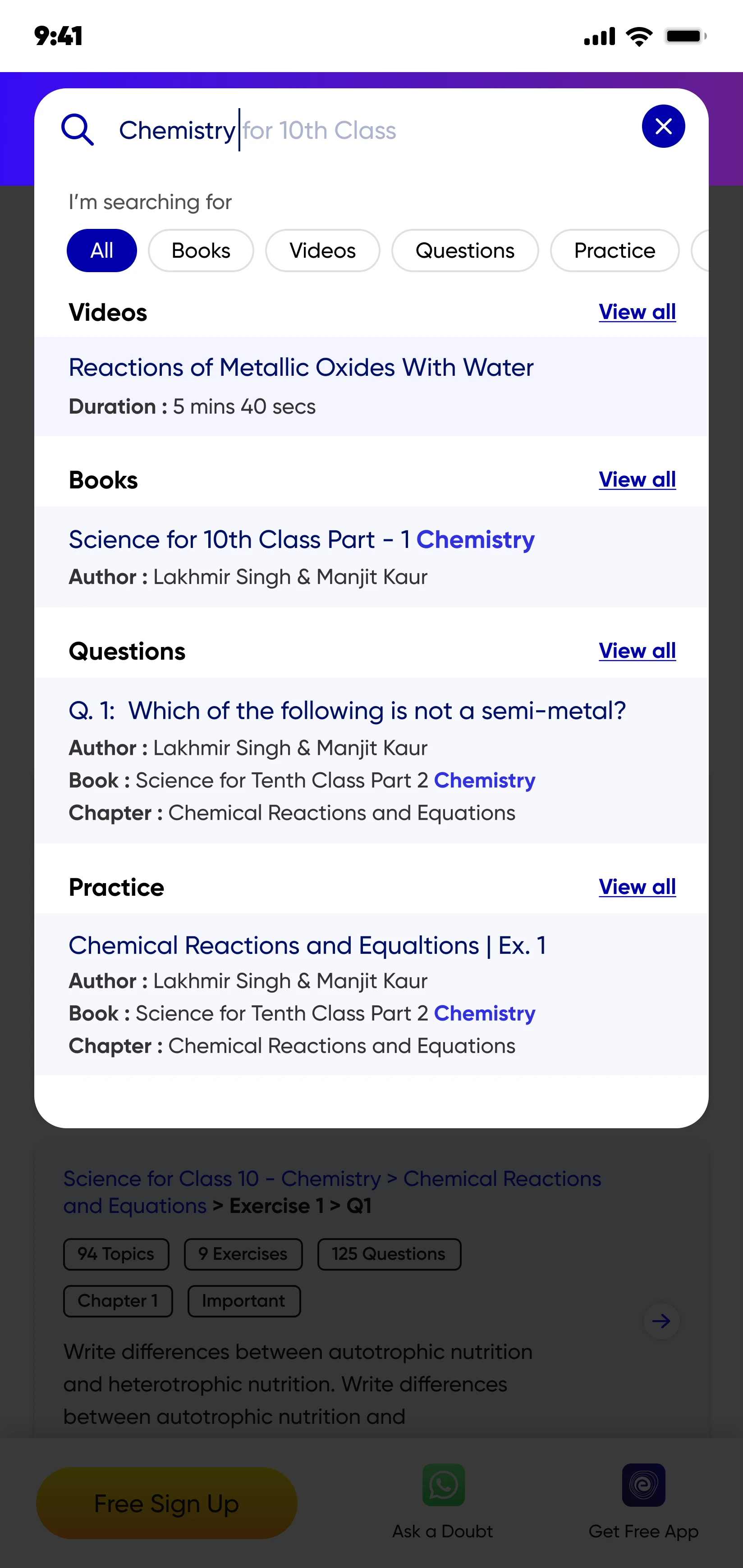
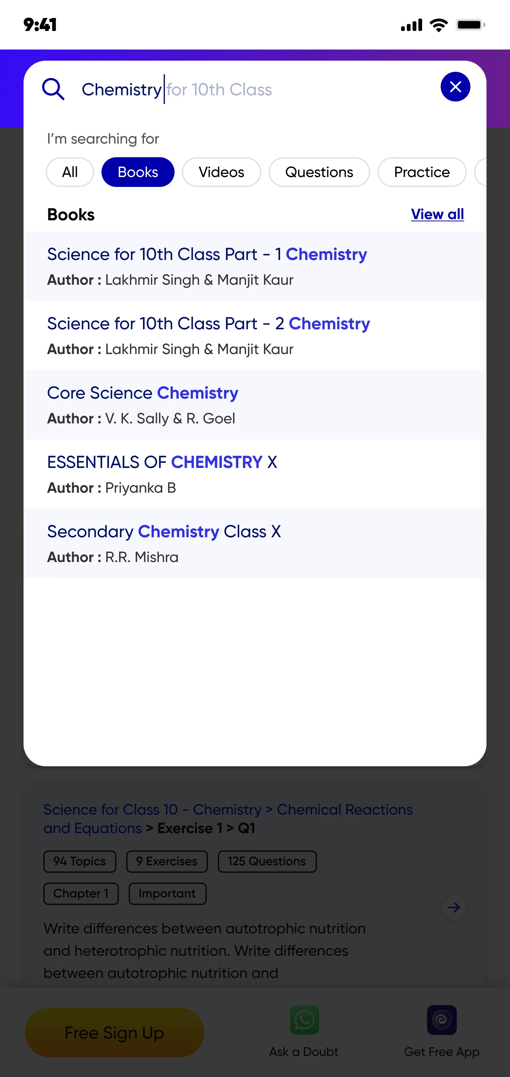
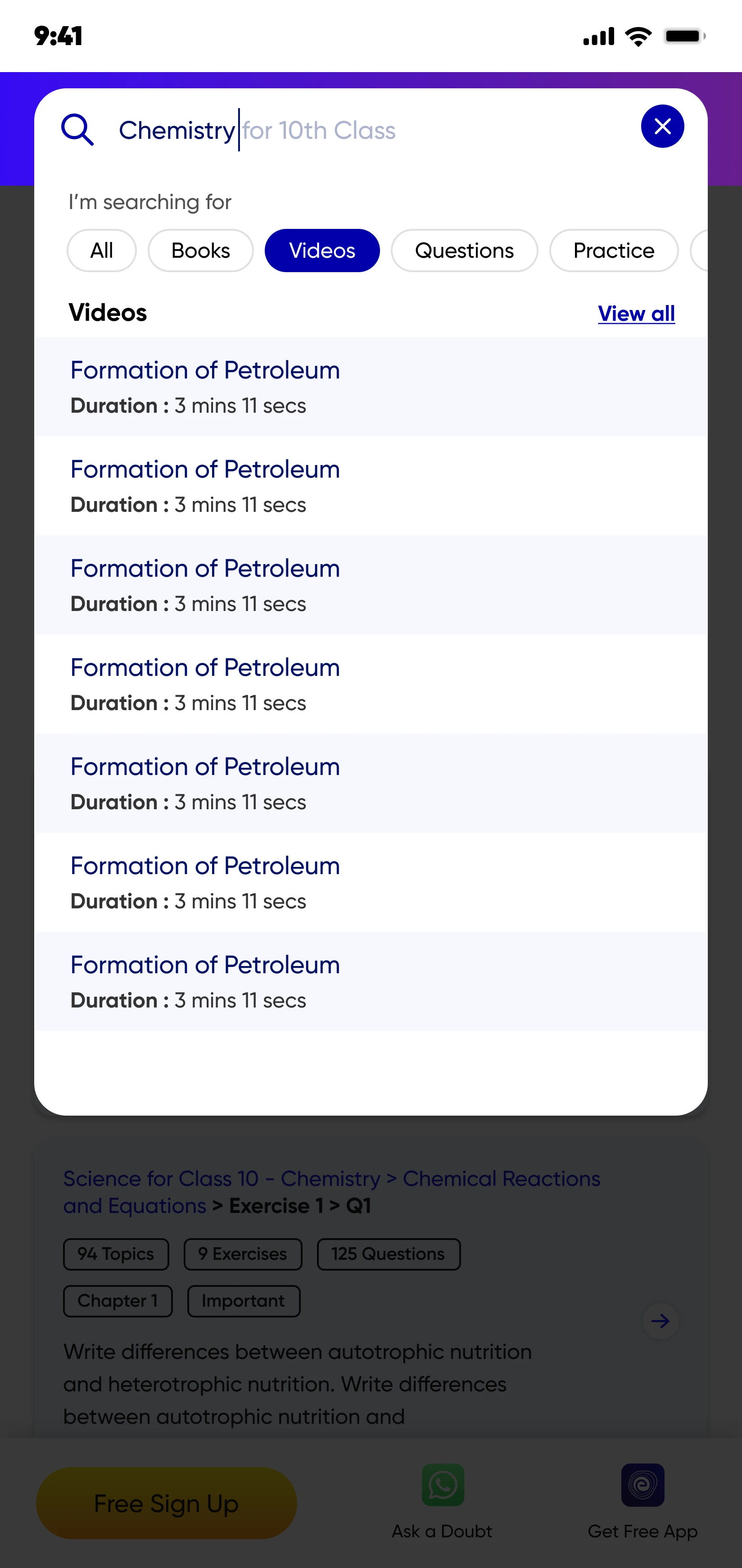
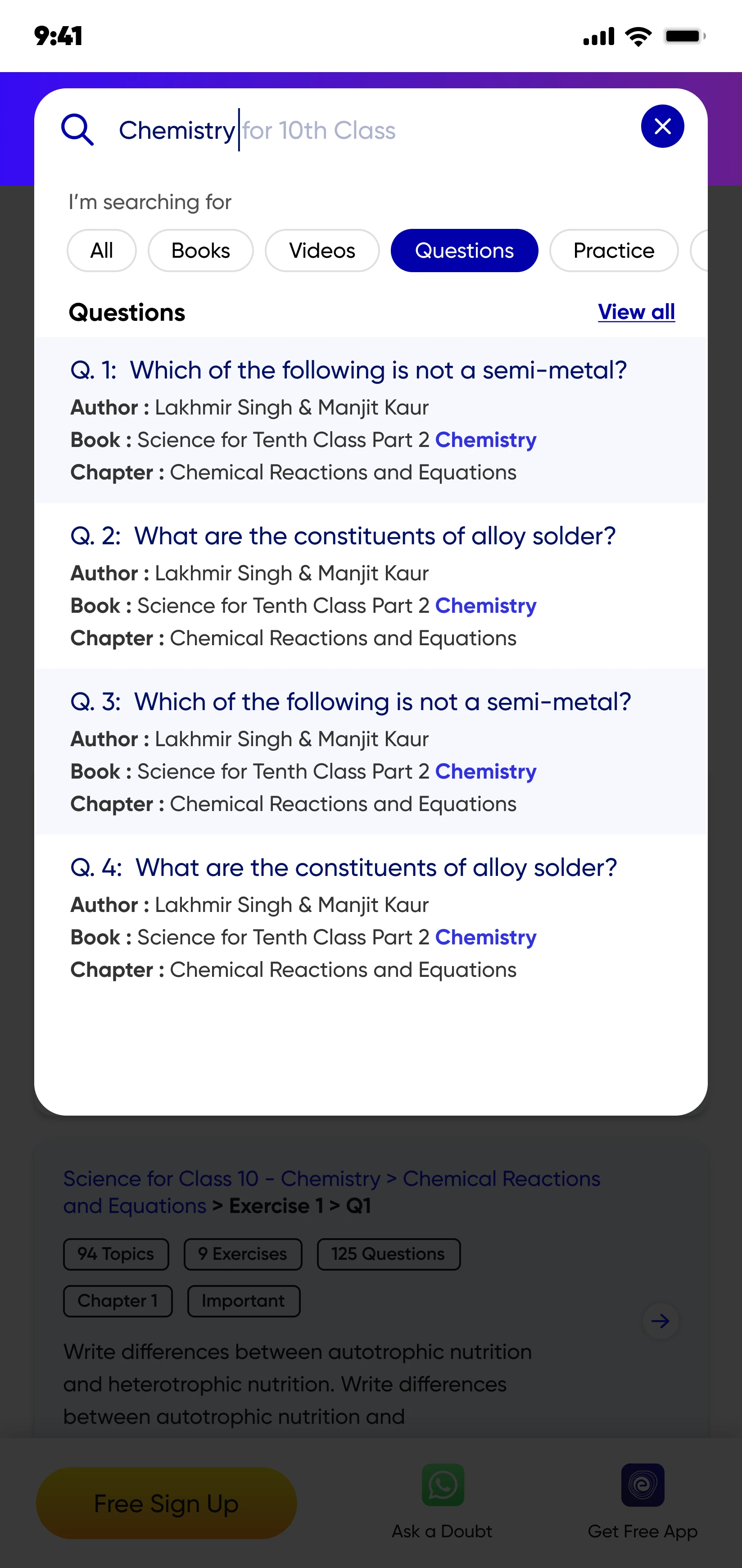
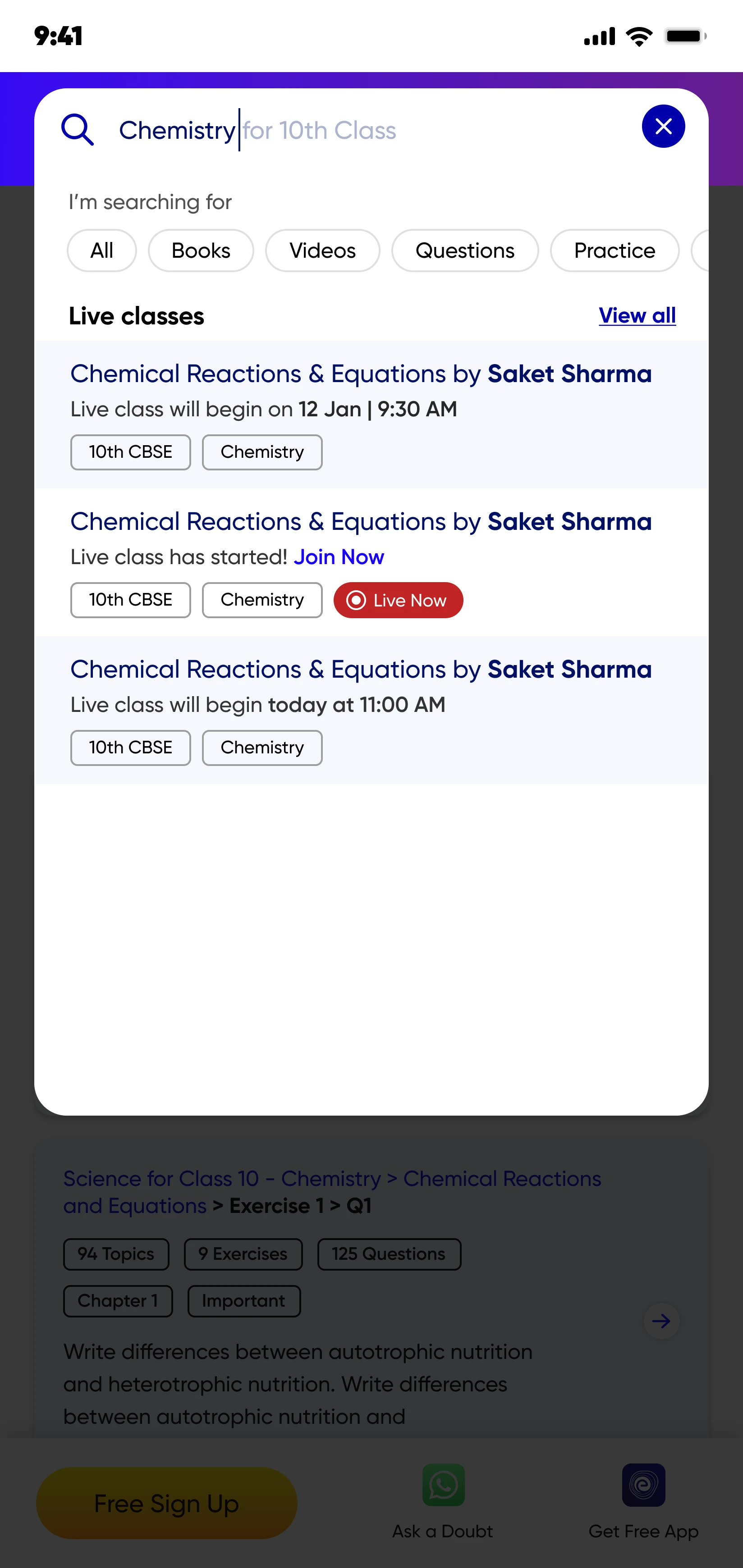
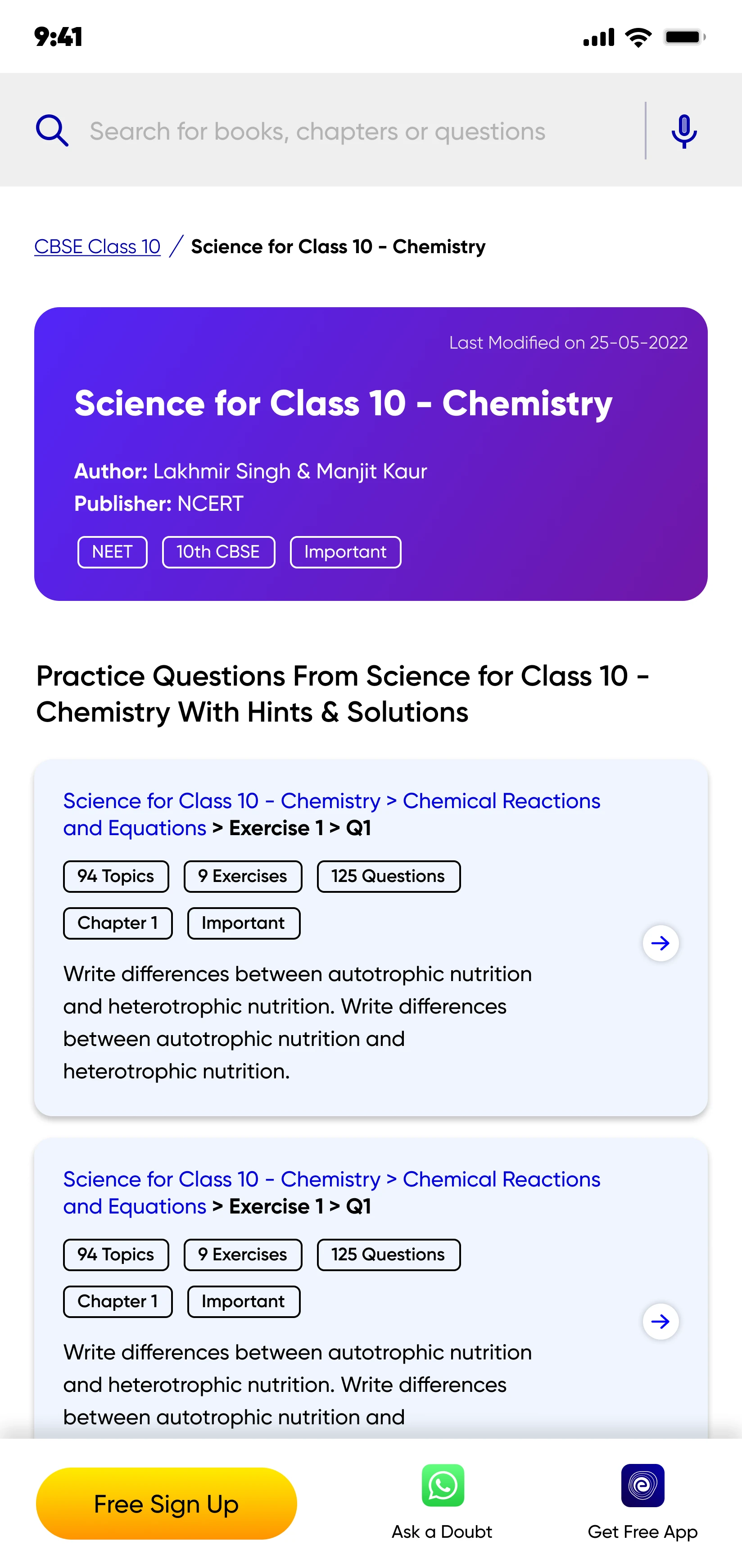
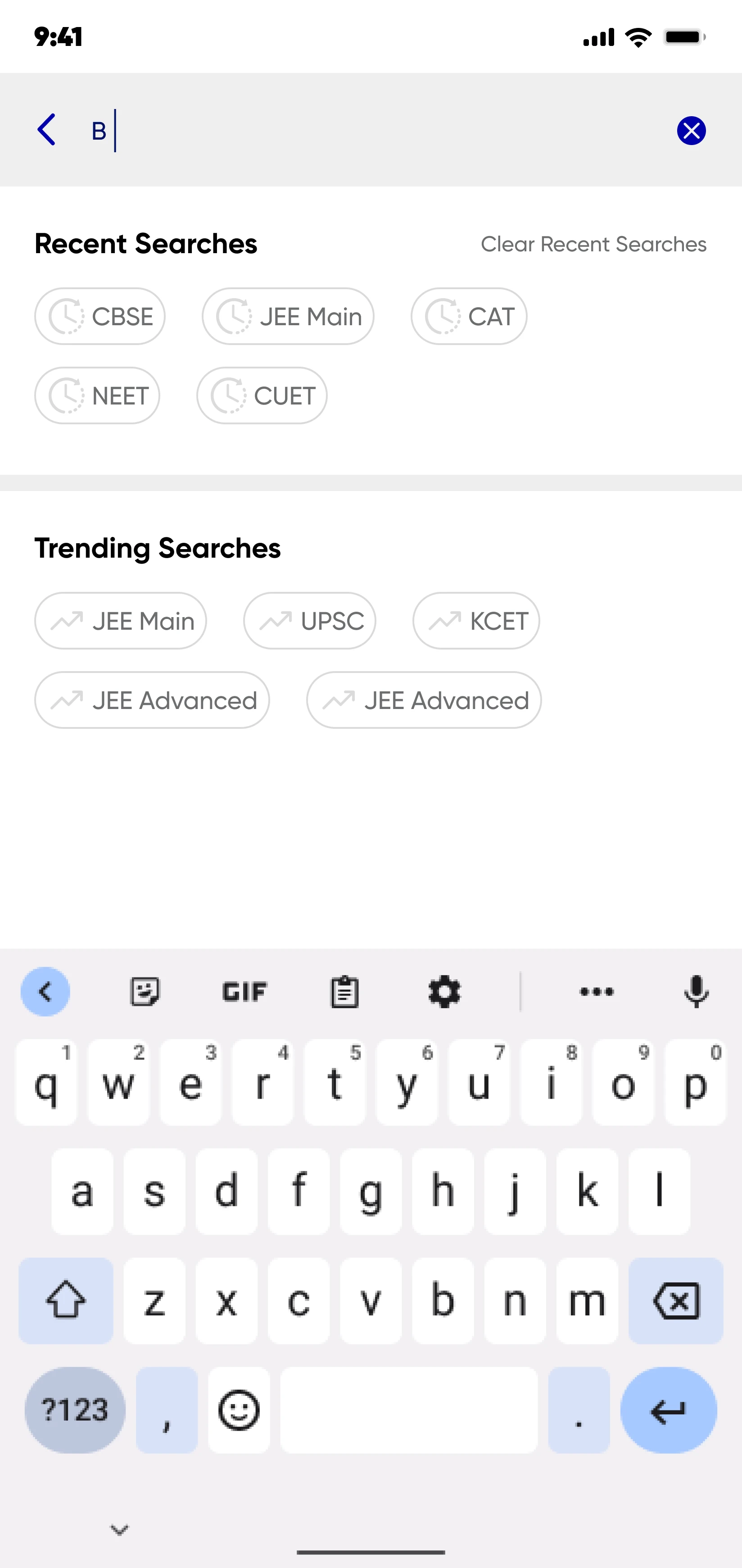
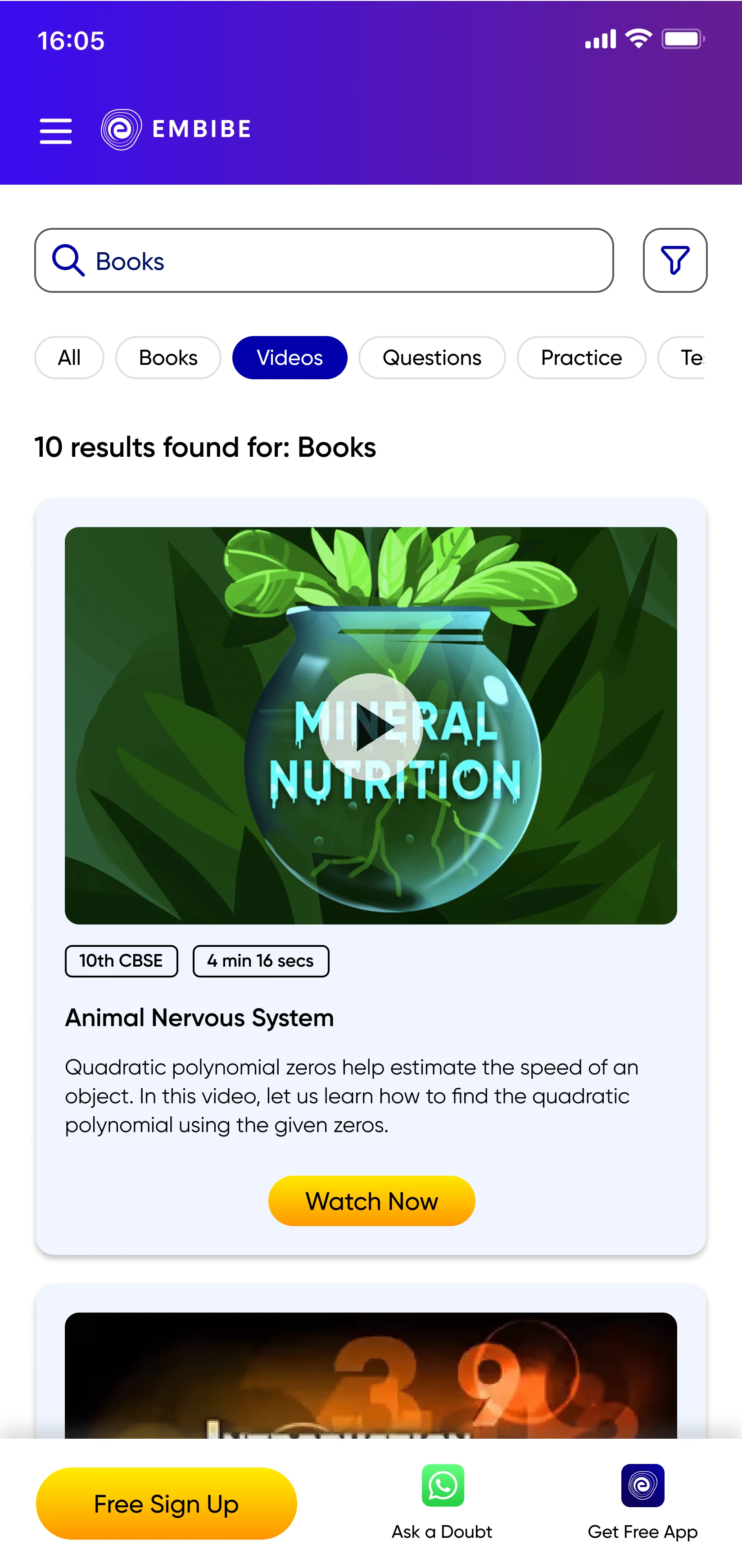
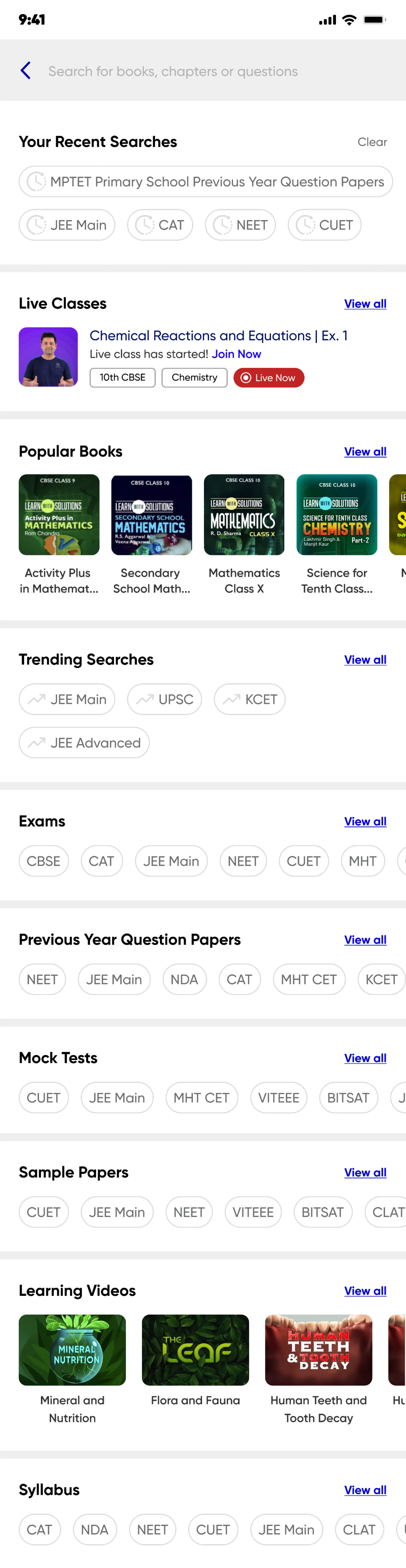
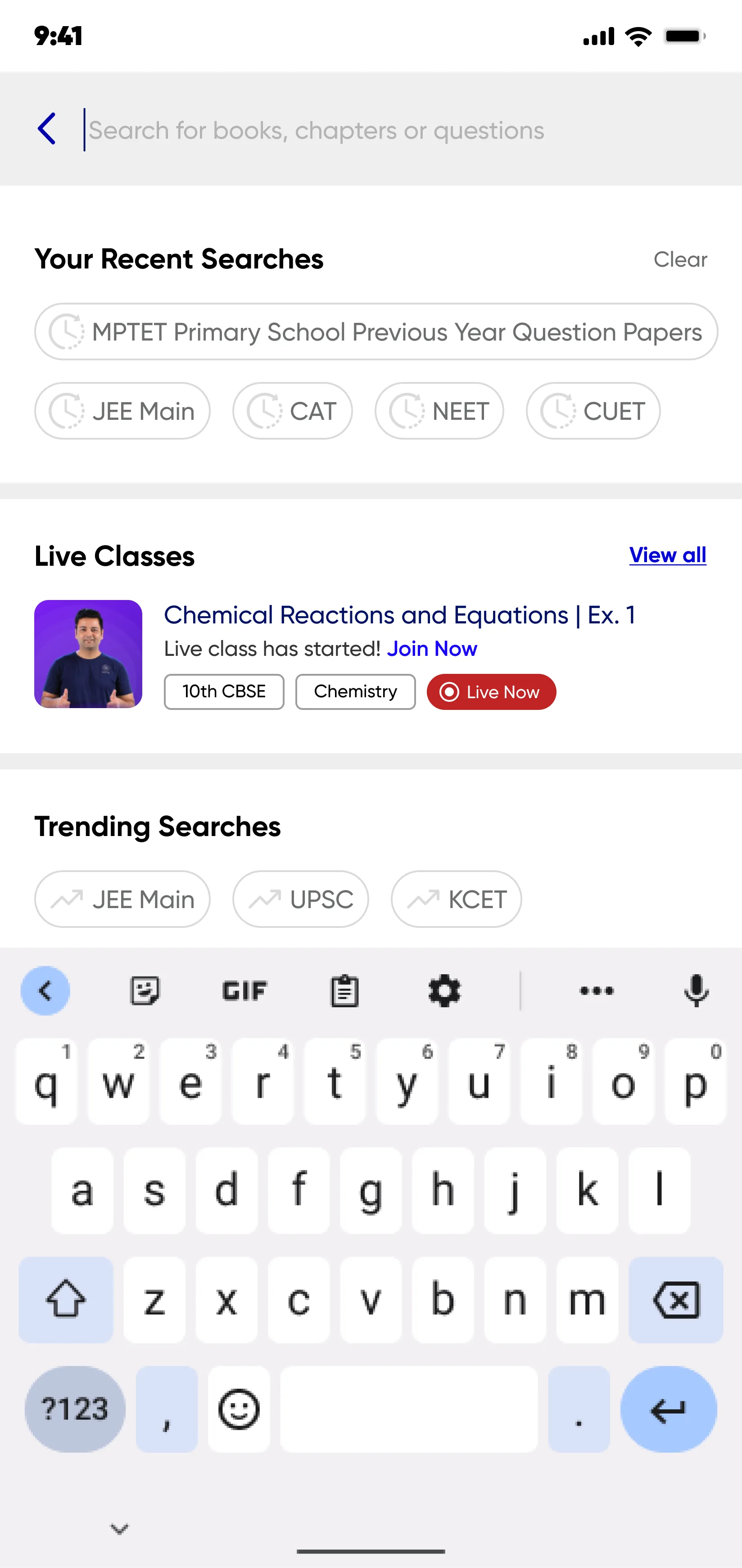
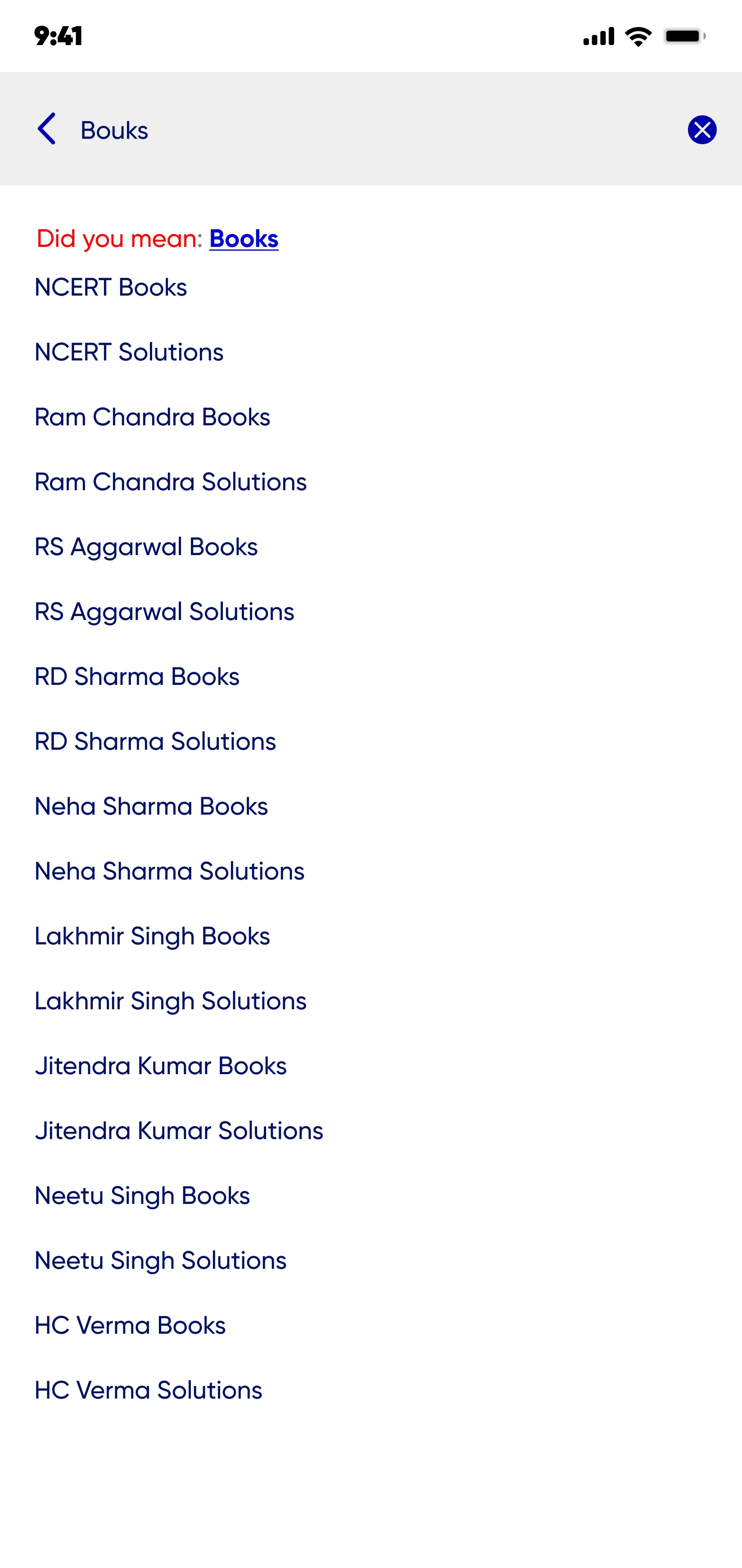
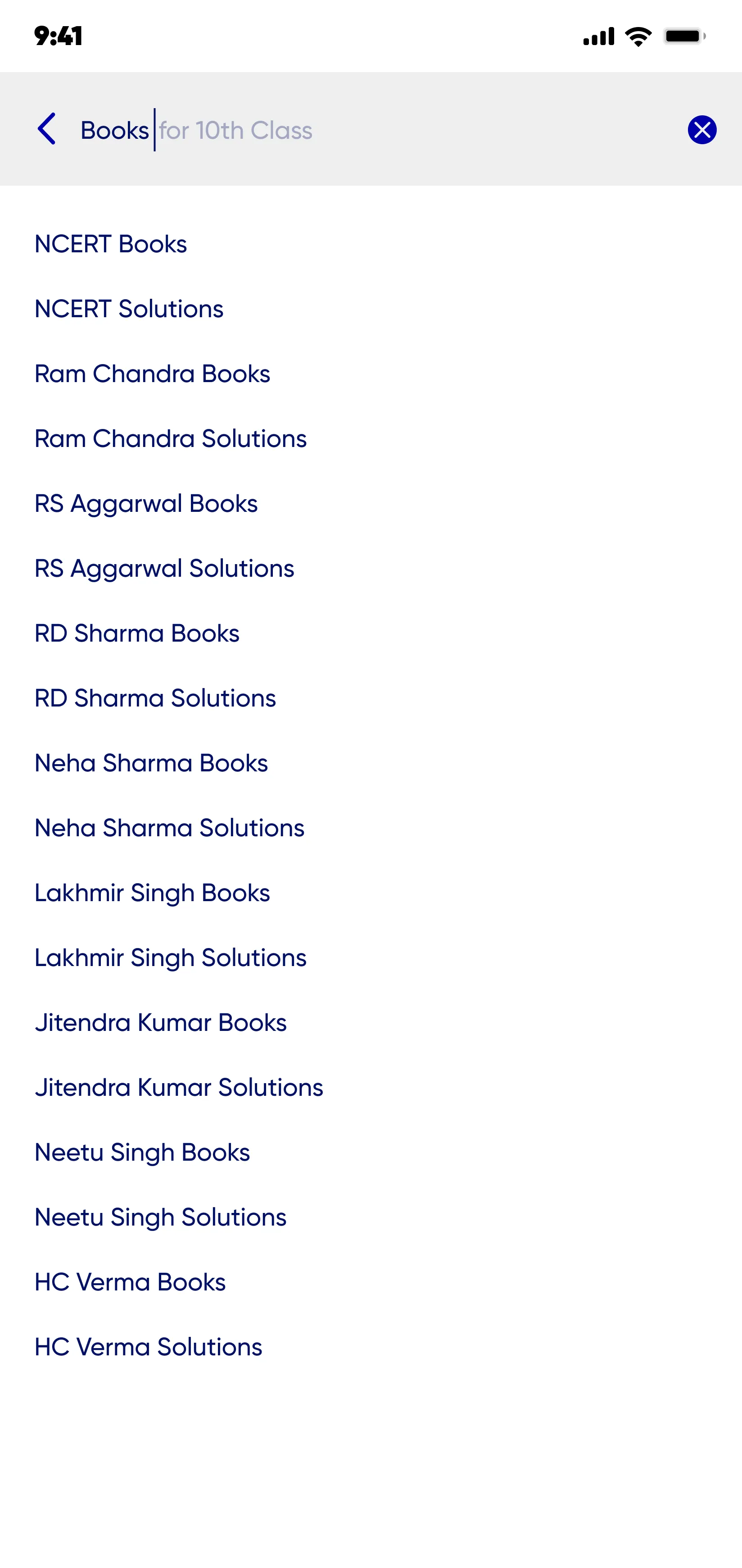
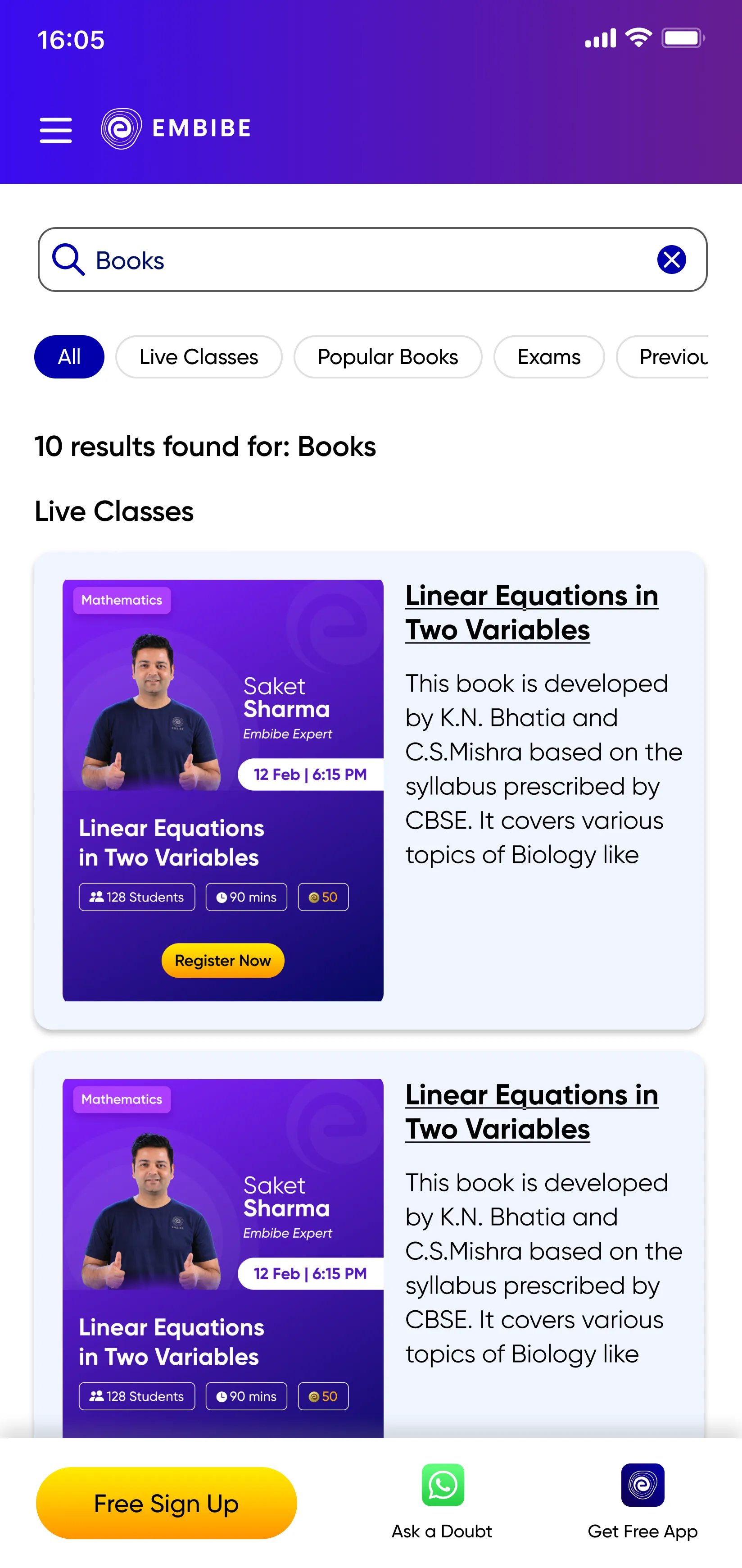
The information architecture analysis revealed difficulties in efficiently finding information. The absence of a search function further hinders navigation and accessibility.
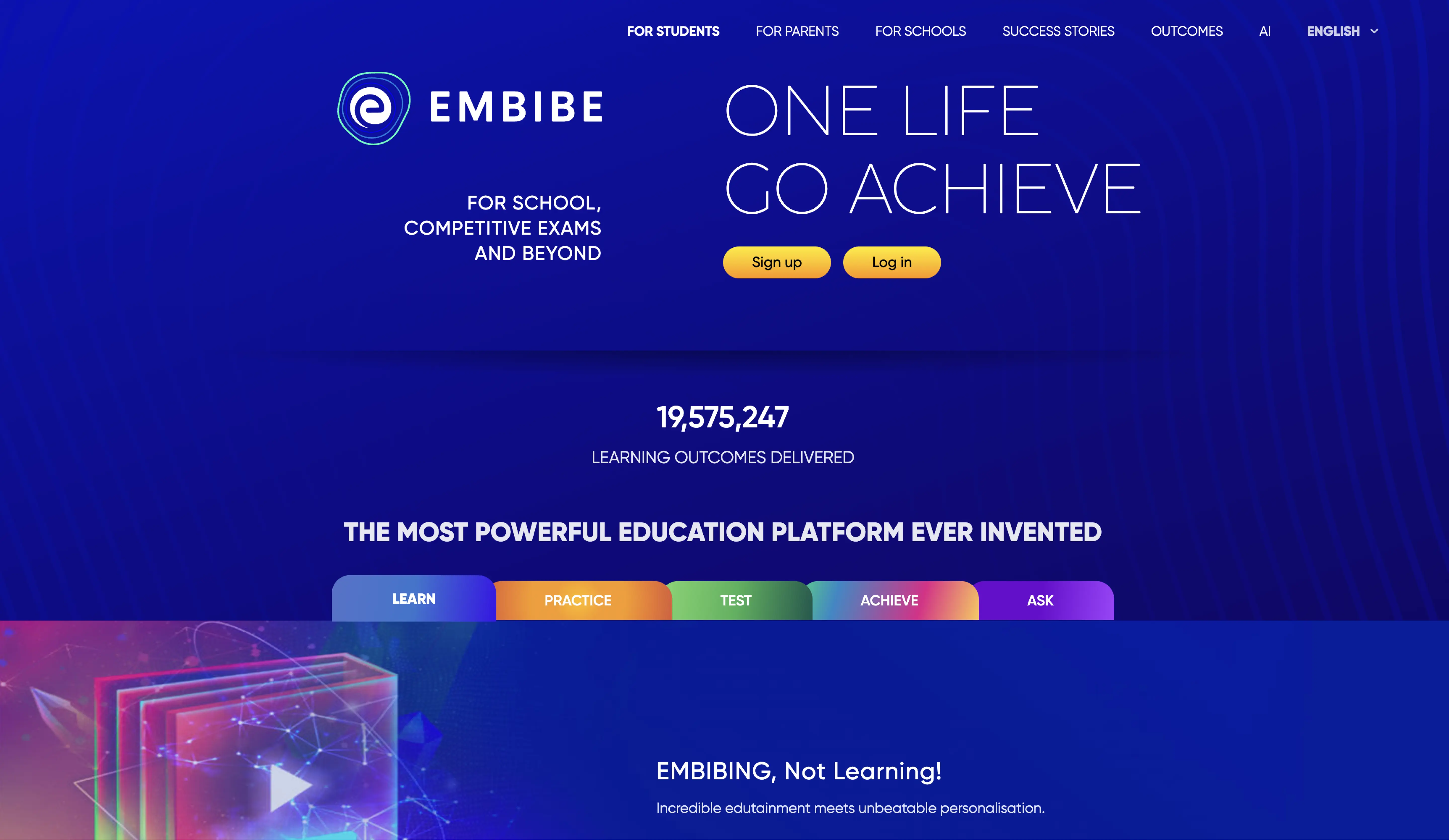

The Students, Parents and Schools menu items redirect to different app-specific landing pages, while Exams is located under the Blog menu which hinders navigation and accessibility.
Menu is not robust to accommodate for the new upcoming App catalogue of multiple apps in the pipeline.
Embibe.com page completely lacks Blog menu item from which user has no way to navigate to Exams and Books
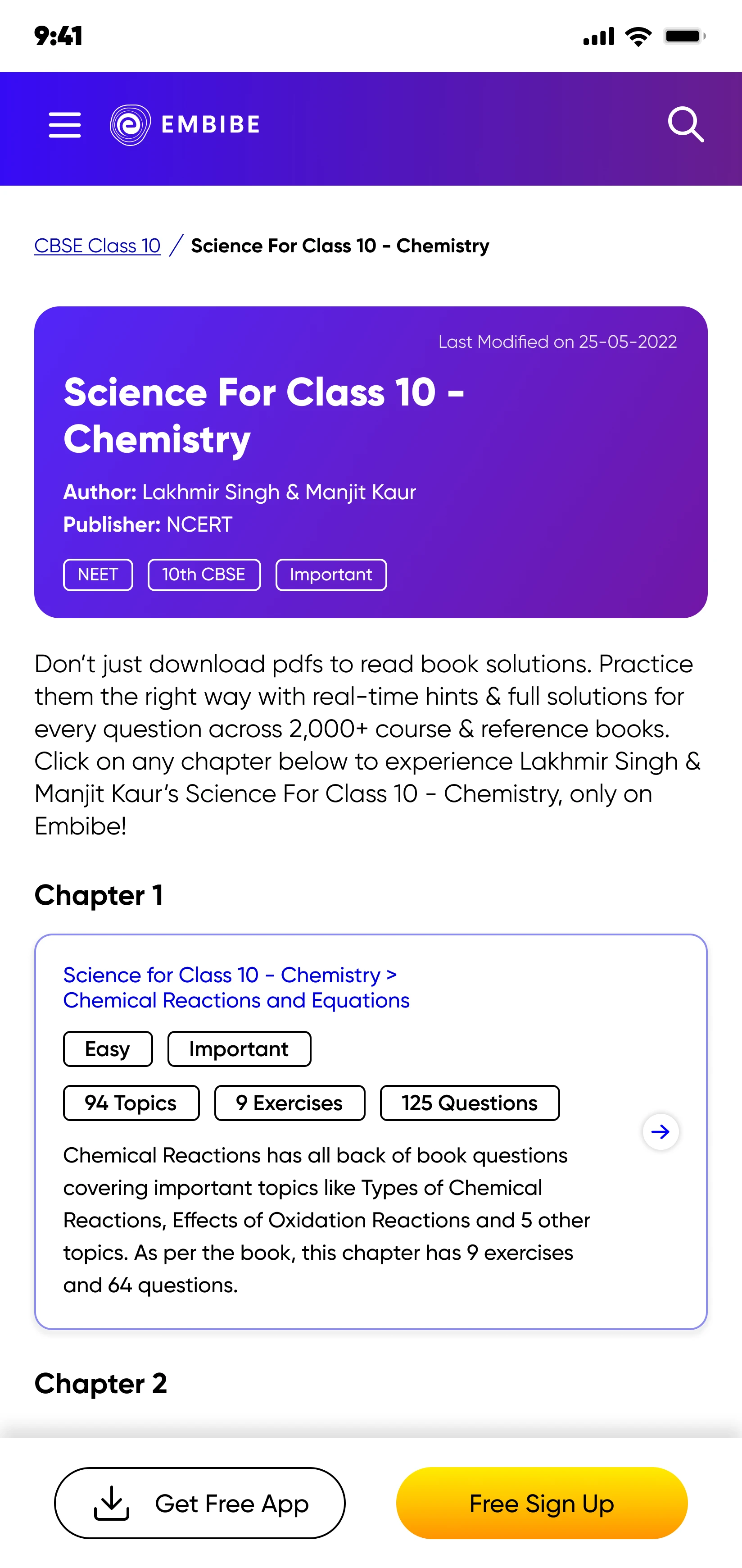
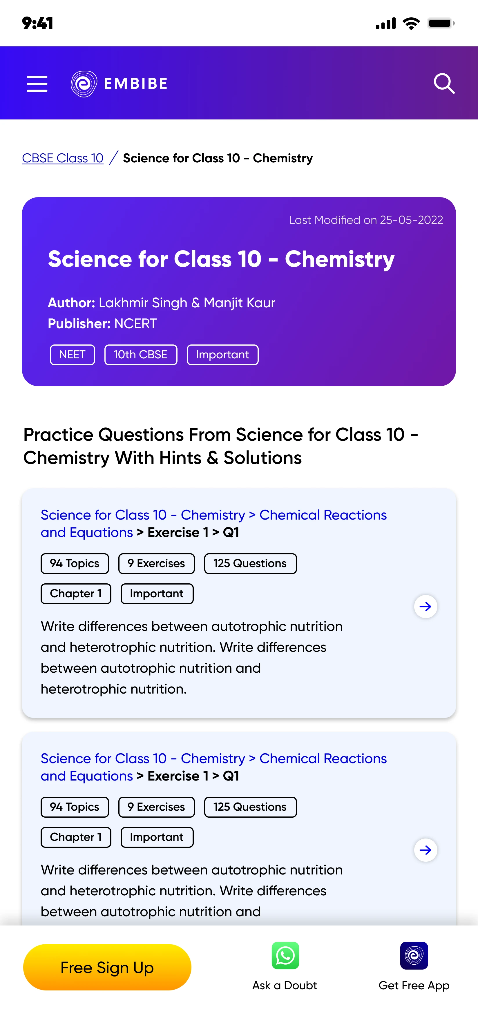
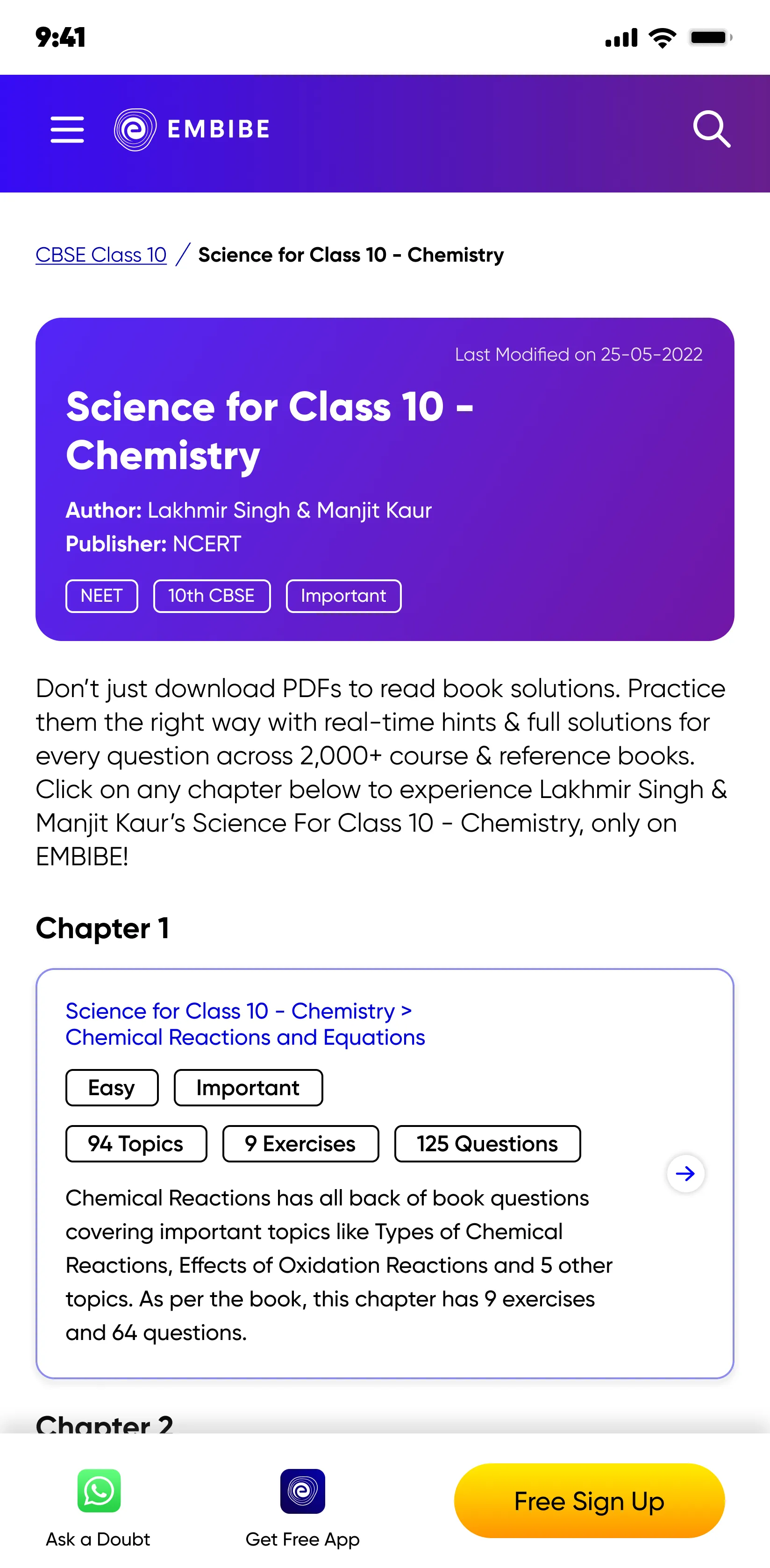
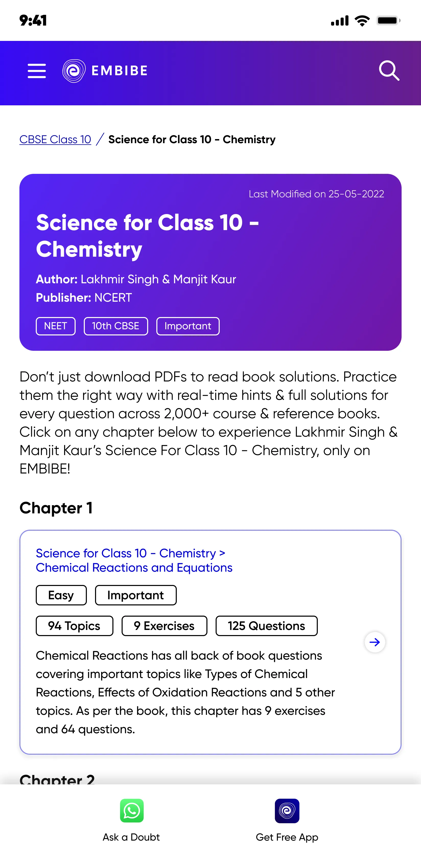
The Embibe SEO pages were the largest source of organic traffic, but due to unclear navigation it doesn't give enough initial trial of what Embibe offers for them, hence drop offs when asked for Sign-Up.
In
Embibe blog pages has more than 3 million questions in 12 languages but lacks a navigation for users to reach them.
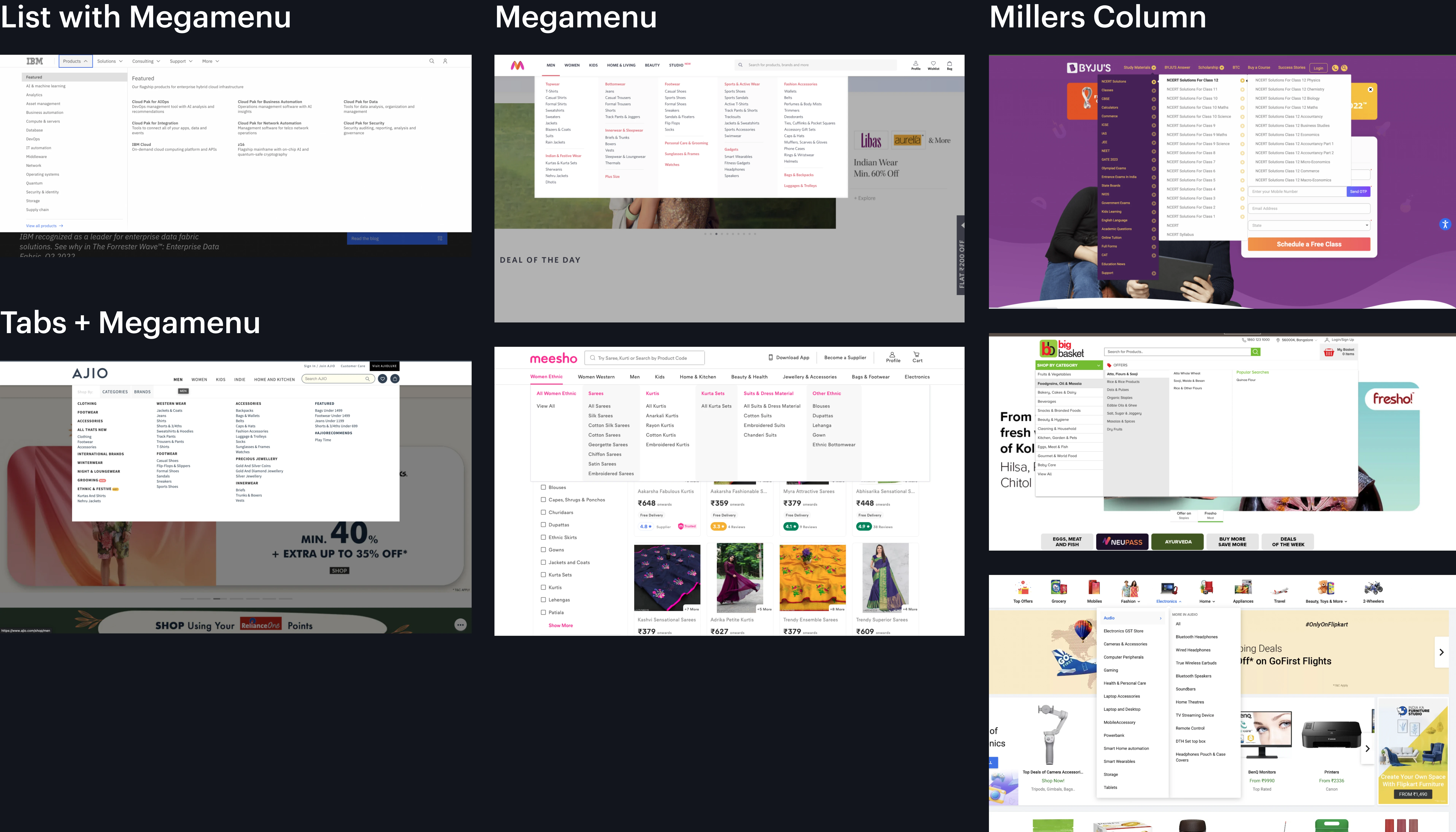
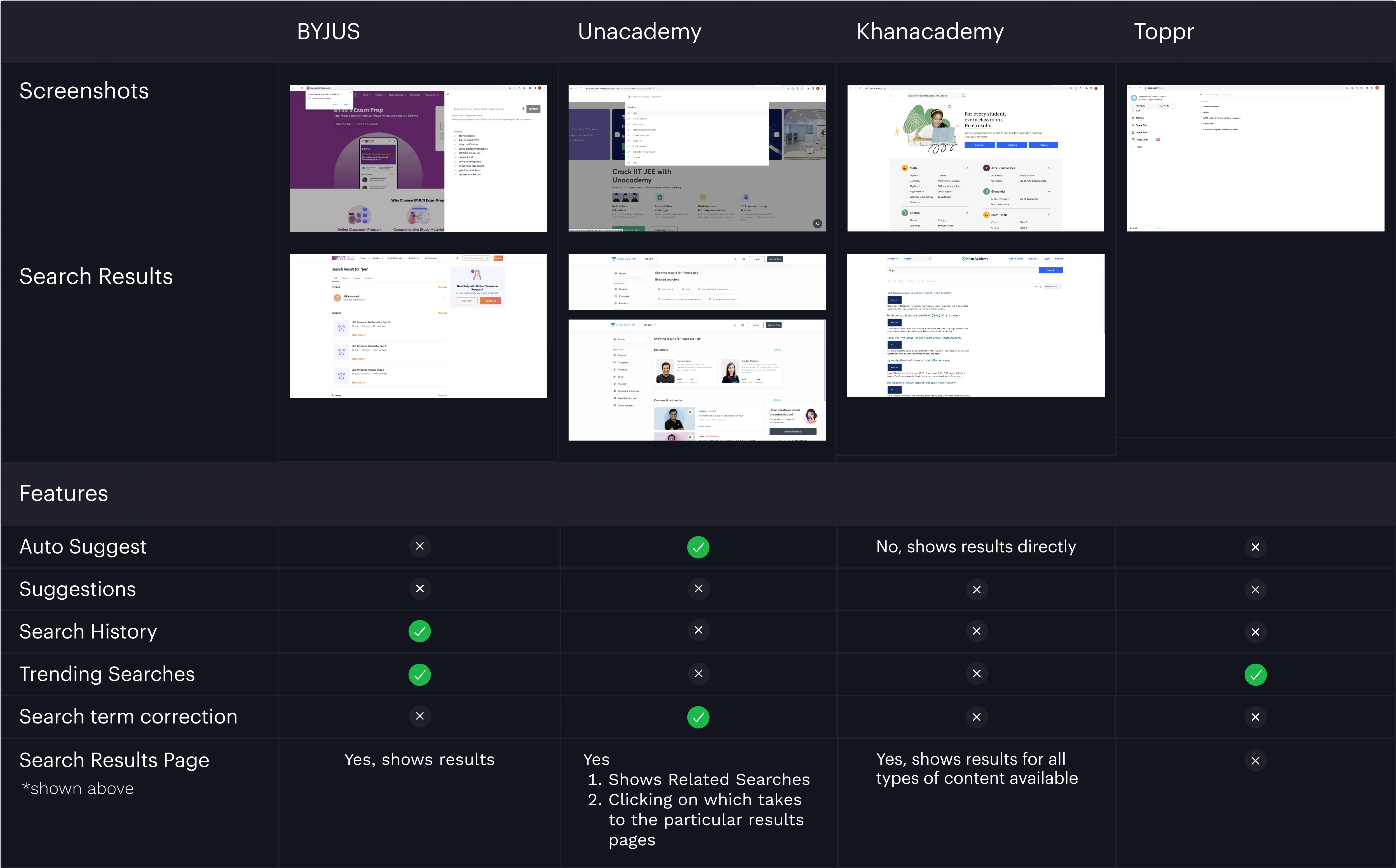
Benchmarked direct competitors on their Web Primary Navigation on both Mobile and Web platforms.

Webflow expert


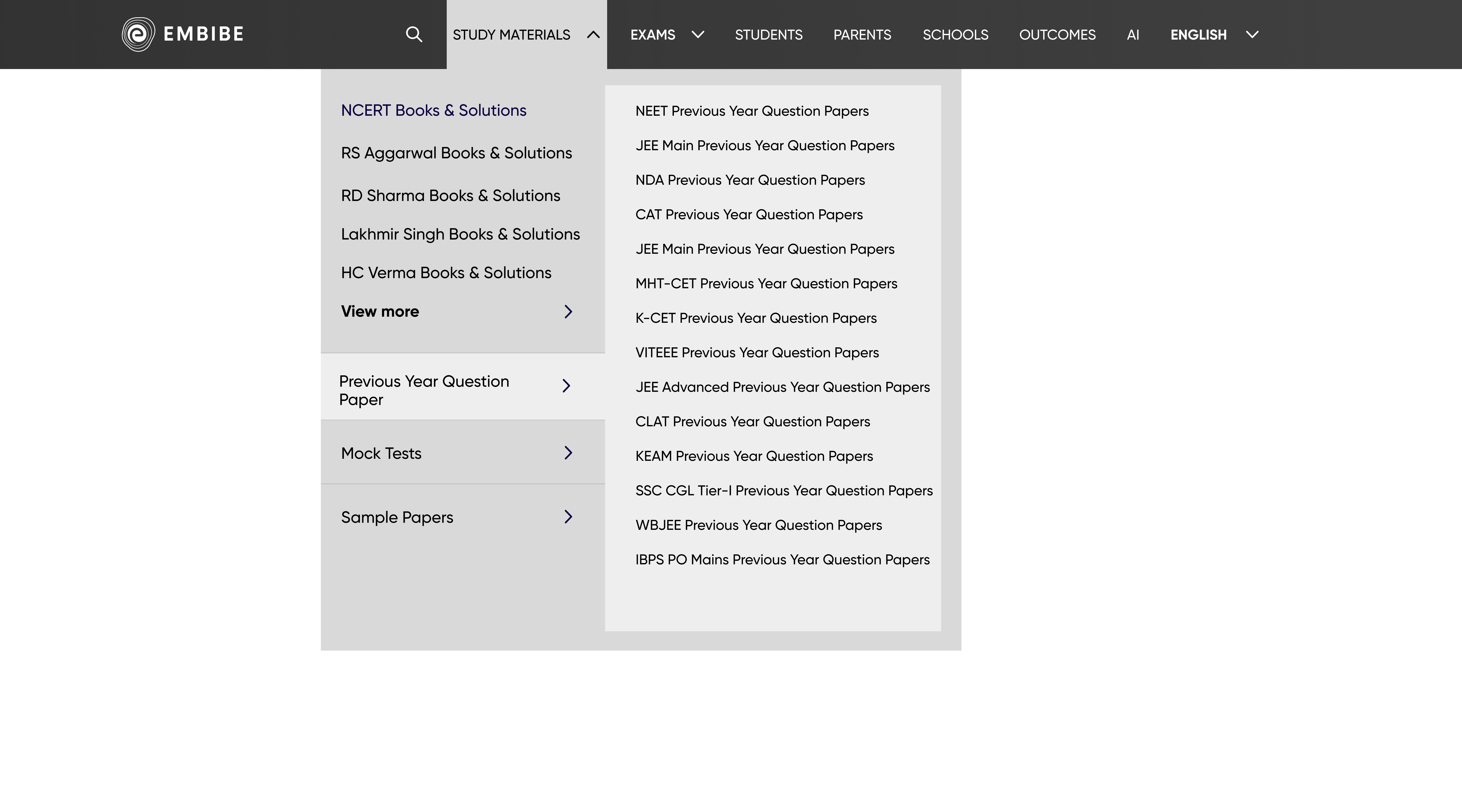
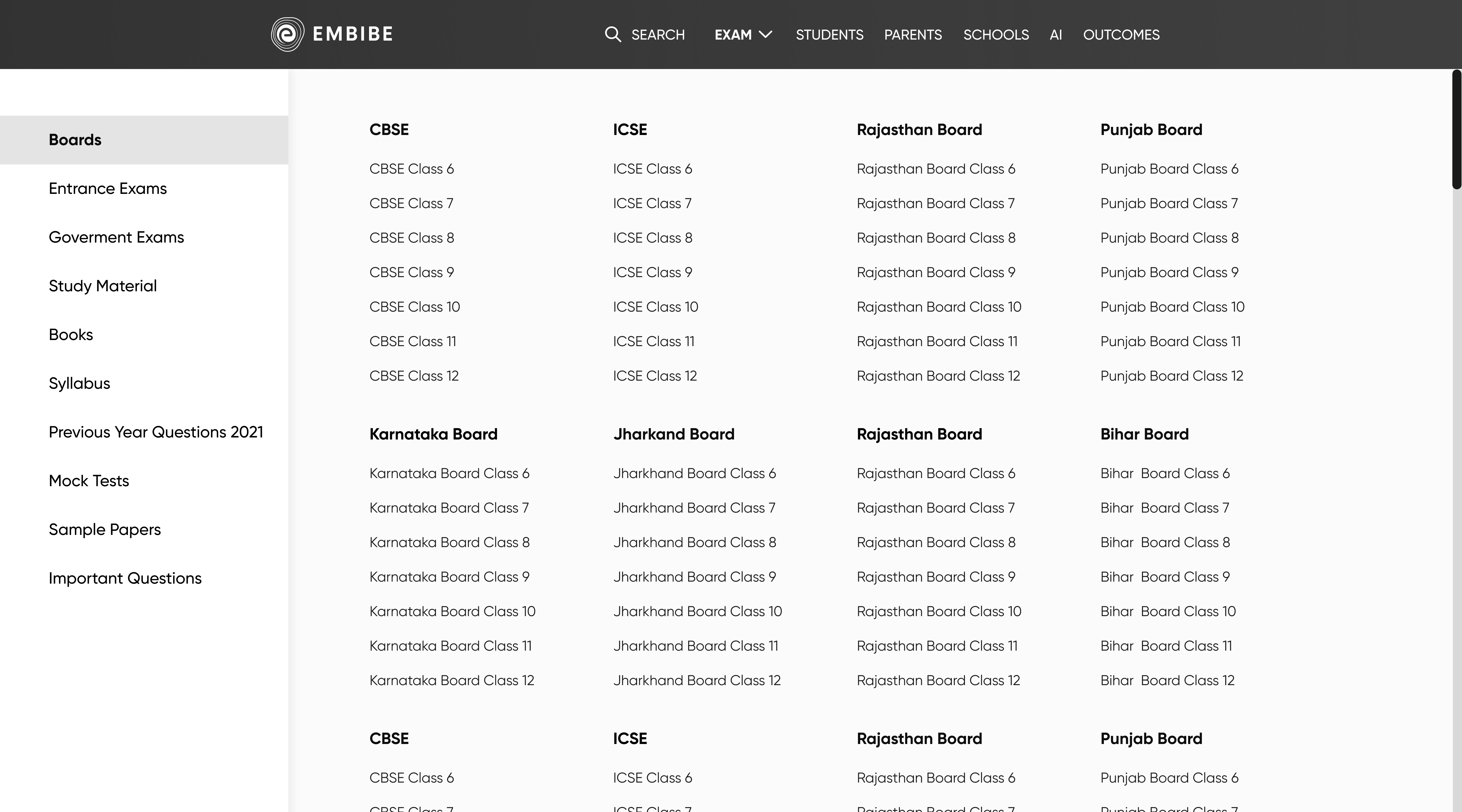
Menu Patterns
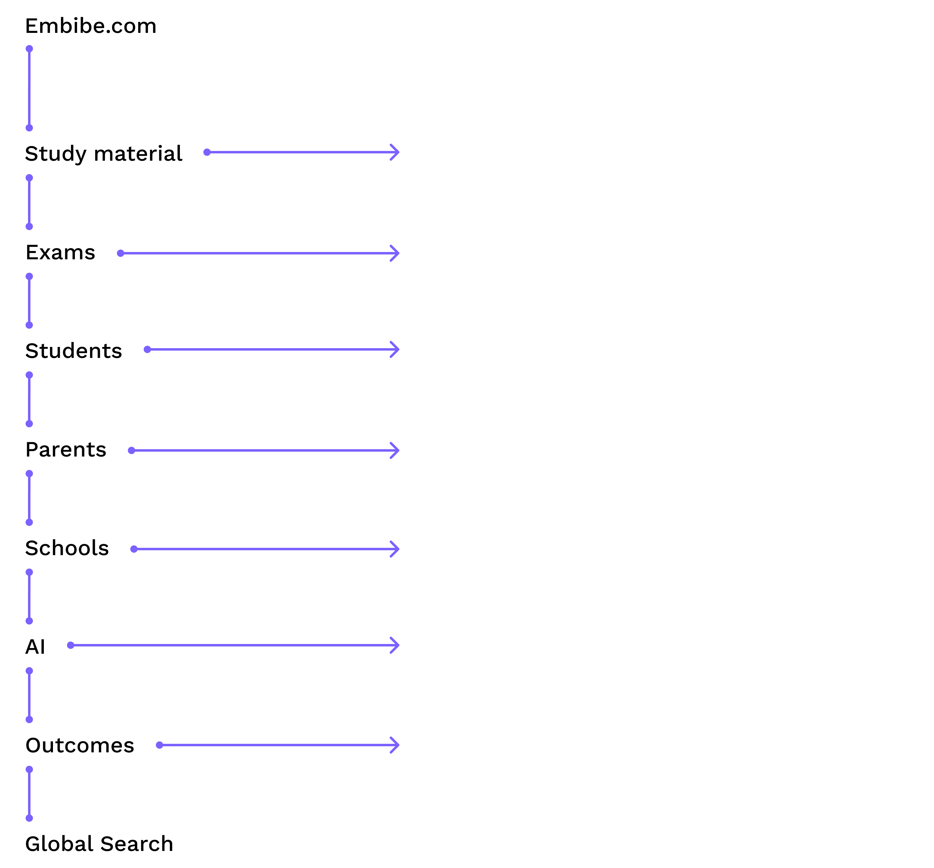
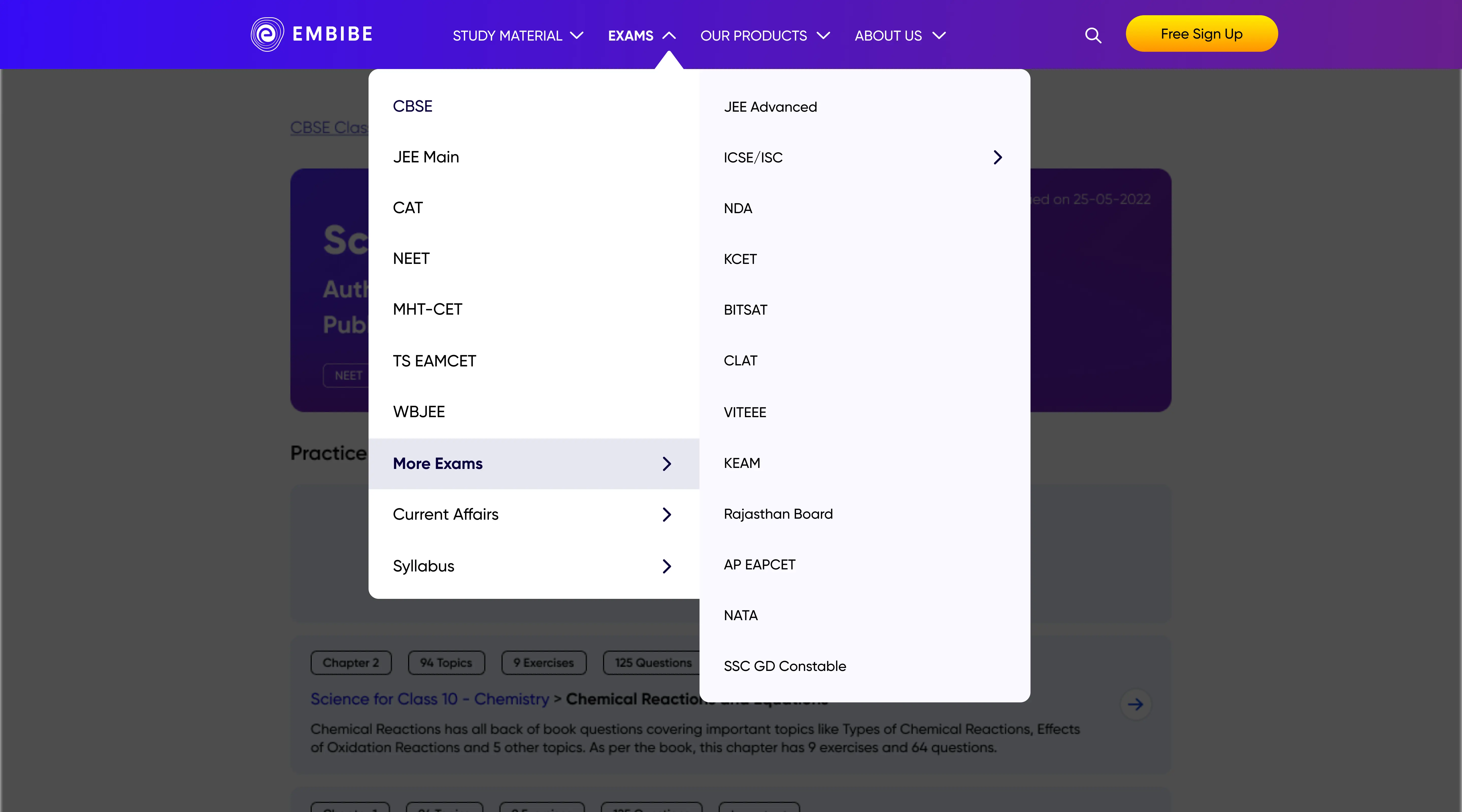
Industry-standard menu patterns were explored, and the optimal pattern was chosen through iterations of information architecture versions. Additionally, feasibility checks were conducted to determine whether to use Miller's column or a list with a mega menu, both of which supported a minimum of 3 levels of hierarchy.
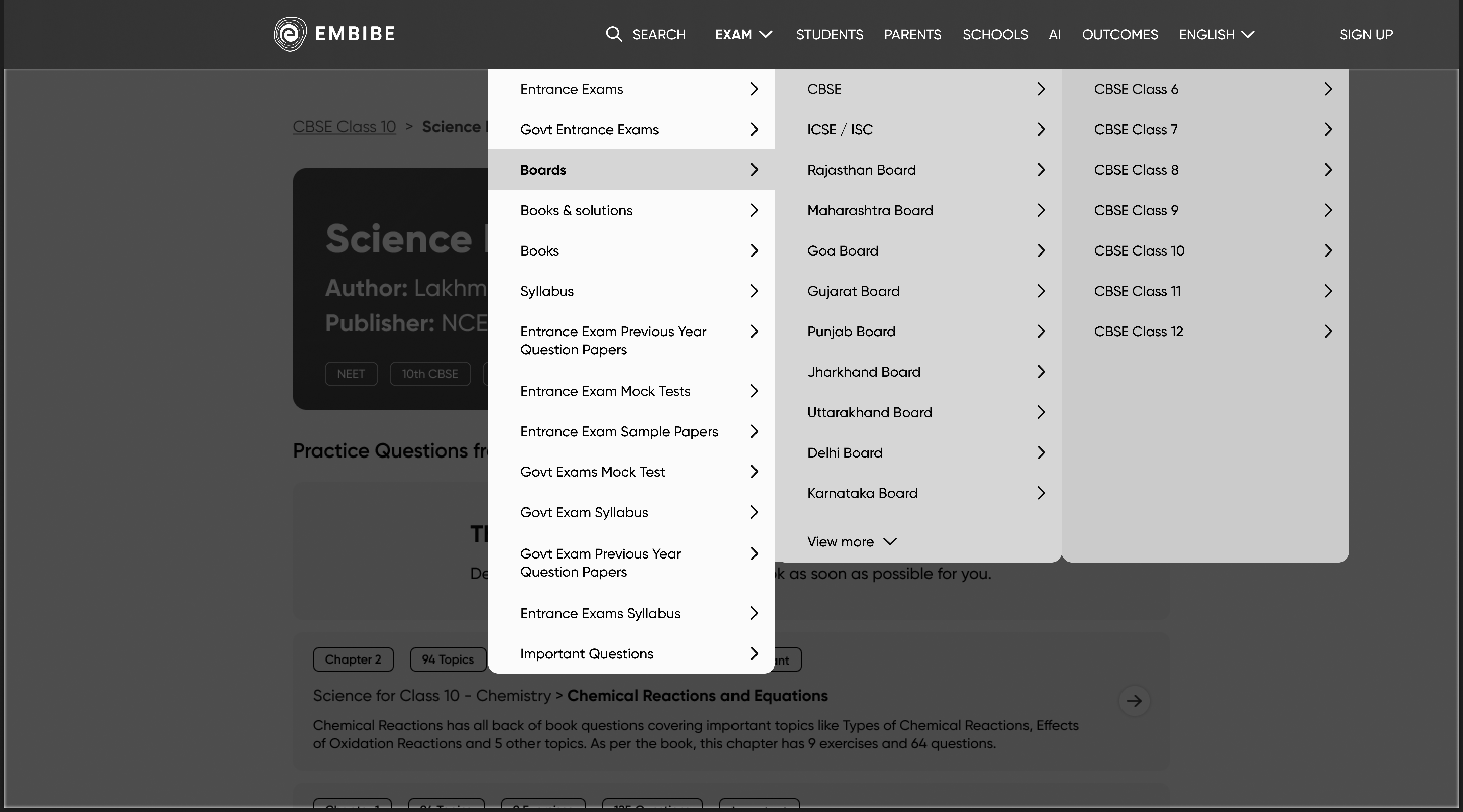
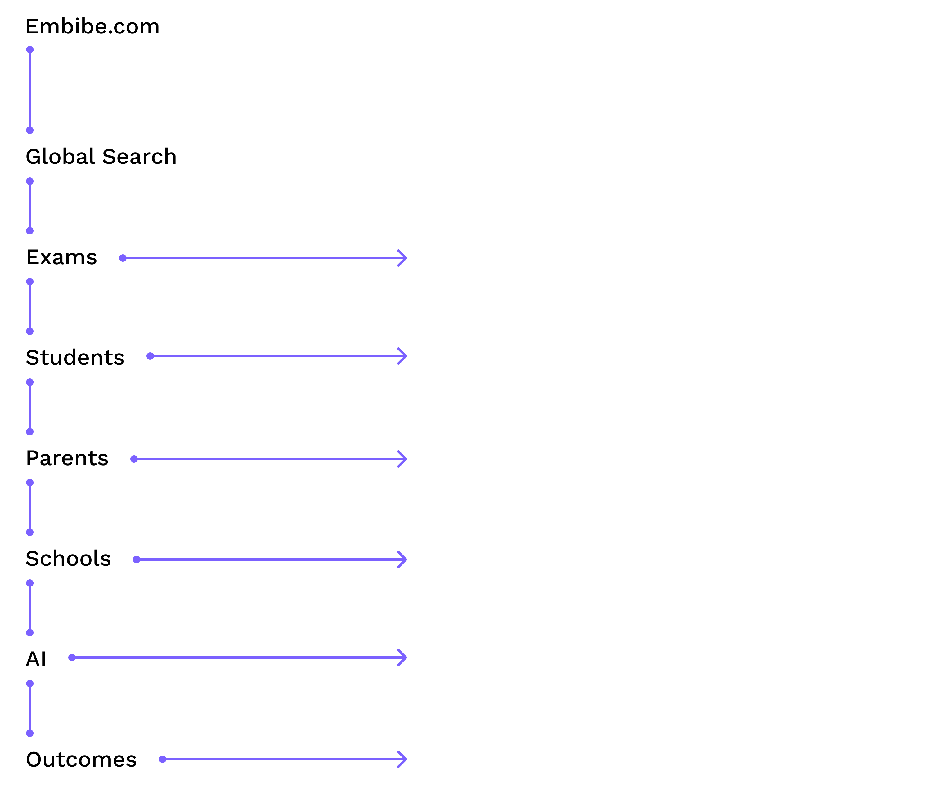
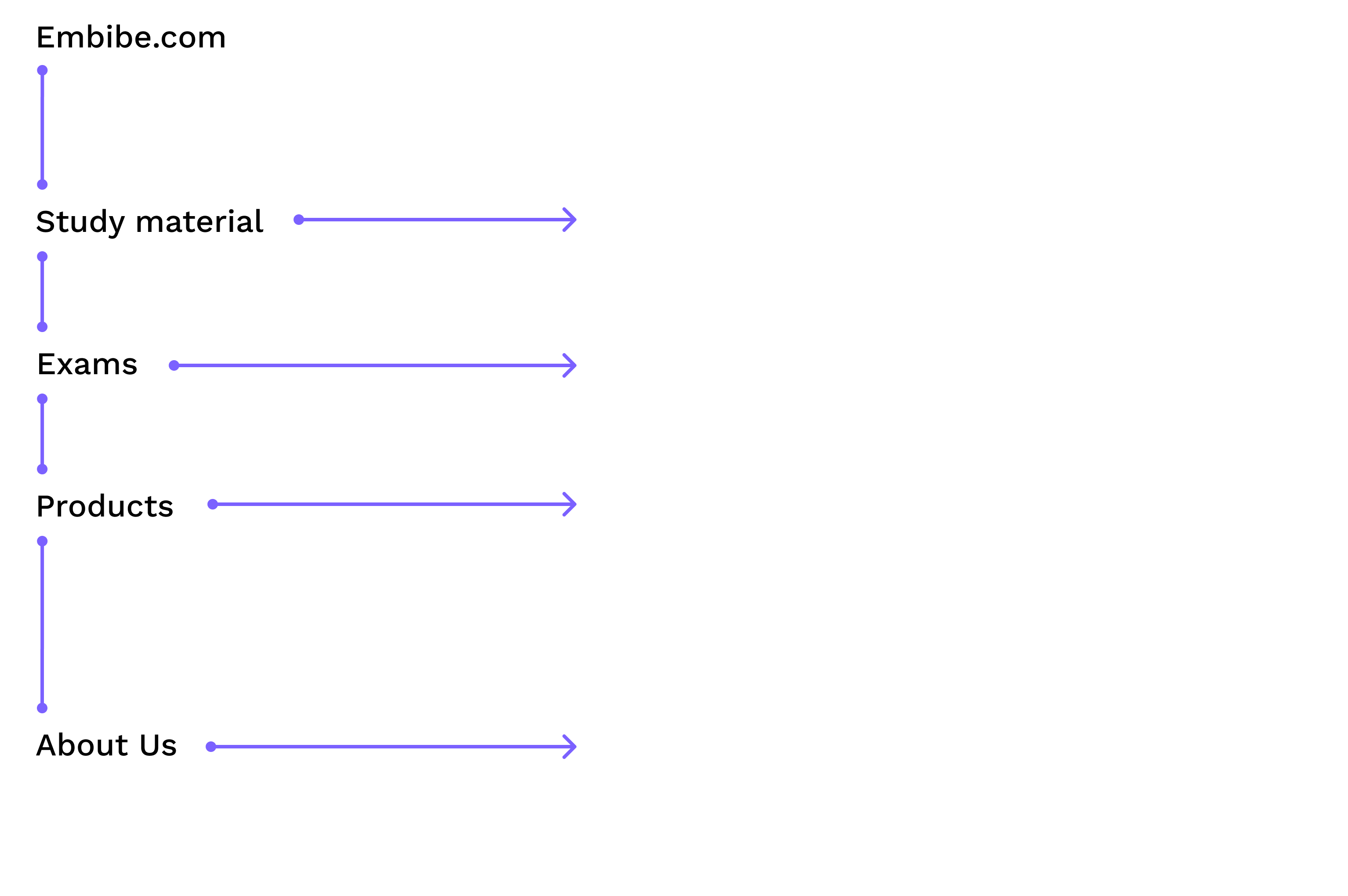
After — Scalable design
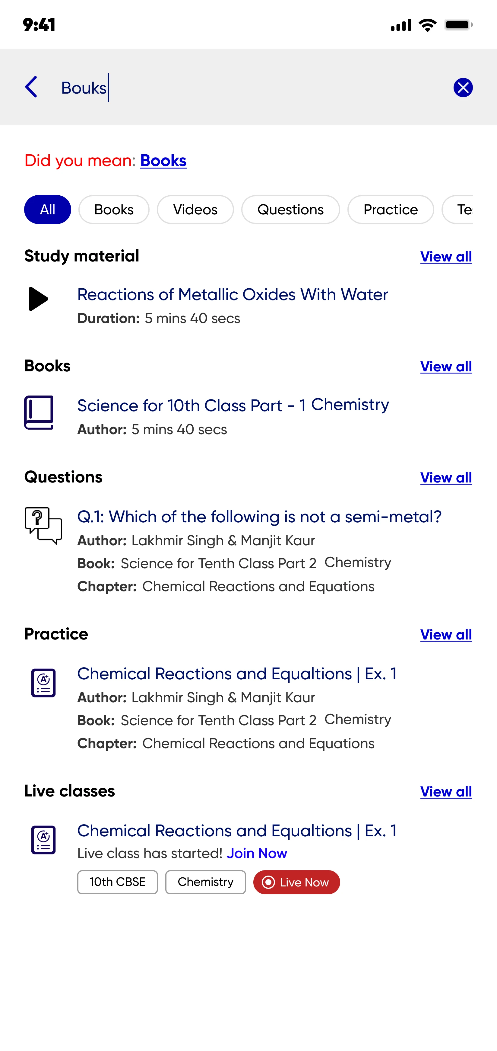
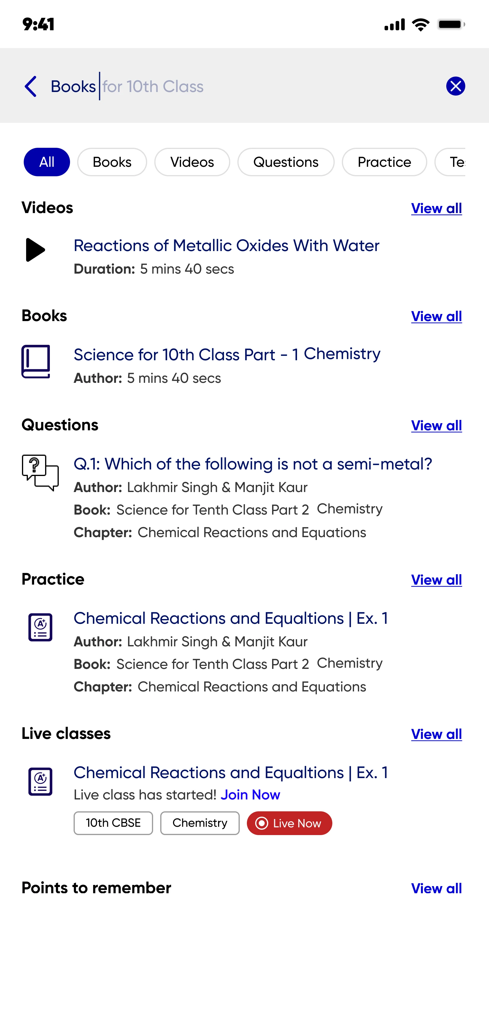
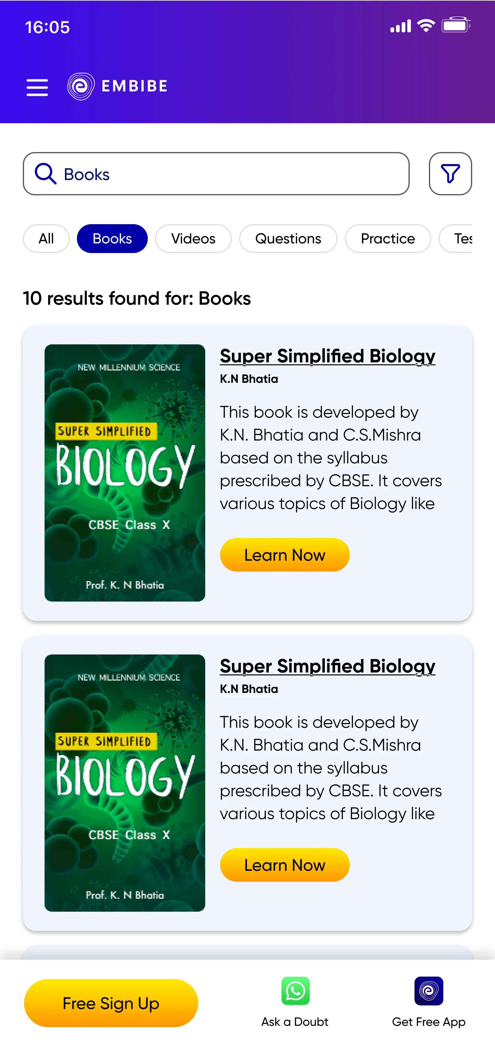
The new design enabled seamless navigation through the extensive study material and exam pages while accommodating all products in Embibe's portfolio. Its success led to implementation across all Embibe web pages.


Design focused on discoverability
Benchmarked to explore industry standards as well as what direct competitors are doing in terms of their Web Search Experience.
Webflow expert
Menu Patterns
The the industry standards patterns of Menu elements were explored and optimal patterns was chosen via eploration of infromation architecture versions.


Before — sadasd
To create a well-structured live class batching system that enhances the learning experience by replicating real-life coaching environments. This system aims to optimize student engagement and performance by providing personalized batch allotments based on assessment results.


Resolving backlog
Before — Too many steps
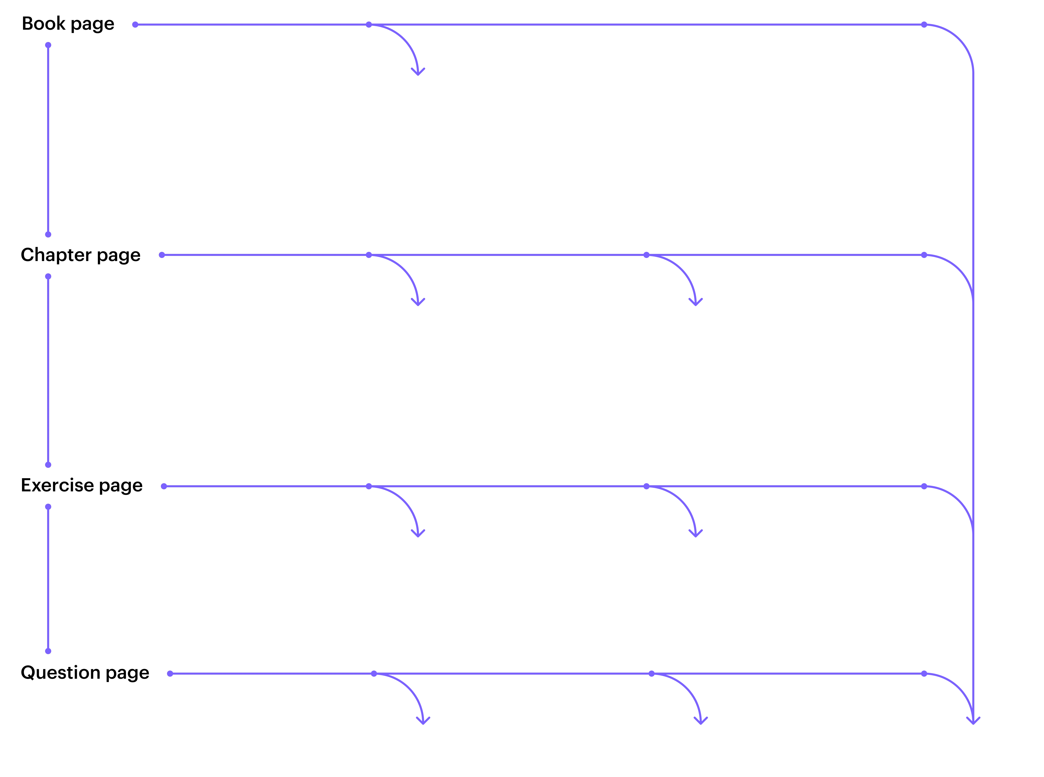
The User Journey across Embibe web pages has two main phases, the Explore & Research and Onboarding.The table shows the drop offs in Sign-up steps which have a sufficient values.


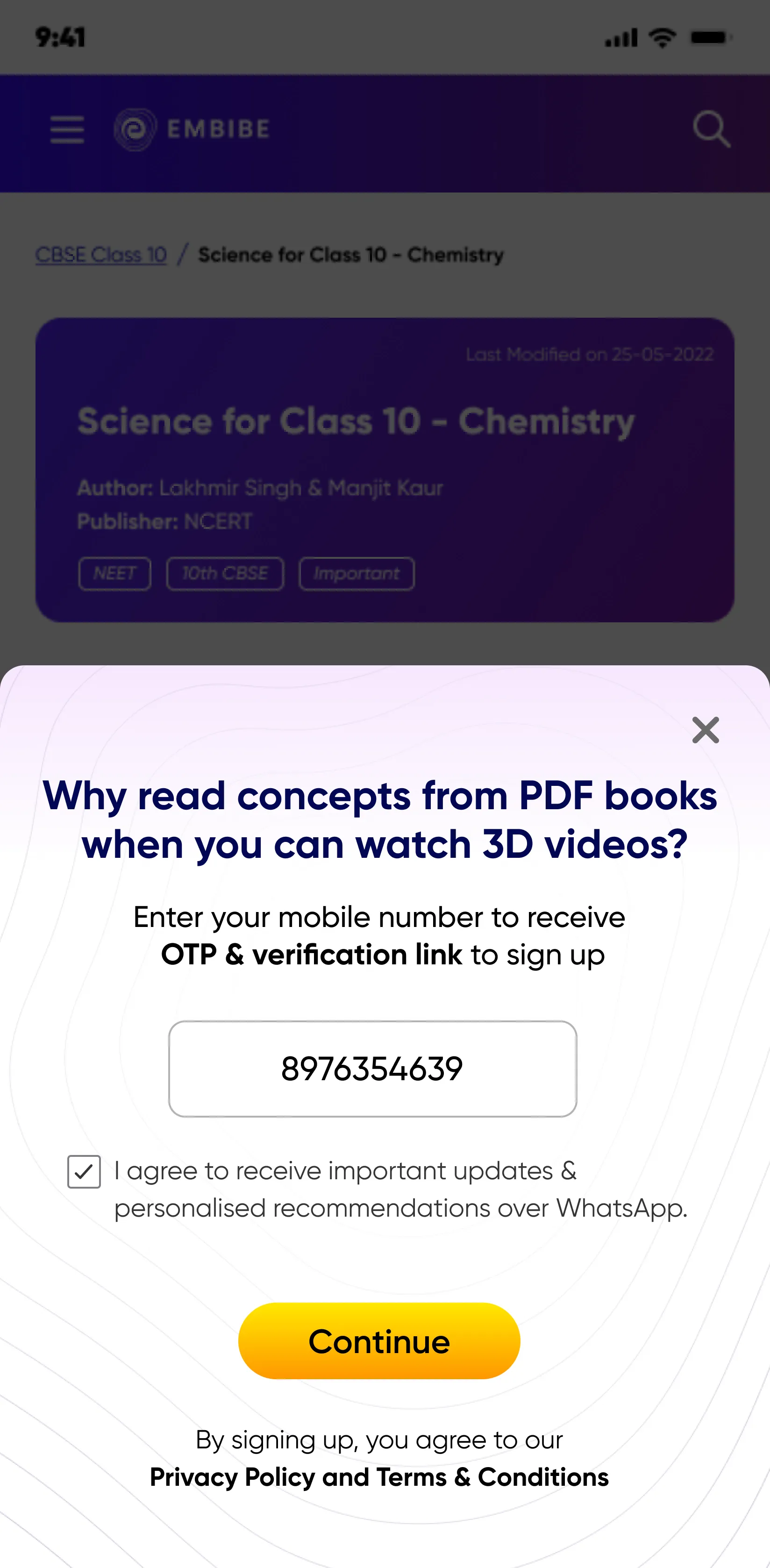
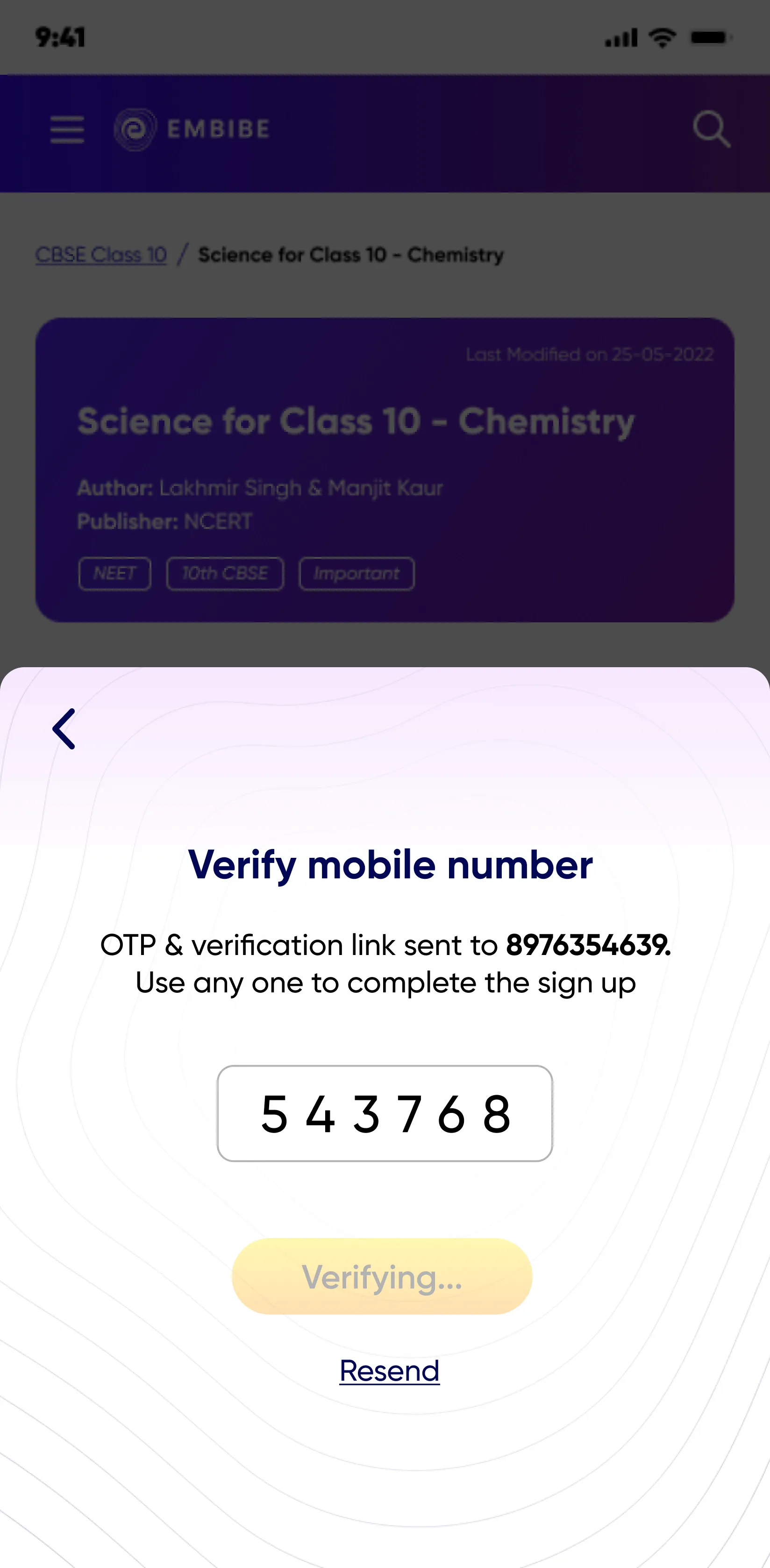
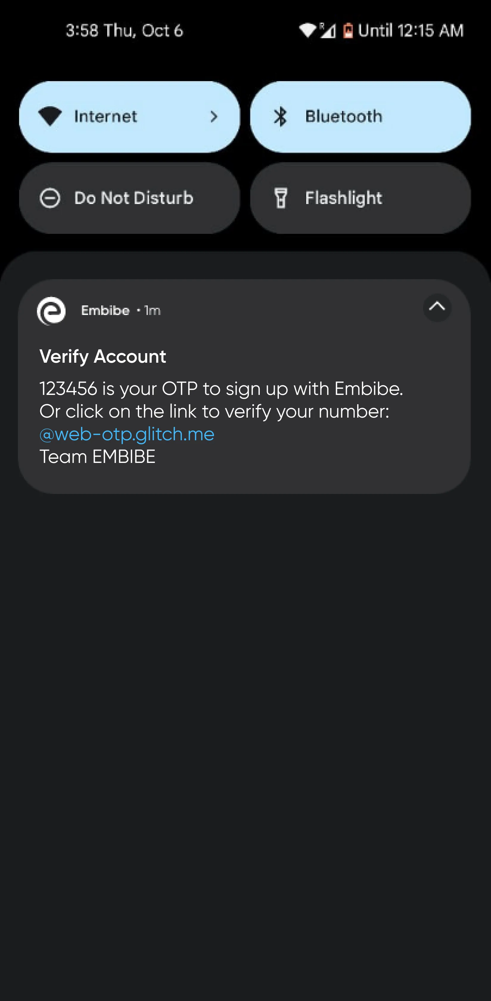
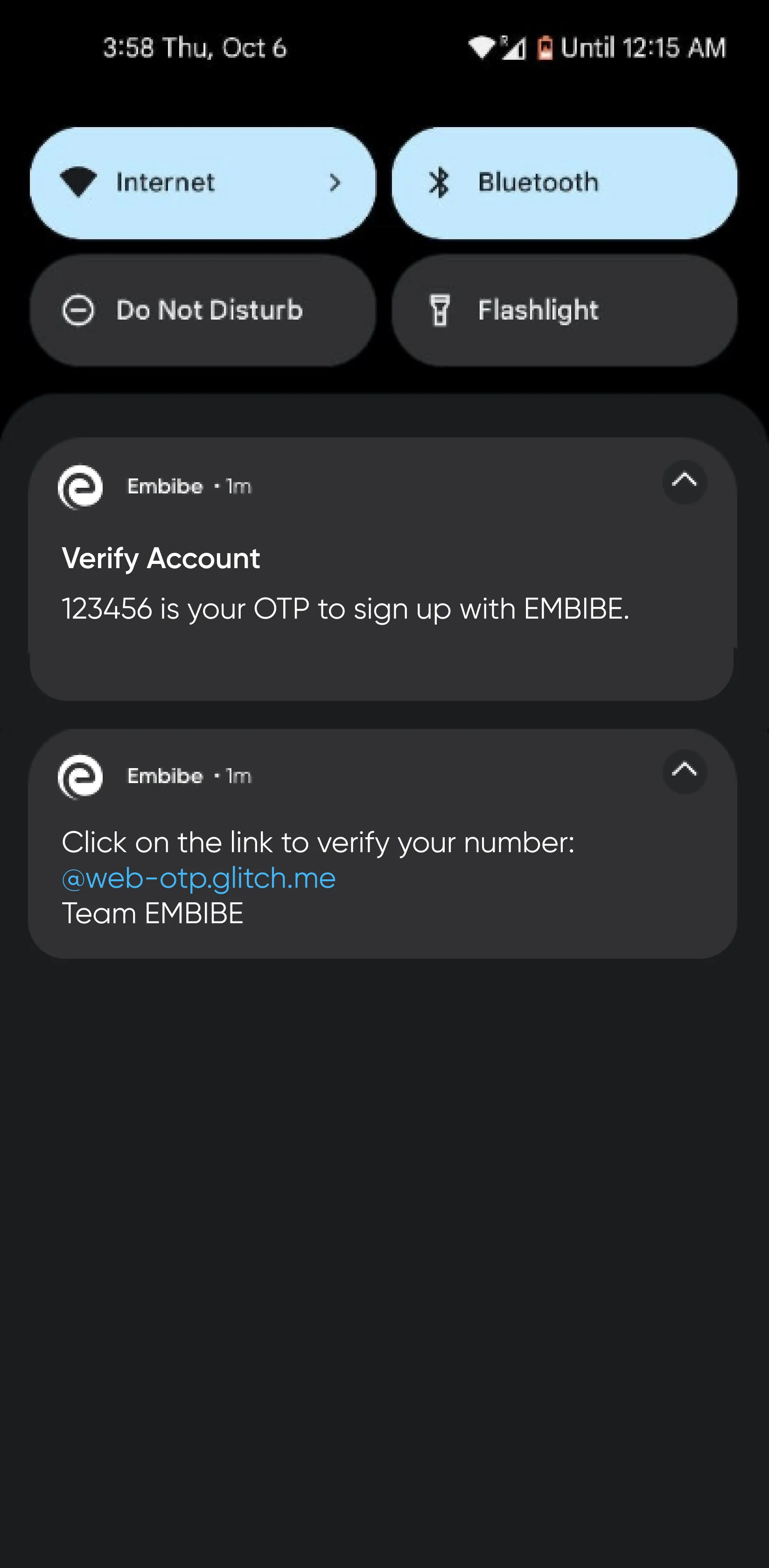
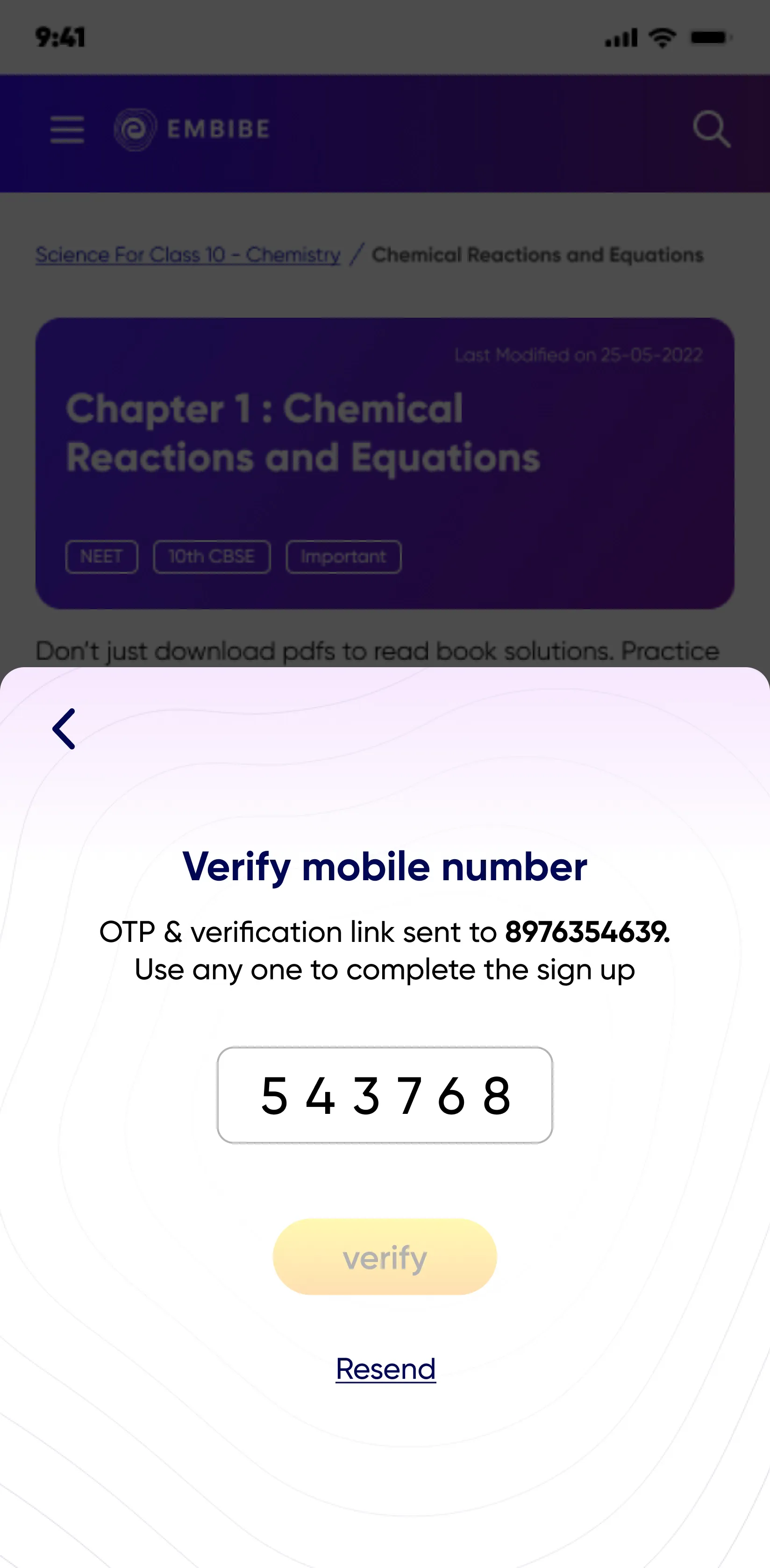
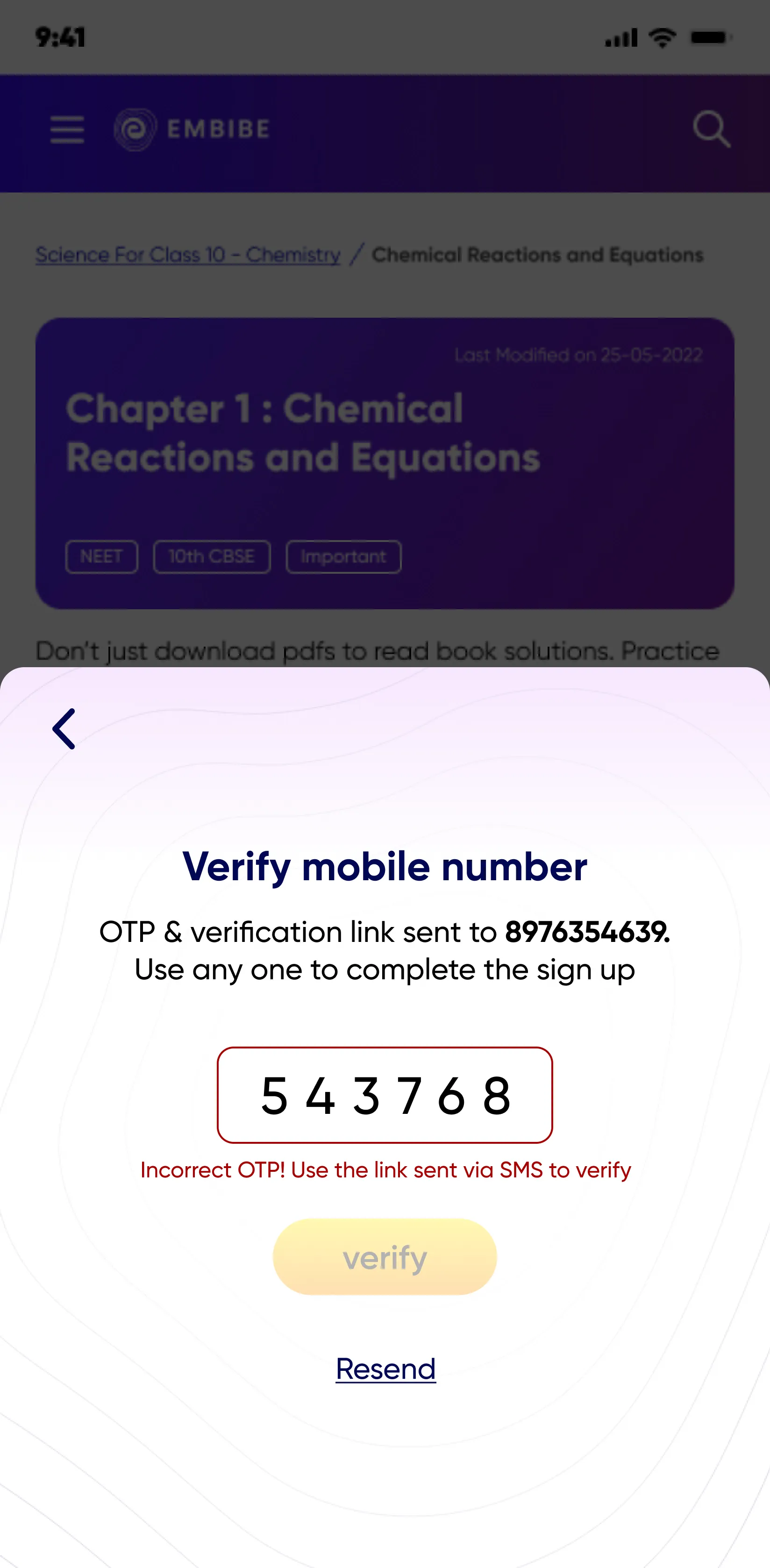
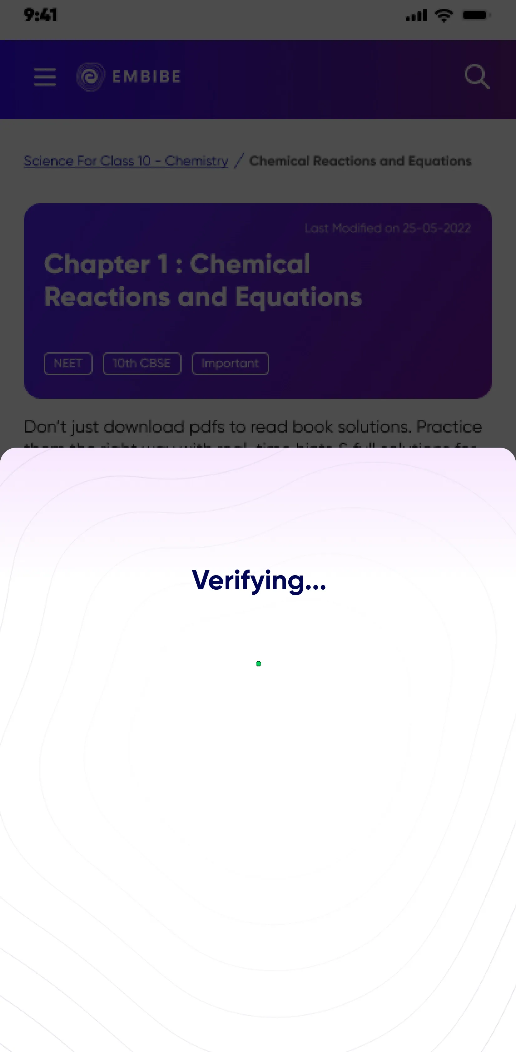
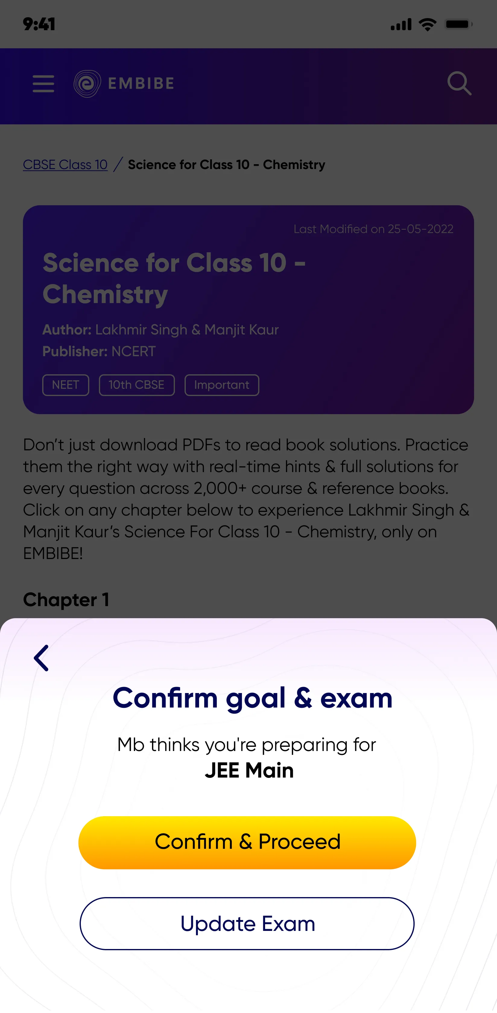
Users are facing the problem in this step of receiving and inputing the OTP for Mobile number verification.
The current signup flow has 7 steps, which is not as per the current good practices of max 2 to 3 steps.
After — Streamlined onboarding
An A/B test was conducted to compare the effectiveness of single-message notifications versus two separate messages with OTP and verification link. In the post-OTP verification flow, users were directed to sign up from the last browsed content type (e.g., a book page if they were previously on a book page).


Resolving backlog
Before — Too many steps
The below table shows the performance of the KPI’s over three periods.
Metrics at Dec’22 vs Nov’22 period could be directly attributed to the Header Menu design changes


Benchmarked features to find mental models for timeline-based content consumption.
Webflow expert
The Class cards

The retrofit Live Class cards were merged into a single expandable card, encompassing all pre and post-class activity content.
An approach that integrates a calendar-style view with a sequential progression for completing pre and post-class activities.
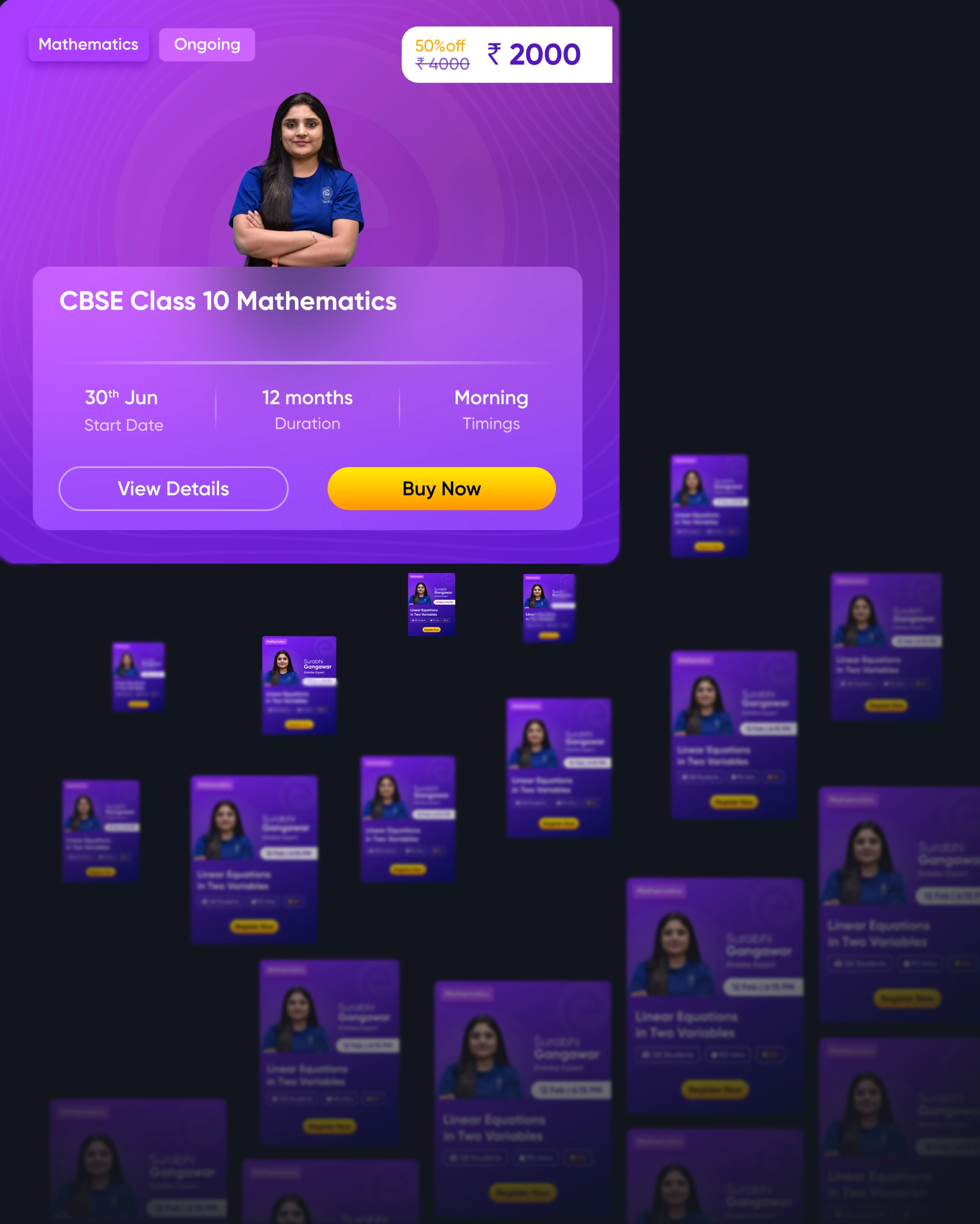
About Page
Through competitor analysis and the co-creation workshop with Design team, User Research team, Category leads, VP growth, we identified the key details a student would need when deciding to subscribe to a batch.Even looking through a more streamlined Information Architecture.


Capitalising on the
value proposition
Batching Monetisation
To create a system where live class batches are offered as purchasable courses, categorized by subject and exam, enabling students to buy access to an entire course instead of individual classes.


Validating our decisions
Iteration 3 was tested
Key Research Focus
- Identify motivations for using live classes.
- Understand barriers to live class adoption, focusing on drop-offs and new users.
- Analyze awareness and compare ed-tech platforms.
- Investigate gaps in existing platforms and explore user experiences.
Target Users
- 3 - Flirtatious Users: Users active on both Embibe and competitor platforms.
- 2 - Embibe Live Class Users: Active users engaged for at least 2 weeks (K12, PPG, PUG).
- 2 - Competition Users: Users from competitor platforms (e.g., Byju's, Physics Wallah).
Findings of Usability Testing
Overall
All the users found the flow easier to navigate owing to clarity in terms of the courses and subjects and the key benefits mentioned.
Also, all the relevant information is seen to be available right at the homepage itself like:
- Live Class banner
- Class wise segregation
- Duration of the course
- Price
Demo/Trial class CTA on homepage
Users need a first hand experience of the live classes that they wish to enroll for. A trial/demo CTA on the home page banner and a tag on the course tile itself will give the user more confidence to proceed further
Sample of Content offered
Though users liked the different modules provided on the 'View details page'. Before making a purchase decision, they would like to see samples of different modules, such as practice questions, study notes, and so on.
Sample of Content offered
Though users liked the different modules provided on the 'View details page'. Before making a purchase decision, they would like to see samples of different modules, such as practice questions, study notes, and so on.
Evaluating Teacher’s style of teaching evaluation
More than the information about the teacher’s experience, No. of classes taken, students are seen to be more interested in the way of teaching. As a result, it is suggested to display a video of the teacher explaining the concept as an example to give the confidence to the students and parents
Aesthetics and Minimalist - UX heuristic
6 menu icons given at the bottom is seen to be too much of a task for the user and the attention is not paid to these icons. Hence, it is recommended to have lesser icons ( ‘Achieve’ as a feature due to low conversions was planned to be Discontinued)
Seamless Experience
Video Player view
The video player view was designed based on insights gathered from competitor analysis of MOOC course providers.

Edge Cases
To address various edge cases in the video player view, solutions were designed to inform and educate users about specific conditions.


.webp)
.webp)

.webp)

.webp)
.webp)


.webp)