MyFinancial Management

Project Lift and Shift to DDS 1.6 (Dell Design Systems)

Year

2021

Client

Moonraft - Consulting @Dell

Contribution

Solo designer, with guidance from a Lead designer, Product Owners

Timeline

3 months

Project Overview

DDS migration of MFM -MyFinancial Management

MyFinancials is an online self-serve Dell application designed specifically for customers to access and view their financial accounts and records.​

Objective

Migrating the UI to Dell Design System DDS 1.6 and also enhancing the experience by fixing usability issues

Scope

The project was constrained by specific limitations provided by the stakeholders:

  • Stakeholders did not allow direct access to end-users for feedback or testing purposes.
  • No modifications to the underlying architecture were in scope ,excluding any major layout or flow redesigns.

Project Team Breakdown

My Role

  • I was the direct Design point of contact after initial handholding while setting the foundation of the project by
    Design Lead - Ajay Chopra

The Stakeholders

  • PDM (Product Manager) - Thow, Siew Heoh
  • CPL - Filipa Ganchas
  • CFS - Shobhitha Krishna

The Design Process

Stakeholder collaboration

UX Evaluation and Feature Prioritization
  1. Daily UX catch ups.
  2. Weekly UX design jam sessions with stakeholders.
  3. Weekly UX design show and tell with stakeholders.

Features were prioritized based on discussion with stakeholders, to create a project plan conducive to the requirement.

The project plan was created with features segregated into one-week sprints, with the below mentioned recurring meetings:

MyFinancials

User Experience Design

Considering above UX screen flow; design system and UI design screens have been created following the agile process along with iterations wherever needed.

Design Activities 

These activities will repeat each week to elaborate, design and validate each feature.

  • Stakeholder Interviews
  • Current & Future state mapping
  • Heuristic Analysis
  • Gap analysis
    While working on improving the user experience, we filled gaps in the existing components to match those in Dell Design System 1.6 (DDS 1.6)

Project Timeline

Feature elaboration & query resolution

Learning the complexities through weekly stakeholder collaboration

The Users

MyFinancials is for

  • Dell customers who are on Net payment terms

and not for

  • Dell customers whose account information is not available for payments made by credit card, Dell business credit, prepaid, and so on
With My Financials

Users can:

  • Raise a dispute on outstanding invoices.​
  • Raise a promise by providing timelines to pay the outstanding invoices.​
  • View or export multiple lists of invoices to excel.
  • View and download multiple invoices.​
Entity Hierarchy in MFM

1 to Many relationships exists between the Entities.
Transaction are mapped to these Entities and in MFM they serve as filters to drill down based on selection.  

    Transaction types
    Invoices - INV

    A legal document you receive from Dell with details of the products or services you have ordered, along with the amount you owe.

    Receipt - REC

    Proof that you have successfully made a payment to Dell for an invoice.

    Debit memos - DM

    A legal document sent to you by Dell if they need to debit your account for additional charges, such as if there was an error on the original invoice.

    Credit memos - CM

    A legal document issued by Dell to you, crediting your account for a refund or a return of goods. This could be due to an overpayment, a damaged product, or a cancelled order.

    User flow

      Through regular stakeholder catchups, i got to know all the touch points possible for as user.

      Heuristic Evaluation

      Taskflow 1:
      Login/Signup to the MyFinancials portal

        / APPEARANCE & AESTHETICS
        /1
        Clean, simple design
        Unnecessary dropdown to select country.
        /2
        Appropriate use of white spaces
        lot of wasted Real estate
        /3
        Accessible design
        The mail icon is blended with the background colors
        /4
        Disabled states are clearly differentiated
        The Dropdown being grey looks disabled
        / EFFICIENCY & FUNCTIONALITY
        /5
        The system supports error prevention
        Important Information to use same email as shared with collector is missing
        /6
        Provide information text where needed
        Ghost UI could be avoided by following progressive disclosure
        / PAIN POINTS & OPPORTUNITIES
        / 1
        Confusing user interface: Users might not understand what actions they should take or where to find the information they need.
        Enhance user onboarding and guidance,by providing only relevant contextual information when needed.
        / 2
        Cluttered user interface:  
        The website layout might be overwhelming with unnecessary elements, making it difficult to find relevant information.
        Improve clarity and information architecture by prioritizing and organizing content based on mapped user-flows.
        / 3
        Incorrect use of affordances, by styling tiles and buttons and not having chevrons to indicate expandable row items
        Follow a standardised use of visual affordances be it buttons or chevrons and hoverable elements.
        / 4
        Poorly designed elements (sort/search bar, currency selection)
        the sort/search bar should prominent and user-friendly. Redesign the currency filter with clear options.Simplify dialog interactions and provide clear descriptions/tooltips.
        / 5
        Undistinguished titles from buttons & unclear export options
        Clearly distinguish titles from buttons for better affordance. Clarify export options and downloading process for non-intrusive user experience.
        Heuristic Evaluation

        Taskflow 2:
        Search and View Transactions and Raise Dispute

          / APPEARANCE & AESTHETICS
          /1
          Primary goal/Purpose is clear
          • Not clear how to search and how filters works
          • CTA is not clearly visible
          /2
          Clean, simple design
          The hierarchy of PP>Acc>BTA cannot be understood
          /3
          Current status of icon/component clearly visible
          No affordance of being a accordion
          /4
          Search box is easy to identify and use
          Status wise Sort and Search bar is very hard to find in between other possible report options;
          /5
          Icons/text are universally understood
          • The currency selection is just a filter.
          • Not clear what "view copy" means.
          • export is only exports xlsx of table records
          /6
          Consistent design
          Title looks like button
          /7
          Wrong use of patterns
          Dialog on dialog in wizard is wrong usage
          / CONTENT
          /8
          Major headings are easy to understand
          Understanding what each transaction tabs mean is a challenge
          / EFFICIENCY & FUNCTIONALITY
          /9
          System tells user whats is going on at each step
          Information shown doesn’t follow order of selection in different steps
          /10
          Provide information text where needed
          • Not clear what dispute section means
          • currency of total amount not shown
          /11
          User doesn’t have to wait
          The downloading interrupts from doing anything else(almost 2 mins)

          The Redesign

          Solving Problems

          The following major changes were executed on weekly sprints, with regular feedback from stakeholder through the entire project timeline.

          Dispute/ Promise Statuses

          / 1
          Active Promise
          • A promise to pay is an offer by User to pay due invoices by a certain date. Users can make a promise to make a full or partial payment.
          • Submitting a promise to pay can prevent Users from being contacted by the collections team, but submitting a promise to pay does not waive any of Dell's rights.
          / 2
          Broken Promise
          • A Broken promise is when Dell has not received your payment within the promised date
          • Add here
          / 3
          Active Dispute
          • Once a dispute is raised, the collections team will investigate and process based on findings. Raising a dispute does not waive any of Dell's rights.
          • If Users find a discrepancy with an invoice, such as an outstanding balance of an item or delivery of goods, you can raise a dispute.
          / 4
          Broken Promise
          • The dispute will no longer be active if a superseding action has been performed:
          • The collections agent has reviewed the dispute and determined it should be removed
          • Transaction has been paid in full or closed out with a credit note

          Contextual Information messages

          / 1
          Error Messages
          • Were the edge cases which were given by the tech team to show up when there are certain database or access related issues
          / 2
          Information Messages
          • Due to the tech implementation, the Transaction table populated only after a BTA selection.
          • Whenever there is no Open transaction the Transaction table has no entries to populate.

          Microfeedback

          / 1
          It was more of UX copy and tech implementation to gather contextual feedback from users
          • Dell based in-house micro feedback engine was implemented

          FAQ

          • Created design for the previously non existent FAQ page.
          • The detailed FAQ section was done for all main pages of MyFinancials,the content was provided by in house UX writer in order to meet UX copy standards
          Gap Assessment

            While working on improving the user experience, we filled gaps in the existing components to match those in Dell Design System 1.6 (DDS 1.6). This mapping was done for all the UI components.

            Strategic Reflections

            Documenting Design Debt for Future Enhancements

            MyFinancials is an online self-serve Dell application designed specifically for customers to access and view their financial accounts and records.​

            Objective
            • Document all design and usability enhancements that were not included in the initial project scope due to timeline constraints or deliverable limitations.
            • Create a Confluence design debt repository to document all suggested design changes according to usability best practices.

            1. Placement of Customer Account Selection

            • As the Customer Account selection is the focal point to which all tabs such as Parent Party, Bill to Address, and the below transactions, it made sense to keep it prominently at the top level. This structure allows for easy navigation and reflects the hierarchy within the UI, as a customer can have multiple Customer Accounts.
            • While this approach satisfies both usability needs and stakeholder perspectives, major changes were not feasible due to the scope and the need for backend architecture modifications.

            2. Combining the Transactions, Raise Promise, Raise Dispute into a single Transactions table

            • The Raise Promise, Raise Dispute tabs has the same Transactions that exist in Transactions tab, i nth older designs they had different tabs for the purpose of Raising a Promise and Dispute
            • This was put across to the stakeholders and again not in scope with current effort and project timelines

            Final Prototype

            Solving Problems

            The solutions for key workflows and design execution- based on major features over the entire project timeline are shown

            Use Case 1: Onboarding Screens

            1

            Existing User - SignIn

            Users who have already logged In before click on the card as shown

            2

            Landing Page - Account Selection

            As the user Logs In he is directed to his page, where he gets to see "What's New" and to proceed further the "Account selection" must be done

            3

            Details of Promise or Dispute

            The Promise or Dispute details are shown on hover over the status chips

            4

            Aging Summary

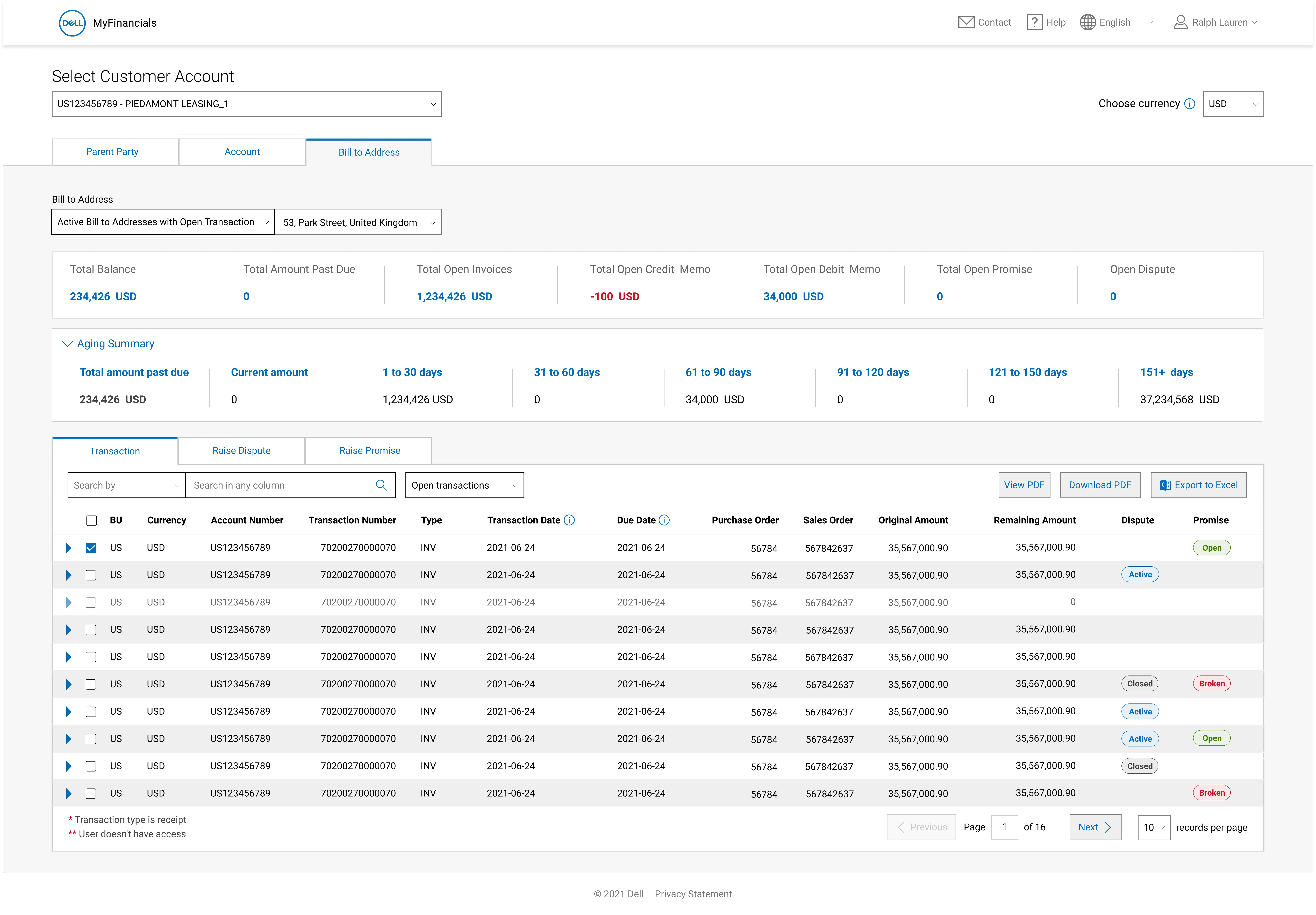
            To view Aging summary for the Account selected user has to expand it

            5

            Dell Collections contact detail

            Dell Collections contact being the most important point of contact for any discrepancies with Account details, Transactions, Promise and Dispute statuses

            Use Case 2: View and Download Invoices and other financial documents

            1

            Transactions table - View and download and Export selected Transactions to Excel

            Users can export the Transaction table and select the number of records they wish to export

            Use Case 3: Raise a Promise

            1

            Select Transactions to Raise a Promise

            Multiple Transactions which are eligible to be Raised as Promise are selected.

            Use Case 4: Raise a Dispute

            1

            Select Transactions to Raise a Dispute

            Multiple Transactions which are eligible to be Raised as dispute are selected.

            Use Case 5: Information messages and Error states

            1

            Different Information messages and Error states

            According to different use scenarios.

            2

            Error message - Technical issue

            If there is a Tech related issue due to various factors

            3

            Error message - IT Maintenance

            If there is scheduled or unscheduled maintenance

            4

            Information message

            If the user doesnt have access to. any specific page or section of the dashboard

            5

            Information message - No open Transactions

            When there is no Transaction tagged or Open transactions under a Customer Account

            Accessibility Assessment

            The entire product was run through a Dell accessibility check done by Accessibility team at Dell. From which we picked up priority design changes and tech team took up the technical changes to be implemented both on basis of level of impact they have.

              Project status

              Project is live!

              The product has been live since 2022.
              Stakeholders were delighted with the output and wanted to proceed with the next upcoming customer deliverable of payments.


              However, after the release, I was reassigned to another project with Dell. During this time, a colleague took over the payment flow, and I provided initial handholding and design support.

              Go to Live Site

              More Case Studies