
MyFinancial Managements Lift and Shift to DDS 1.6 (Dell Design Systems)
MyFinancials is an online self-serve Dell application designed specifically for customers to access and view their financial accounts and records.

Employer
Dell
My Role
Research, product design
Contribution
Solo designer, with guidance from a Design Manager, Product Owners, Business Stakeholders(Dell Financial Services)
Timeline
3 months


Improved the usability of the dashboard, earning positive stakeholder feedback
driving the design team’s re-engagement for the next phase of the end-to-end dues payment experience.
DDS migration of MFM -
MyFinancial Management
Migrating the UI to Dell Design System DDS 1.6 and also enhancing the experience by fixing usability issues
The project was constrained by specific limitations provided by the stakeholders:
Stakeholders did not allow direct access to end-users for feedback or testing purposes.
No modifications to the underlying architecture were in scope ,excluding any major layout or flow redesigns.


Driving Clarity and Interaction Through Collaborative Design Sprints


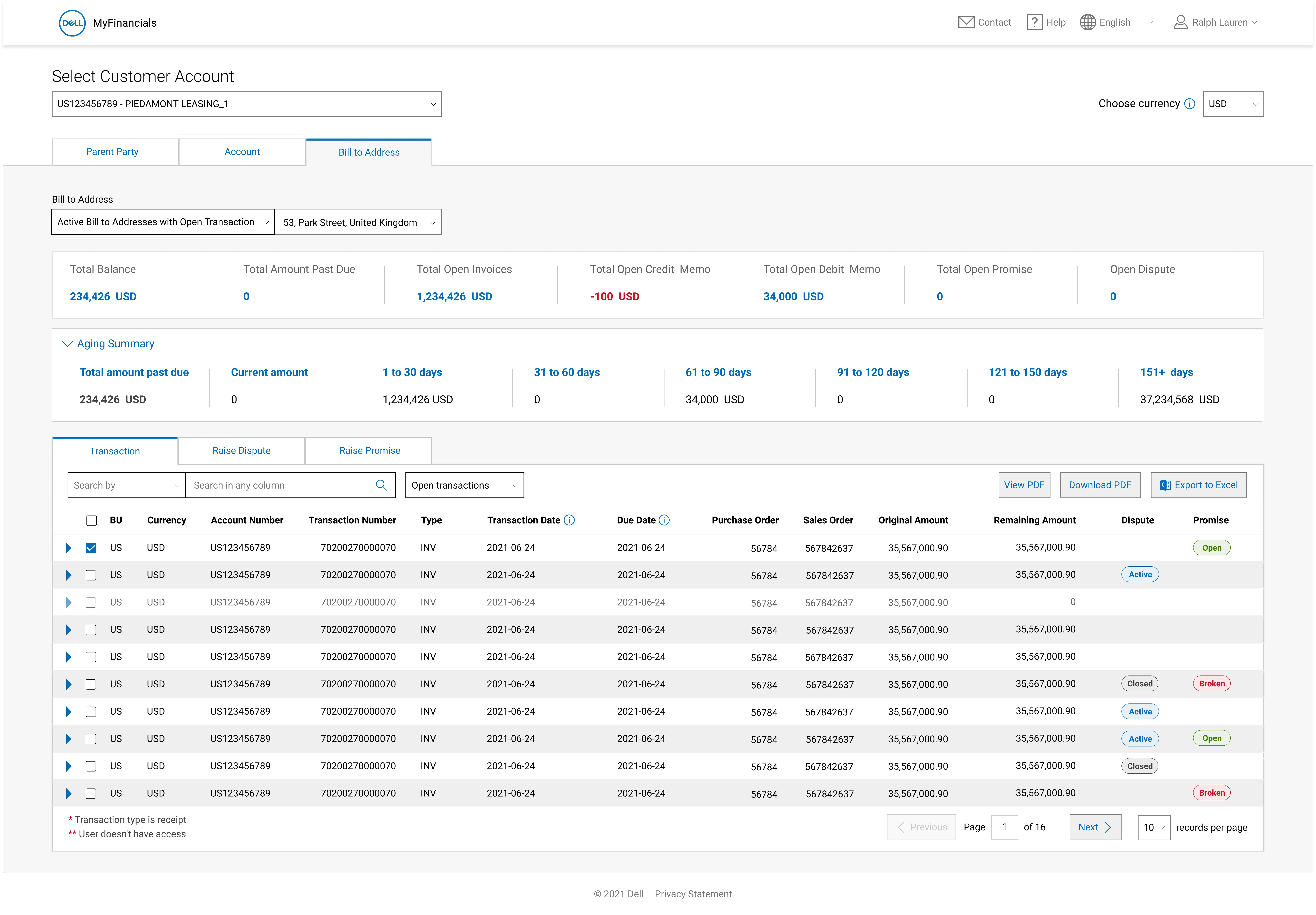
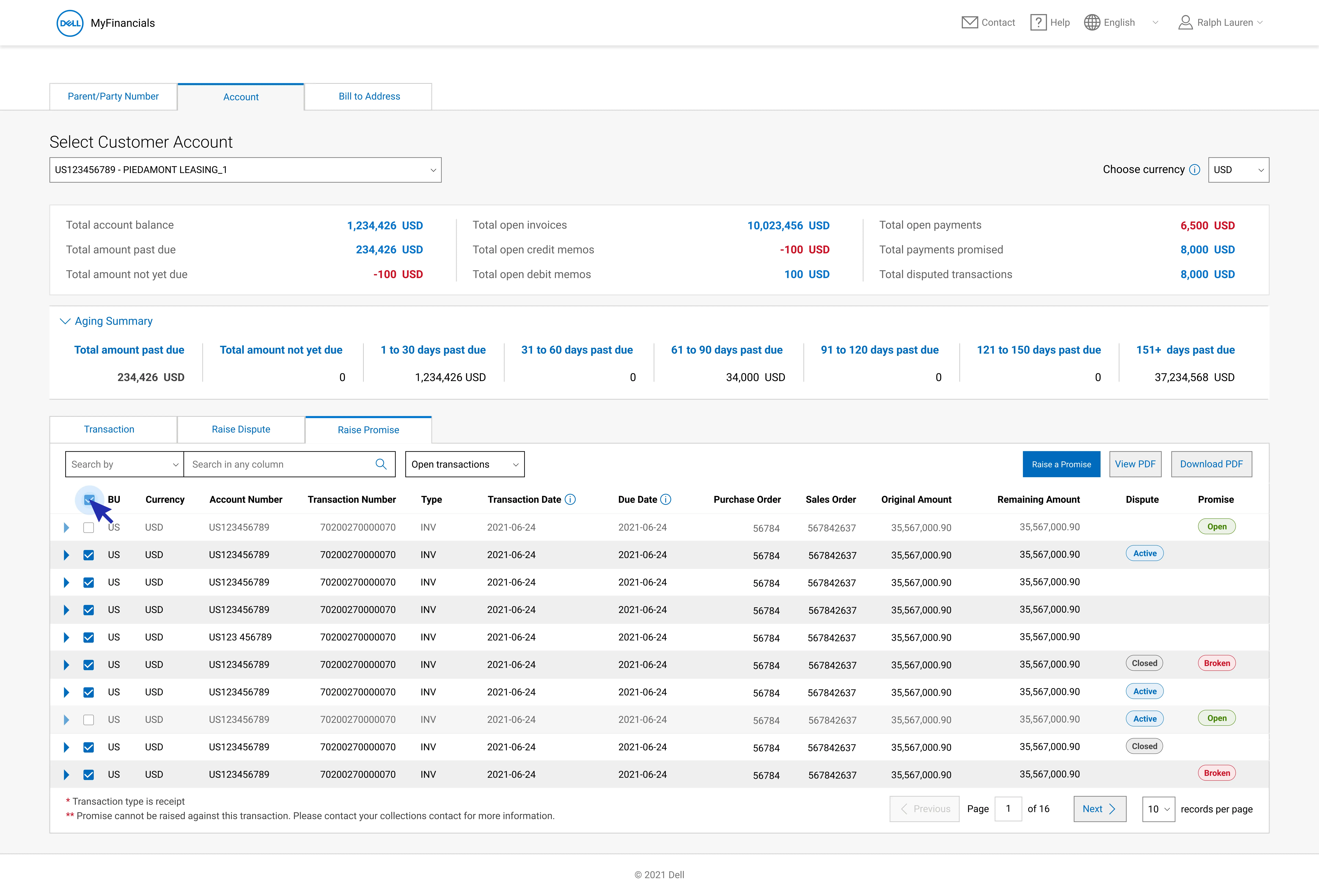
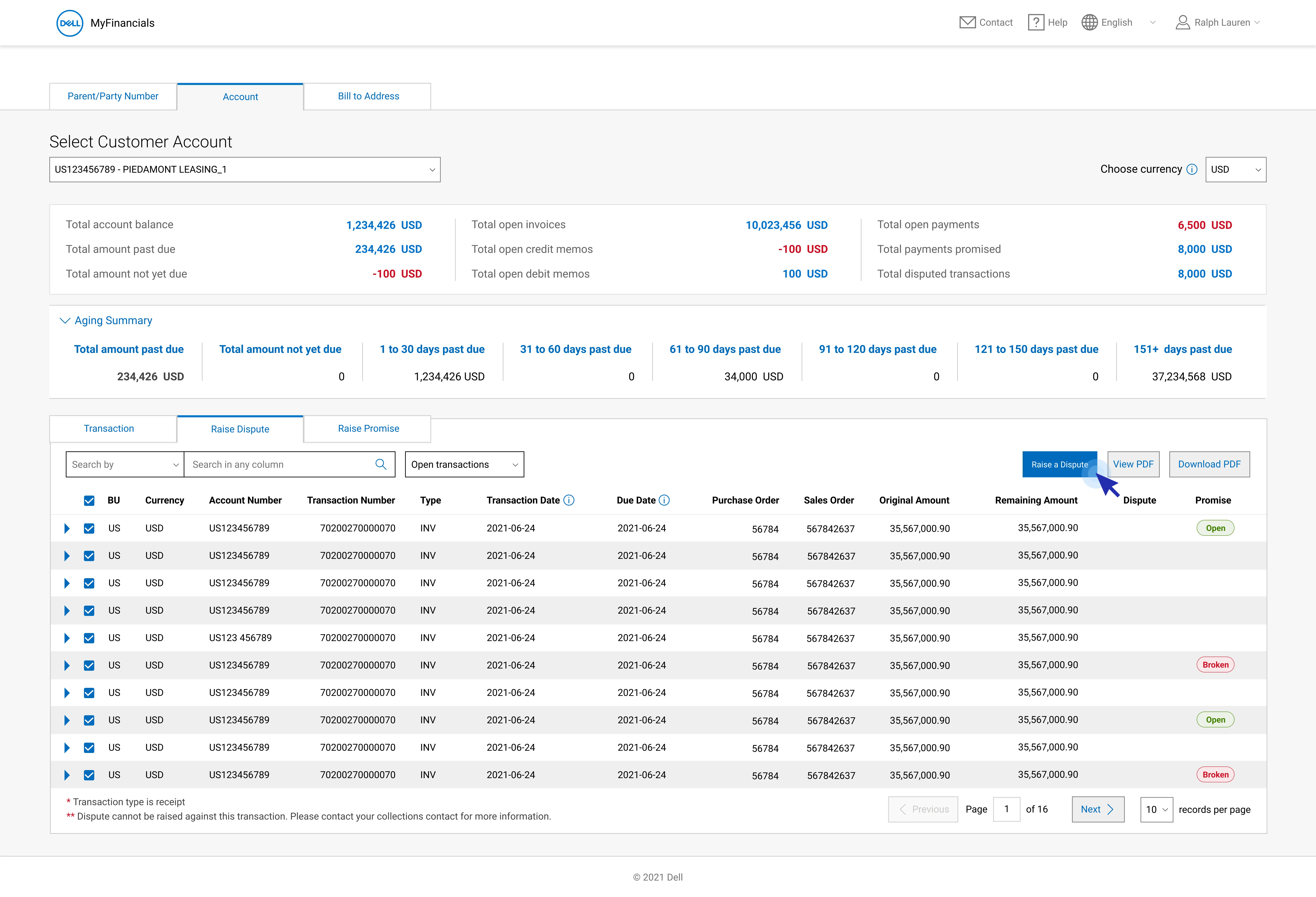
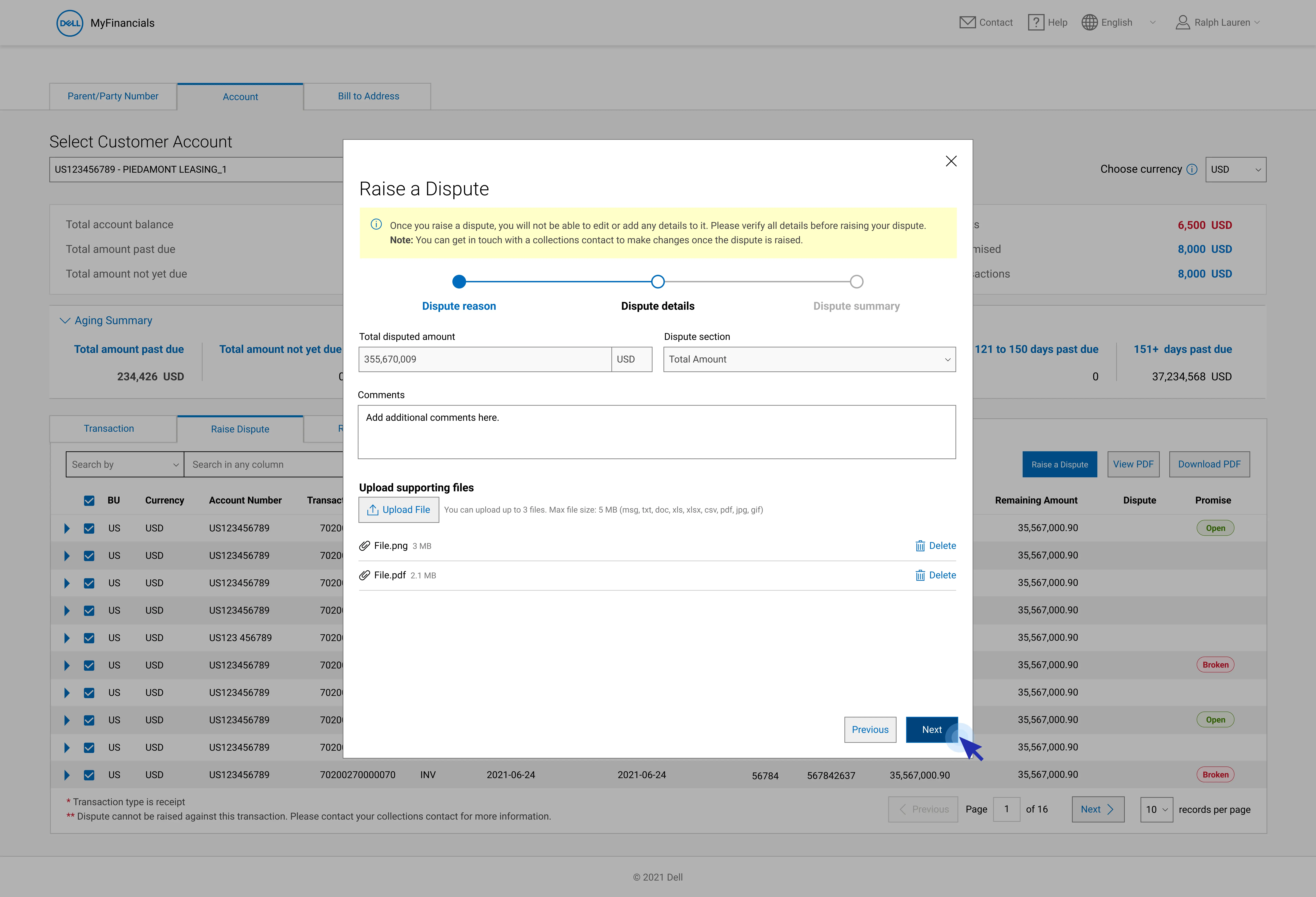
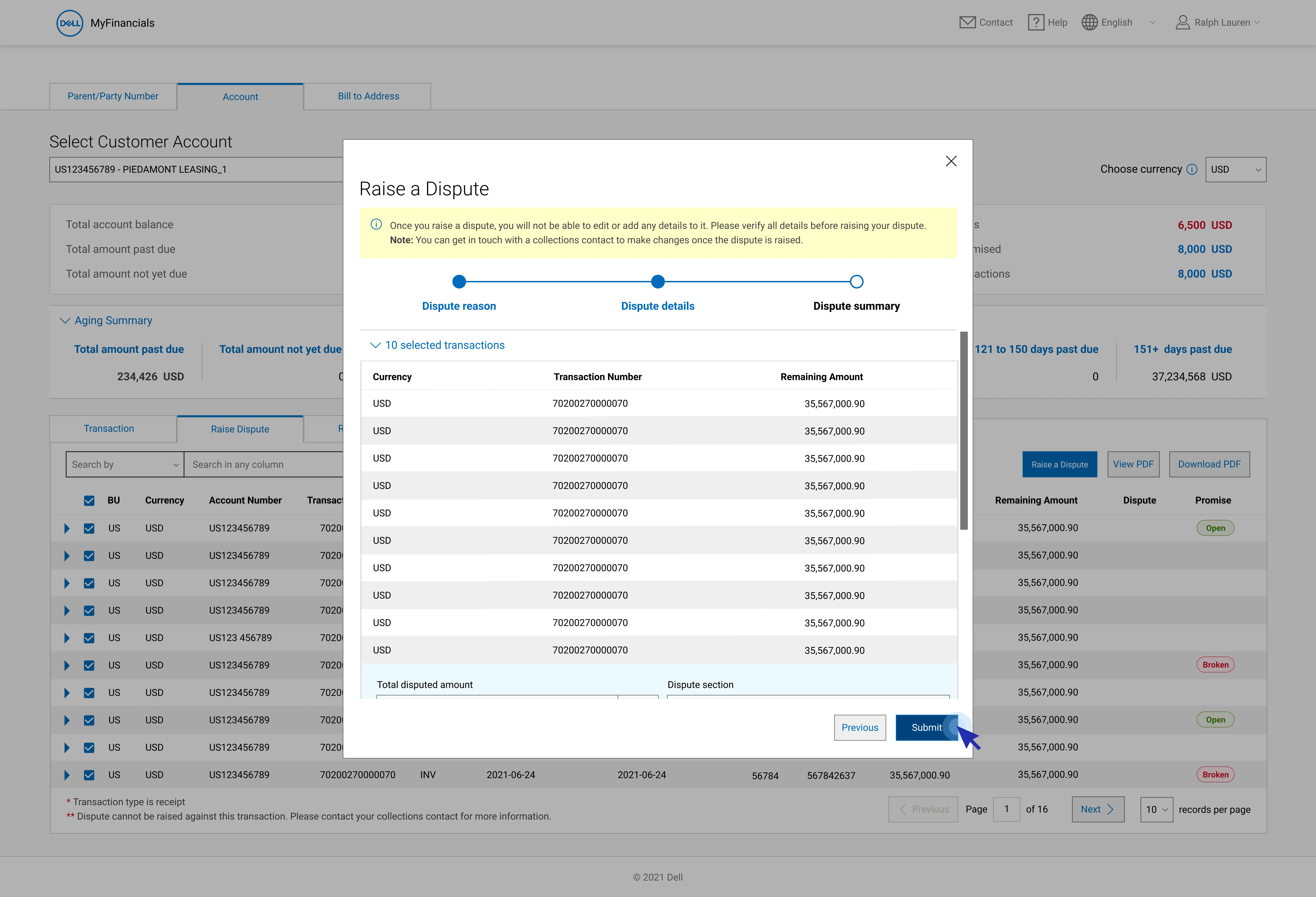
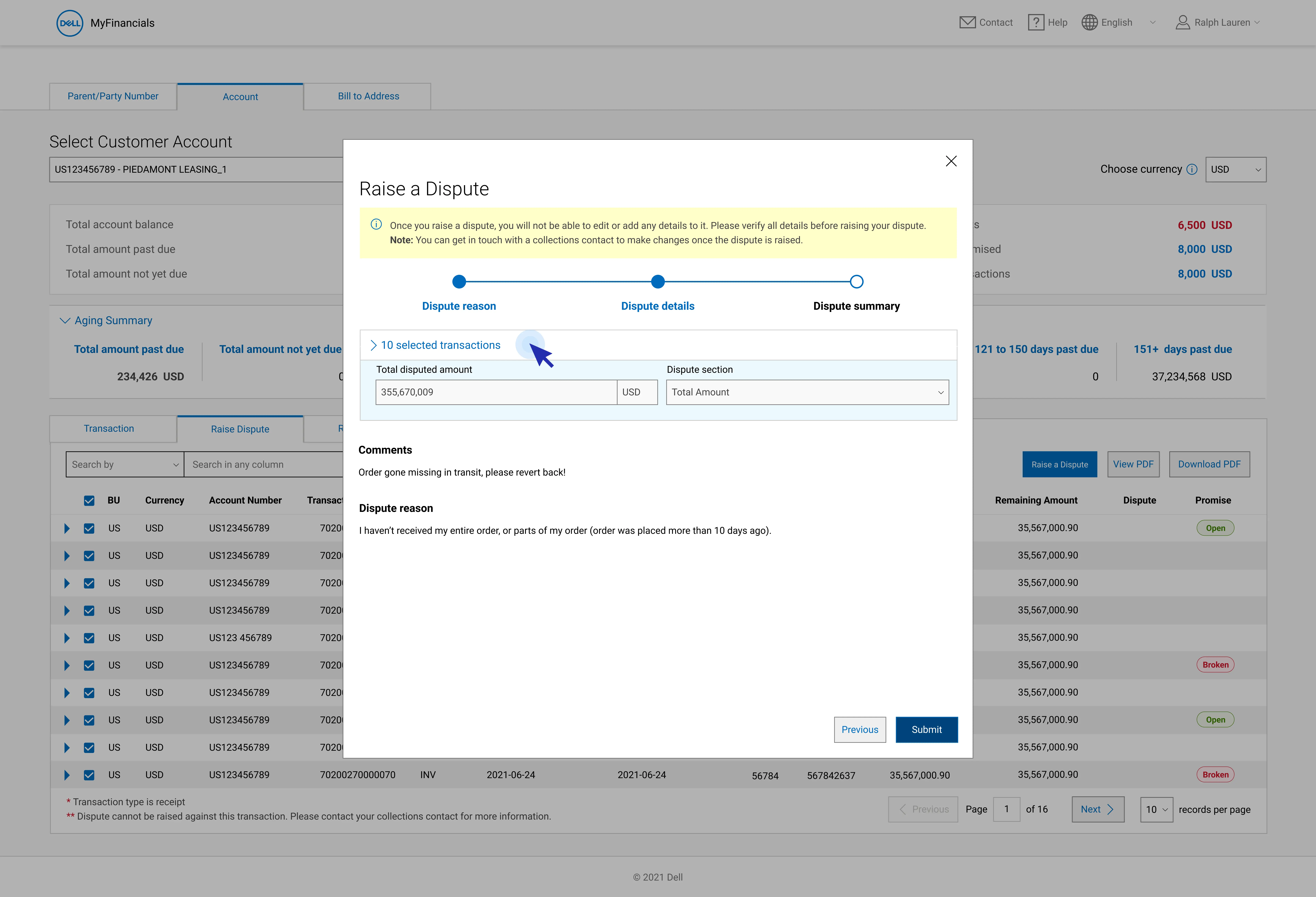
Improved Usability and Accessibility in Dispute and Promise Statuses
Achieved WCAG AA compliance by enhancing contrast, introducing clear status labels, and refining visual design, resulting in improved readability, accessibility, and a more intuitive user experience.
.docx
.xlsx
.odt
.pptx
.rtf
.webp
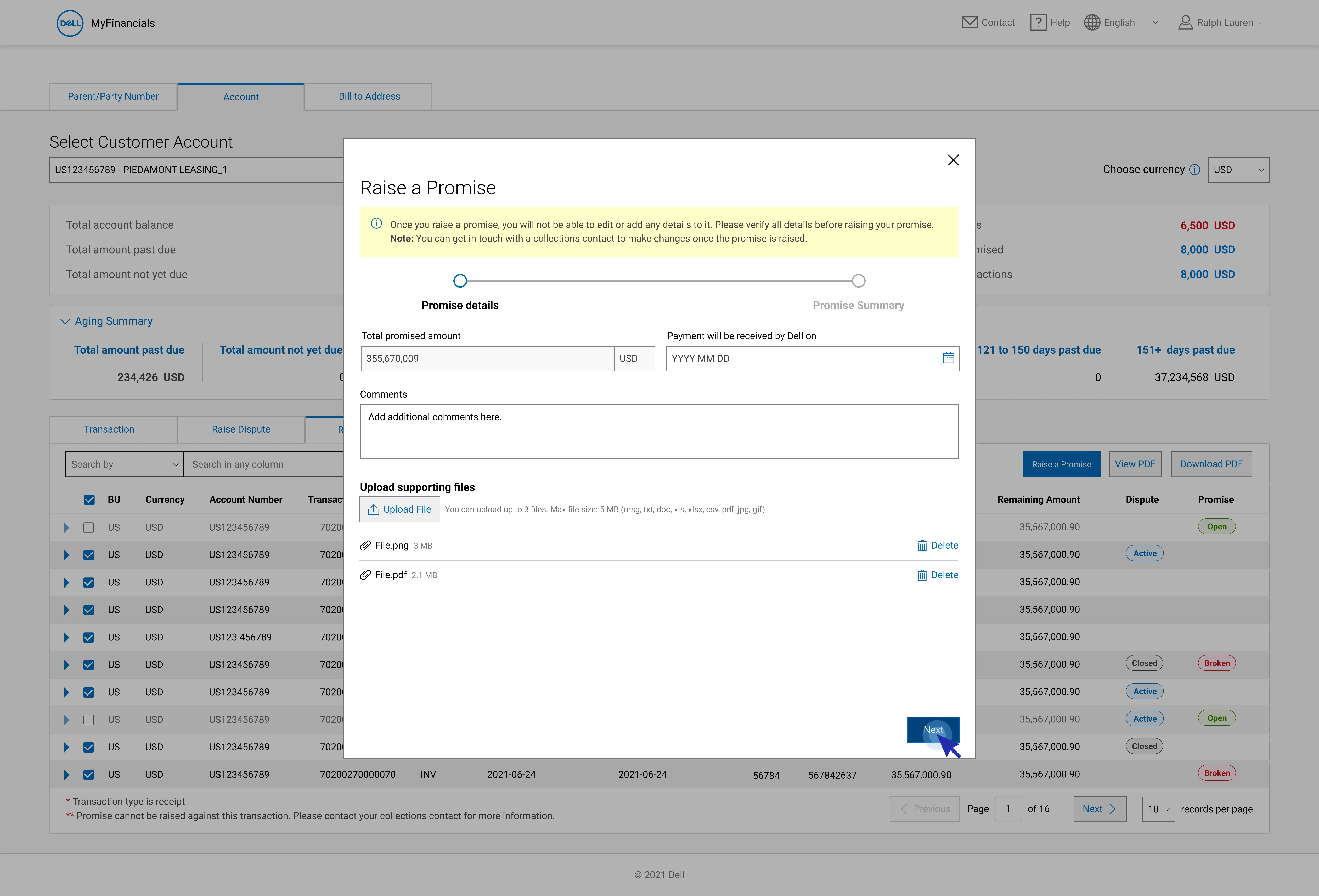
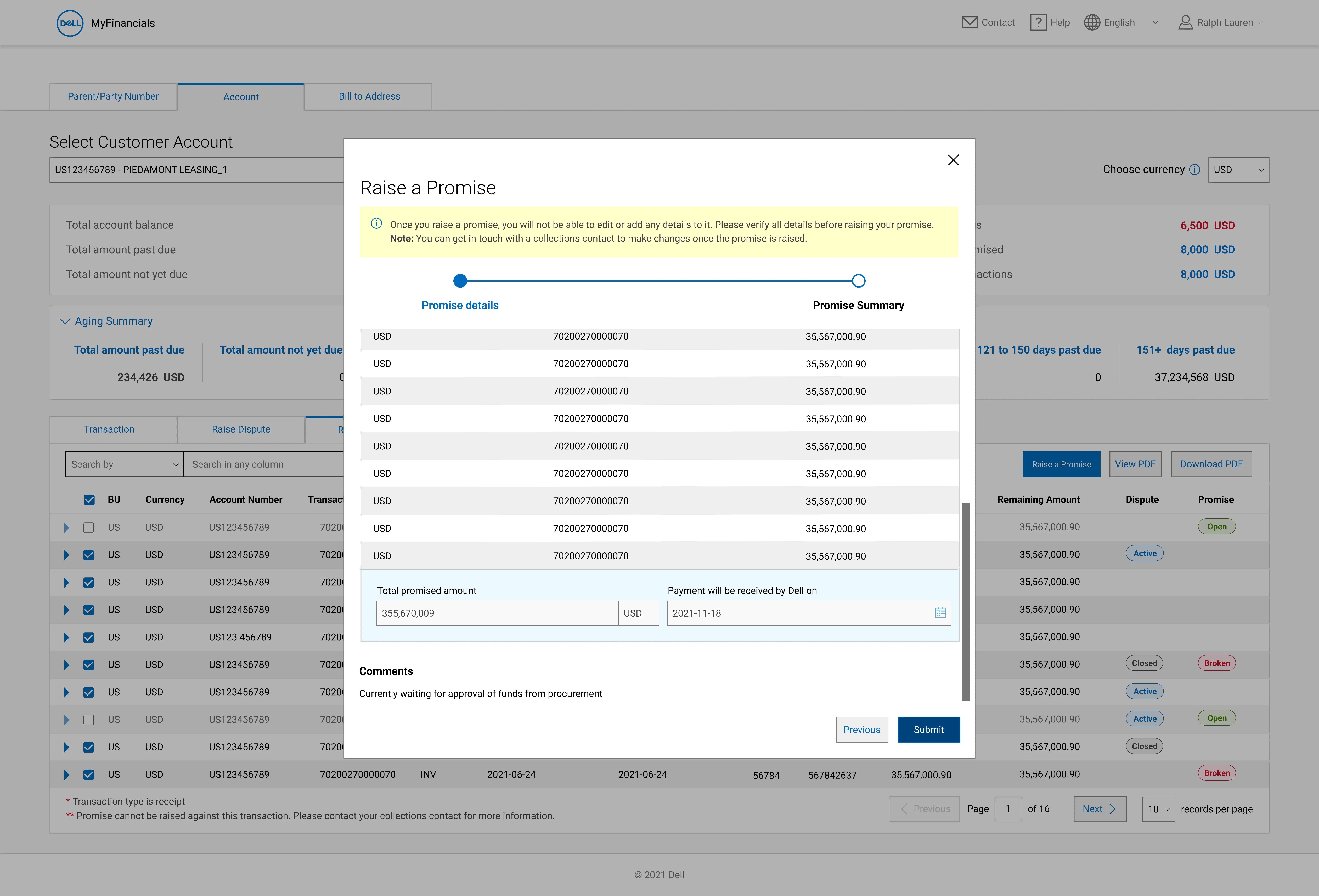
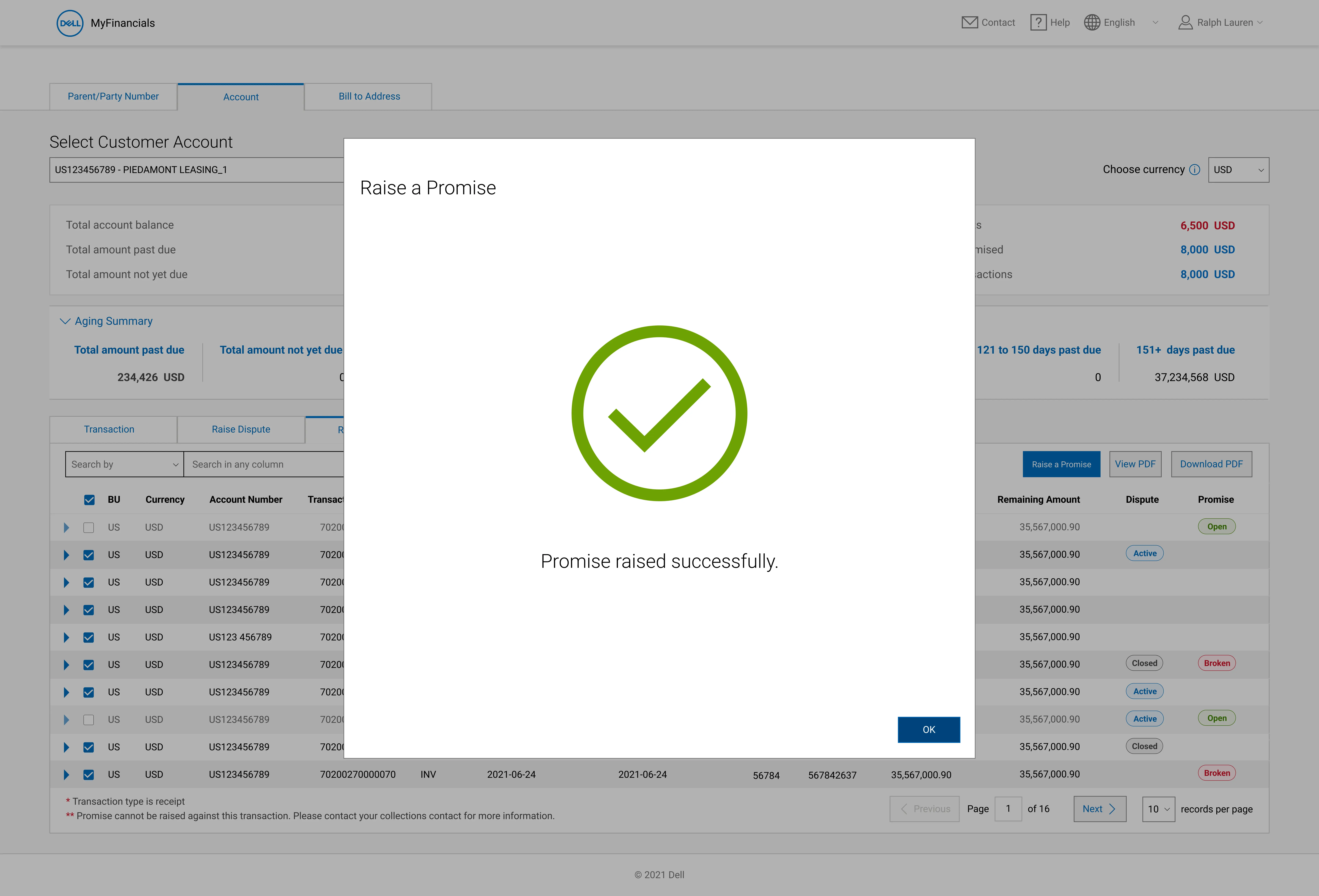
Contextual Information Messages for Clearer User Guidance
Streamlined error and information messages with improved visual cues and messaging clarity, ensuring users understand system status and required actions with ease.


Integrated Microfeedback for Continuous UX Improvement
Enabled real-time user feedback collection through in-house microfeedback tools, enhancing usability by aligning design improvements with user needs and insights.
.docx
.xlsx
.odt
.pptx
.rtf
.webp
Comprehensive FAQ Design for Seamless User Support
Developed a detailed and accessible FAQ section across key pages, providing clear, user-friendly guidance and reducing support dependencies.
Issues in the Signup funnel
Users are facing challenges that hinder their full learning experience. These challenges include
User Drop off : While Sign-Up conversions were the ultimate goal, the journey to engage users and encourage them to browse enough content to convince them to sign up was insufficient.
Navigation between pages was virtually impossible: The absence of primary navigation made it extremely difficult for users to move between pages effectively .

Building upon clarity
Figuring the best order of items inside the menu

Stakeholder Interviews
While this was the preferred approach, the lack of ready access to users prompted the exploration of alternative methods.
Current & Future state mapping
Expert advice was sought from faculty members, but their diverse approaches to structuring the content did not provide a clear solution.
Heuristic Analysis
Since the project was part of the SEO team, they suggested utilizing MSV or Monthly Search Volume to order the menu items, with the highest searched topics appearing first, aligning with user search trends.
Gap analysis
Since the project was part of the SEO team, they suggested utilizing MSV or Monthly Search Volume to order the menu items, with the highest searched topics appearing first, aligning with user search trends.

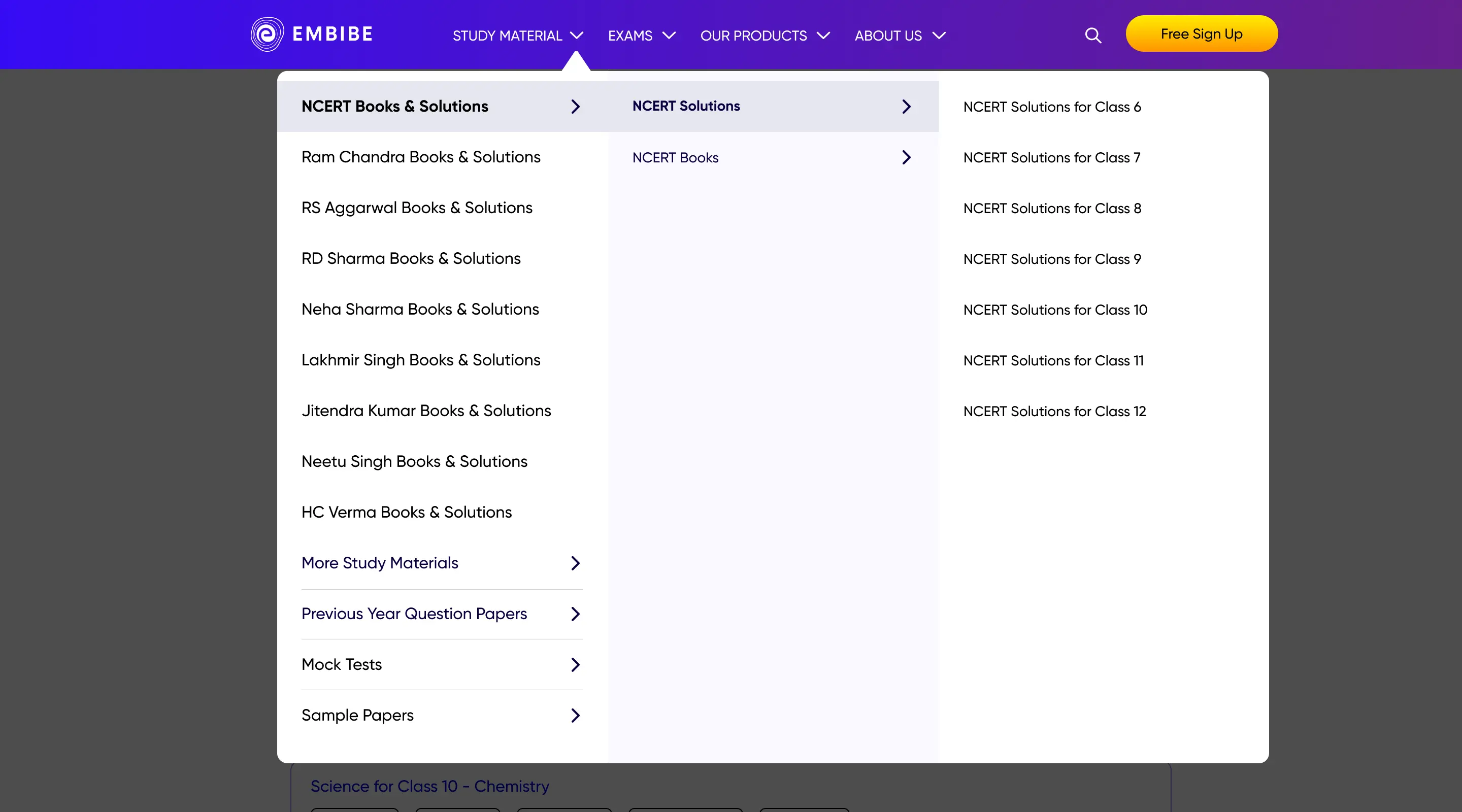
A Global Header menu for all the Web pages
Before — Fragmented Information Architecture
The information architecture analysis revealed difficulties in efficiently finding information. The absence of a search function further hinders navigation and accessibility.


Inconsistent header menu items across different pages created a disjointed user experience.
The menu lacked scalability to accommodate the upcoming app catalog with multiple apps in the pipeline.
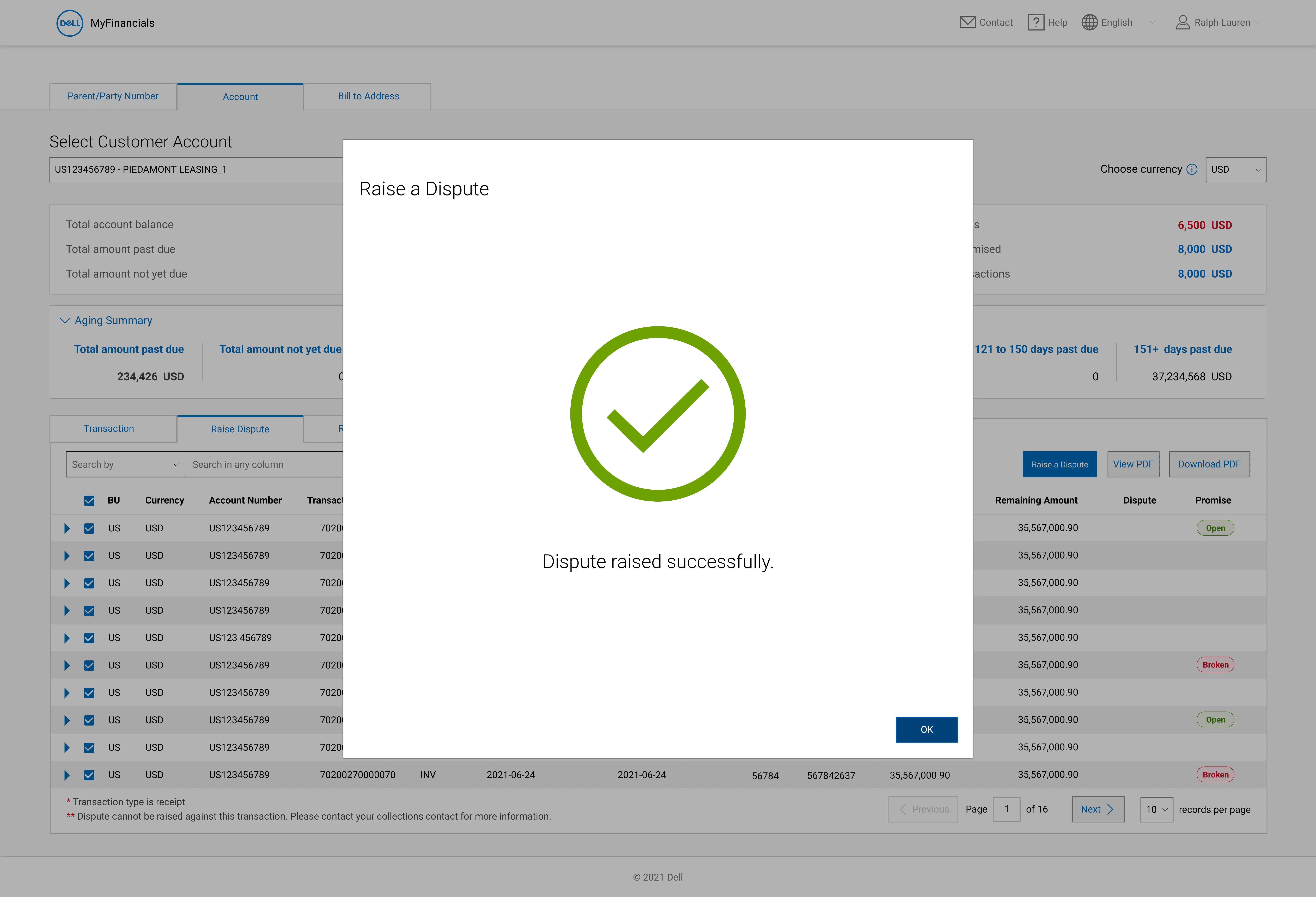
Raise Promise
The new design enabled seamless navigation through the extensive study material and exam pages while accommodating all products in Embibe's portfolio. Its success led to implementation across all Embibe web pages.


Raise Dispute
The new design enabled seamless navigation through the extensive study material and exam pages while accommodating all products in Embibe's portfolio. Its success led to implementation across all Embibe web pages.

Design focused on discoverability
Design Evolution: Iterations and Lessons Learned
Learnings
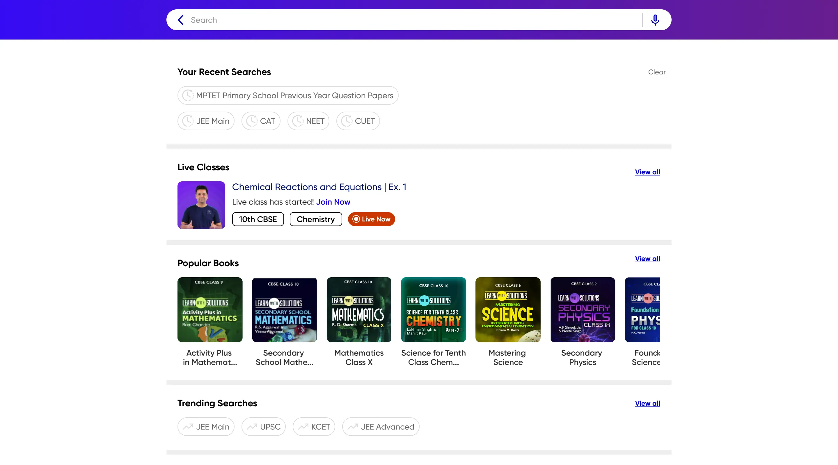
- Iteration 1 - Focused on functional basics—autocomplete, autocorrect, and comprehensive search results for books, chapters, and exercises.
- Iteration 2 - Introduced detailed suggestions with thumbnails and pills but faced challenges in balancing clarity and interface clutter.
- Iteration 3 - Replaced thumbnails with icons, which proved ineffective due to space constraints and difficulties in creating universally recognizable content type icons.


After — Search to increase content discoverability
The Final Version of Search is a matured version which implements positives from the 3 iterations.


Resolving backlog
Before — Too many steps
The User Journey across Embibe web pages has two main phases, the Explore & Research and Onboarding.The table shows the drop offs in Sign-up steps which have a sufficient values.


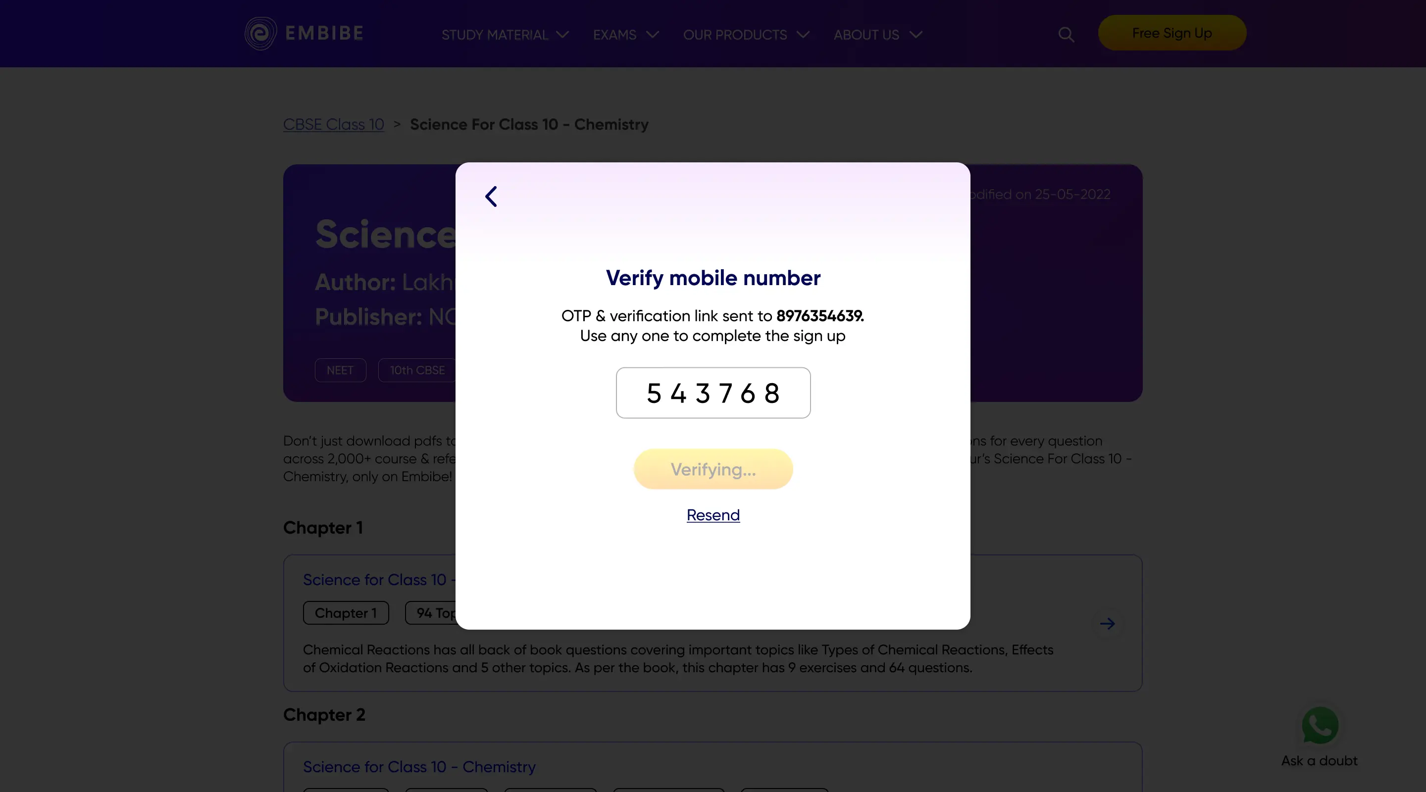
Users are facing the problem in this step of receiving and inputting the OTP for Mobile number verification.
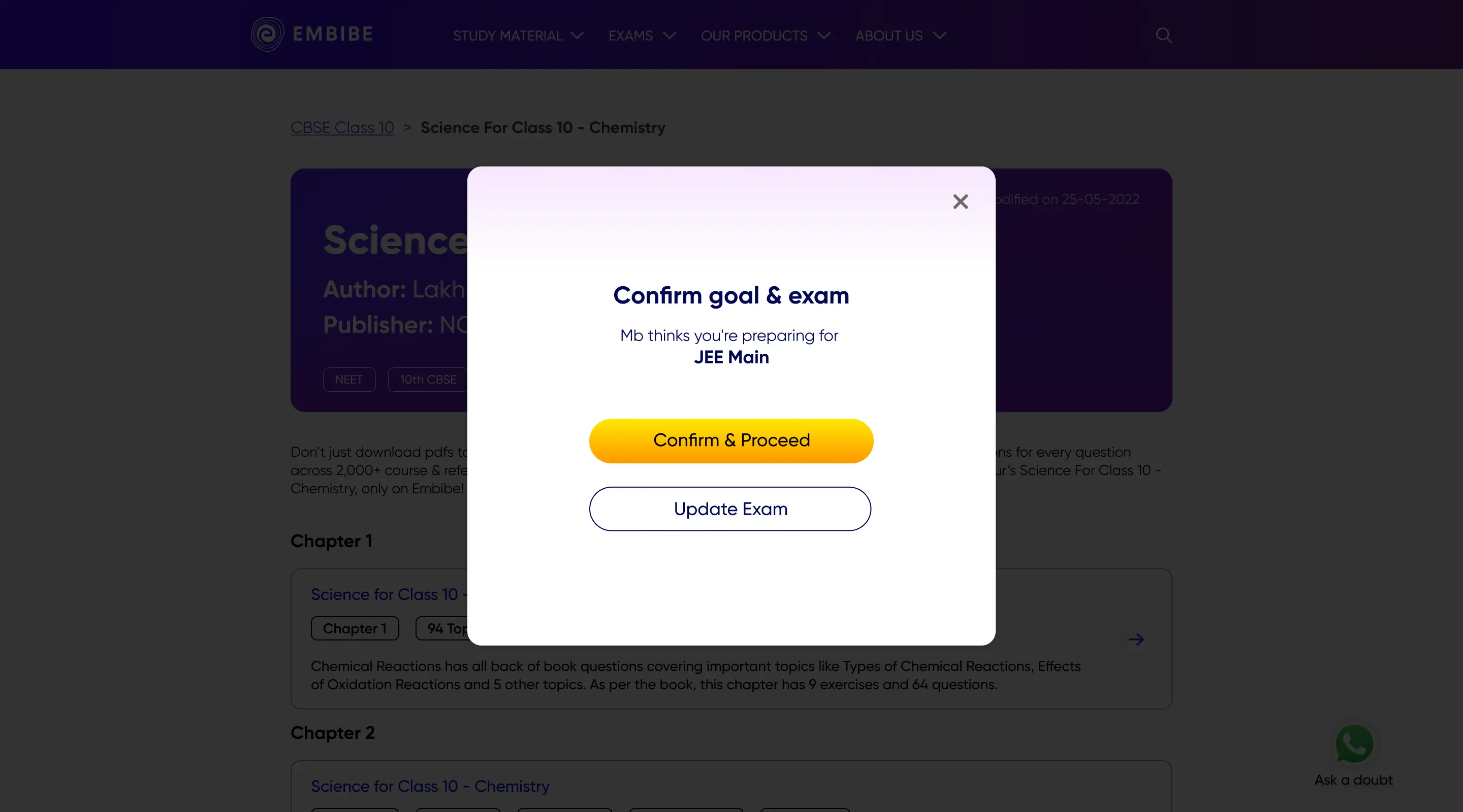
The current signup flow has 7 steps, which is not as per the current good practices of max 2 to 3 steps.
After — Streamlined onboarding
An A/B test was conducted to compare the effectiveness of single-message notifications versus two separate messages with OTP and verification link. In the post-OTP verification flow, users were directed to sign up from the last browsed content type (e.g., a book page if they were previously on a book page).


.webp)


.webp)


.webp)


.webp)
.webp)


.webp)
.webp)